
We often spend too much time optimizing buttons.
Hunting for the right wording, the right action verb, the right level of urgency.
We rewrite “Add to cart” as “Add,” then “Add now,” then test a softer variant, a shorter one, a more assertive one.
To illustrate this, here's a real example from a brand the authors work with. We were certain that standardizing the wording, replacing an offbeat variant with a classic “Add to cart,” would be the right call.
Out of humility, we put it to the test before deciding.
And it's a good thing we did… the results taught us that tone is a matter of brand world.
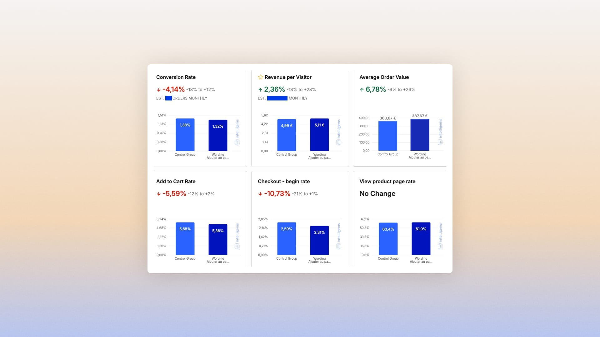
The exercise shows that you can never find “THE” phrase that will trigger something in the user, as if a button alone could carry the decision.
A button is the end point of a thought process
It's the visible form of an inner path that has already happened: understanding where you are, understanding what you're looking at, understanding what it means.
The CTA is not the message.
It's the final note, the result of the context the page managed (or failed) to set up.
So an effective CTA is never about isolated wording. It's about overall clarity. For someone to click, they need to know exactly what they're doing.
This clarity isn't magic. It rests on a series of small moments of understanding that come before the action.
- Am I in the right place?
- Do I understand the product?
- Does the promise speak to me?
- Do I know what happens after I click?
- Am I making an informed choice?
The button has no power as long as these questions are unanswered.
We tend to forget this mechanism.
We focus on what's visible [the colored rectangle, the text, the size of the button] and lose sight of the fact that a click depends on a cognitive climate, not an isolated stimulus.
If users doubt, they won't click.
If they don't understand, they won't click.
If they feel pushed too fast, they'll back off.
If the CTA shows up before the intent is ripe, it feels abrupt, almost intrusive, even with the best intentions.
In practice, the mistakes are often subtle.
We see buttons placed too early, before the page has had time to explain the essentials.
We see identical CTAs for different actions, which creates instant confusion: “Continue,” “Next,” “Order,” “Proceed,” “Confirm.” So many verbs that seem interchangeable but aren't at all.
We also see important actions buried in the page, literally invisible because the visual hierarchy doesn't support them.
Pages that stack up CTAs at the same level, as if an overload of options would reassure… when it only scatters attention.
The most common problem, though, is the absence of a message
That layer of explanation that lets users understand what they're about to do.
Without it, the button is a leap into the void. You don't know what comes next.
Everything gets blurry: the price, the delivery time, the commitment, the next step.
When in doubt, users stop. Not because the CTA is poorly written, but because the context hasn't prepared the ground.
A CTA is never the first thing you optimize, but the last.
Because it depends on the story. On consistency. On the logical sequence that leads to the action. A button only has power if it closes something that has been understood. It's a matter of timing and rhythm. Of information hierarchy.
So what makes a CTA strong is not urgency, creativity, color, or even syntax.

It's the clarity of the context, the transparency of the promise, the resolution of any lingering doubts, the consistency of the brand tone, and its visibility and availability in the right place.
When these elements are aligned, clicking takes no effort.
It's no longer a complex decision; it's no longer a risk. It becomes obvious.
The button then hardly matters in itself: it simply embodies the logical next step in the journey.
Users don't need to be convinced.
We've guided them to this point.
A CTA isn't there to force anyone's hand.
It's there to confirm an intent that's already in place.
The CTA often gets the attention because it's measurable, testable, and easy to tweak.
You can change a verb in 30 seconds, launch an A/B test in a minute, and draw conclusions too fast. But that's not where performance is decided: a button never improves a journey people don't understand, it doesn't make up for missing context, and it doesn't fix a vague promise.
Real optimization means working on what isn't measured: understanding, clarity, a consistent story, a smooth mental progression.
When these elements align, the button hardly matters. It just confirms a path that has already done its job.
It's simply the interface of a decision that has already been made.