
For a long time, I wondered why my online bank made me wait a few seconds after I entered my PIN.
That progress bar crawling along, that short delay before I reach my account summary. Technically, verifying a PIN takes a few milliseconds.
The loading screen doesn't really exist: it was designed to exist.
But it says something.
It says the app takes the security of my data seriously, that my access has been verified, that entering a banking space deserves a moment of processing.
It's entirely manufactured, yet it carries meaning, and that meaning builds something real: a form of trust in the system.
UX designers have a name for this mechanism: performative latency.
It's latency added on purpose to signal effort, attention, verification. It's friction by choice, a decision. It works because it taps into something deeply human: we trust what seems to take time, what shows its work.
In e-commerce, though, the dominant reflex goes the other way: remove all unnecessary friction, shorten checkouts, eliminate superfluous steps…
Today, CRO teaches us that an experience can benefit from slowing down in places.
Create inertia, add texture to the navigation. To give meaning, secure a decision, or help users understand what they're doing.
Some friction serves the user before it serves the conversion rate. Let's put words to three useful forms of friction and look at what they teach us about how buying decisions are built.

Protective friction: making sure users know what they're ordering
Some buying decisions commit shoppers more than others
A custom product, an order with an unusually long production time, an item with a restrictive return policy… in these cases, a user who moves through checkout too fast risks discovering an important detail after paying.
That moment of late discovery is often what leads to a cancellation, a return, or a customer service complaint.
What CRO teams see in these situations is that the problem rarely comes from the product itself. Customers aren't disappointed by what they received. They're disappointed that it isn't what they thought they ordered. That nuance changes the whole question: the product page didn't fail, the confirmation moment was missing.
Protective friction steps in before that tipping point. It takes the form of a visual summary at the end of checkout, or a piece of information made impossible to miss right before payment. Its cost is a few seconds of attention. Its benefit is an order that holds up over time.
There's a psychological phenomenon behind this mechanism, well documented by Daniel Kahneman and Amos Tversky in their work on prospect theory: we feel losses more intensely than equivalent gains.
A customer who learns after purchase that their package will arrive in six weeks doesn't weigh that information neutrally. They feel it as a loss, even if the information was available somewhere on the product page. Protective friction anticipates this asymmetry. It makes sure critical information doesn't have to be hunted down to be found.
When friction creates value
This type of friction is fully justified in three specific contexts:
- Products with strong visual customization
- Orders with non-standard logistics constraints,
- Any purchase involving a return policy stricter than the market norm.
In all three situations, the extra step protects both sides.
Ace & Tate homepage
Ace&Tate is a brand that sells eyewear online, with frames customizable by color, lenses and coating options.
After analyzing their customer return data, which regularly mentioned surprise at the color received or the production time, they added a visual summary step at the end of checkout: chosen frame, exact color, selected lens type, estimated production time.
This step measurably reduced post-purchase change requests.
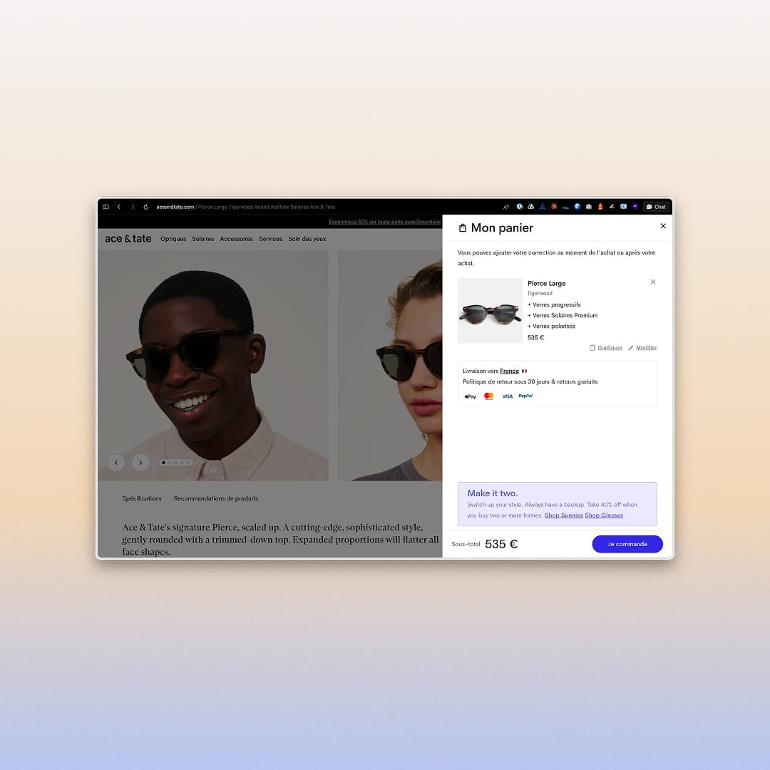
What changed wasn't the speed of checkout, but the quality of the decision that comes out of it.
A customer who knows exactly what they're ordering doesn't come back the next day to cancel. And a customer service team that absorbs fewer complaints over avoidable misunderstandings can focus on situations where its help really matters.
Engagement friction: building value along the way
The IKEA effect
Engagement friction rests on a well-documented mechanism in behavioral psychology. Dan Ariely and Michael Norton formalized it as the "IKEA effect":
"We value more what we've contributed to, even if the contribution is minimal."
Assembling a piece of furniture yourself is enough to raise the perceived value of the result, regardless of the product's objective quality. Simply having taken part creates attachment.
Applied to e-commerce, this mechanism shows up as journeys that ask something of the user before offering a product.
A short quiz about their habits or needs, a configurator that asks them to make successive choices, a profile selector that guides the recommendation.
These mechanisms add steps. They can also turn a passive visit into a personal, engaged decision.
Making the user active
What happens during this kind of journey is fairly precise: the user shifts from a consumer comparing products to a contributor building their own solution.
This shift in posture is subtle, but it has concrete effects on conversion and retention. A user who answered questions about their profile before being recommended a skincare routine is no longer buying "one product among others." They're buying the answer to their own answers.
Engagement friction is especially effective when the product comes in several variants tied to a profile or a use. Once a dimension of personalization exists, making it visible and interactive turns the buying experience into something hard to substitute.
Typology homepage
The French skincare brand Typology, available on Shopify, built the entry to its buying journey around a dermatological diagnosis.
About fifteen questions cover sensations, skin observations, lifestyle habits and the participant's environment, not just the traditional trio of dry, oily or combination skin.
Typology identifies 24 distinct skin types, cross-referencing sebum production, the progress of skin aging and exposure to oxidation factors.
The result is a personalized prescription: an AM and PM routine, with products selected based on the resulting profile.
Diagnostic result
Creating value through friction
What's remarkable about this setup is what it does to the status of the recommended product.
A visitor who lands directly on a serum page and reads the ingredient list is in an evaluation mindset. A visitor who completed the diagnostic and receives that same serum as a prescription for their specific skin type is in a receiving mindset.
The brand recommends retaking the diagnostic every six months, since skin changes with the seasons, environment and hormonal cycles. That turns what could have been a simple acquisition tool into a structural retention tool.
The data collected during the diagnostic also feeds personalized post-purchase communications, replenishment recommendations and CRM segmentation.
Engagement friction creates value at the entry point and produces useful data throughout the customer relationship.
Narrative friction: taking the time to justify the price
Narrative friction is probably the most counterintuitive of the three.
It doesn't protect against a mistake, and it doesn't create active engagement, but it provides context.
It takes the time to explain how a product was designed, what really sets it apart, why it's worth what it costs. In an environment where product pages look alike and quality claims circulate freely, this is the mechanism that lets a page turn a promise into proof.
There's a precise economic logic behind this observation.
Taking the time to build loyalty
A customer who bought because of an effective presentation or a promotional price can just as quickly look elsewhere next time. Narrative friction invests in the quality of the decision rather than its speed. It's a conscious trade-off, measured less by immediate conversion rate than by twelve-month customer value.
For brands whose differentiation rests on their method, convictions or expertise, the product page isn't just a sales tool, it's a space for sharing knowledge. Giving that up in the name of simplification means removing exactly what makes the purchase make sense.
This friction speaks to visitors who need to understand before they buy. And those visitors are often the same ones who, once convinced, become loyal customers and natural advocates.
A Patagonia product page doesn't look like a standard listing.
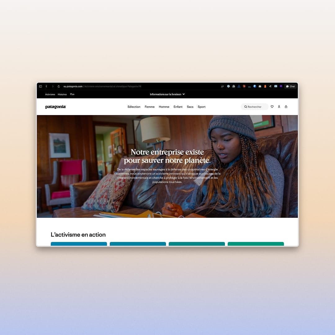
It documents the materials used, their geographic origin, their environmental certifications, sometimes the estimated carbon impact of manufacturing. Some pages include technical explanations of seam construction, waterproof membranes and water-repellent treatments.
It's long… deliberately.
Showing the work that justifies the price serves a precise goal. The page filters as much as it converts. People who read to the end are exactly the ones for whom this product makes sense, those willing to pay the listed price because they understand what it covers.
This selection directly supports a strong long-term customer relationship, as well as the low return rate of a brand whose products are often among the most expensive in their category.
Example of a product page
The lesson applies well beyond premium outdoor gear.
Any brand with something to explain, such as local manufacturing, a formulation developed over several years, or sourcing that takes real effort, is better off showing it than boiling it down to a tagline.
The hurried reader will scroll. The invested reader will read.
That second reader is often the one who builds a store's profitability over time.
What metrics don't always show
These three forms of friction share one trait: they exist to serve the user, not the funnel.
They slow things down for a specific reason, a clearly defined goal.
The difficulty is that this distinction is rarely visible in a standard dashboard.
An A/B test can show that an extra step lowers the checkout rate and conclude it should be removed. What the test doesn't measure is the quality of the orders that remain: their cancellation rate, their return rate, their twelve-month value, their likelihood of leading to a second purchase.
Well-calibrated friction can hurt a short-term metric while improving the store's real economics.
The useful question isn't "can we remove this step?" but "what does this step do for the user?" Friction that helps people decide better is almost always worth more than a decision made faster.
Trust is rarely built through speed. It's built in the details that signal care, attention and rigor.