

A product page has a much more complex role than most people imagine.
It's not just a promotional space, a spec sheet, or a sales pitch. It's where someone arrives with a real hesitation, sometimes tiny, sometimes very solid, and where the brand has to help turn that hesitation into certainty.
Most product pages fail not because they lack information, but because they tell shoppers nothing useful.
They say too much, or too little, or say it badly, or in the wrong order. You end up with pages that are highly detailed but can't guide a decision, or pages that are heavy on "branding" but short on concrete answers.
Users don't need to be impressed. They need to know how to make a decision.
What someone looks for on a product page is fairly simple:
- Understand why this product exists
- Picture themselves using it
- Check that they're not making a mistake
- Feel they can trust the brand
That's it.

If the page clearly answers these four needs, everything else becomes secondary.
A good product page doesn't try to convince. It aims to create a place where every element has a reason to be there and understanding builds naturally.
What matters isn't the amount of information but how it's organized: a logical thread that moves from the big picture to concrete detail, then from proof to reassurance.
Designing a product page must start by clarifying the message you want to carry.
I don't mean pushing a slogan or a flight of brand rhetoric. I mean simple framing: "here's who this product is for, here's the need it addresses, here's the logic behind it."
Strategy talks a lot about the "target," but writing rarely talks about the "recipient."
Yet that nuance changes everything.
A product page that won't say clearly who it's for doesn't become more universal. It becomes blurrier. It forces users to guess whether it applies to them, silently asking, "Is this product for me?"
Having to guess wears users out much faster than you'd think.
At this stage, clarity isn't there to convince but to orient. It sets a boundary around the product, a space where users can start thinking. Once that frame is in place, you can move on to the heart of the page: context.
Describing a product is never enough.
Everyone does it.
What users really want is to understand what this product changes in their daily life. A material, a format, an option, a technology has no value in itself. It takes on meaning when you understand what it makes possible.
This is where a product page can truly help: by showing the real consequences of the product, how it behaves "in real life," and by offering credible points of projection.
Very quickly, that projection calls for something else: proof.
Here again, what reassures is never overselling, but concrete detail.
The facts:
the materials
the process
the manufacturing
the warranties
the hands-on expertise.
All those small details that build a foundation of credibility.
Many product pages talk about "quality," "craftsmanship," and "premium" without ever explaining what those words mean. The result: nothing sticks, nothing registers, nothing is remembered.

By contrast, a few well-placed proof points can be enough to build deep trust.
Users no longer think, "They say it's good,"
but "I understand why it is."
That's very different, and it's where a huge part of the decision is made. But even with proof, hesitation sometimes lingers, often quietly. That's when trust signals come into play.
These answer the questions people don't dare ask:
- What happens if I make a mistake?
- What if it doesn't suit me?
- How long does delivery take?
- How do I send it back?
- Have others had a good experience?
A well-designed product page never leaves these questions at the end as side logistics. It weaves them into the narrative as anchor points. People move forward when they know they're safe.
Then there are the small "soft frictions," the ones we sometimes forget to challenge even though they're fundamental:
- Understanding a size
- Choosing an option
- Checking compatibility
- Planning for care
- Comparing two models
The essentials, basically.
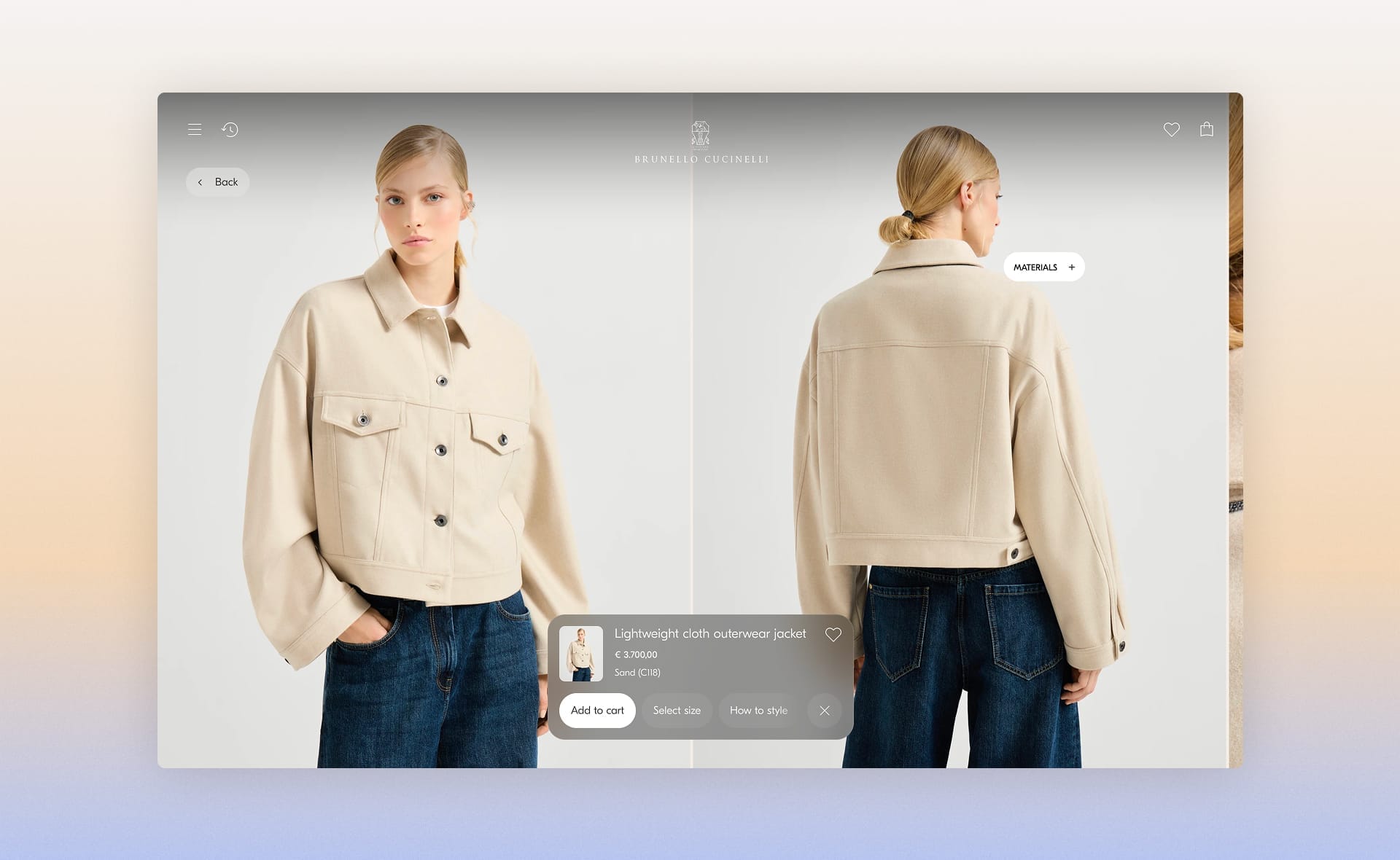
These points of clarity keep users from feeling alone in front of fuzzy choices.
A product page can lose more users over a poorly worded size guide than over a high price. It's a matter of supporting the user. Through all of this, tone is the tool that ties the pieces together:
If the page is too cold, it feels like the brand is talking to a database. If it's too enthusiastic, it triggers distrust and pushback.
Too technical, and you lose half your readers. Too chatty, and everyone tunes out.
Tone is NEVER decorative: it's how the brand chooses to hold the user's hand while they think it through.
Say a lot with a little, say the right thing at the right time, don't overplay it, don't leave needless gray areas. It's a delicate balance, but it's what turns a series of blocks into a logical, pleasant, easy-to-read progression.

Download the complete framework: 9 blocks to structure and audit your product pages
Writing a product page means respecting hesitation.
Look it in the eye, support it, and treat it as a normal part of any decision. An effective PDP doesn't try to rush that moment. It doesn't try to turn doubt into a click.
It aims to make understanding clear enough, and stable enough, that the click becomes a natural consequence.
The goal isn't for the brand to win, but for the user to.
I like to think of a product page as a kind of meeting between the user and the brand. Like all meetings, it can be awkward or brilliant.
It all depends on how the brand speaks, clarifies, reassures, and leaves users enough room to build a relationship.
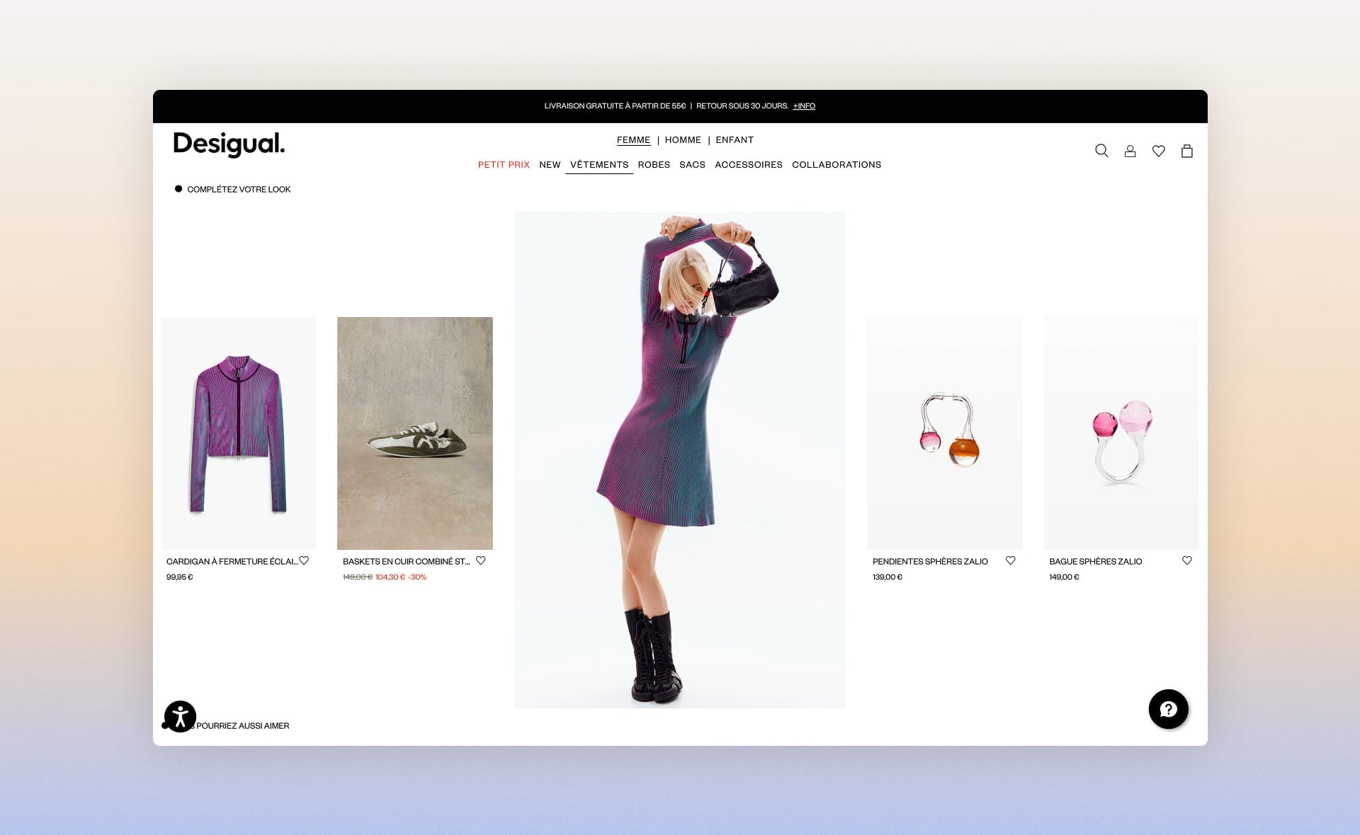
Write for humans, structure for machines
All this work on clarity, completeness, and precision now takes on an even more strategic dimension.
Your next product page won't be read only by hesitant humans.
It will also be analyzed, dissected, and compared by AI agents that will decide (in a few milliseconds) whether your product deserves to be recommended to their users.
In his article on agentic e-commerce, Jérémie Werner explains how LLMs are becoming the new gatekeepers: they scan your structured data, interpret your descriptions, evaluate your return policies, and build their recommendations from what they find. Or don't find.
 Jérémie Werner

What fundamentally changes is that microcopy is no longer just a reassurance tool for humans, it becomes the language machines speak.
When you write:
"Lightweight moisturizing gel for combination skin, formulated with hyaluronic acid and niacinamide, absorbs in under 30 seconds, ideal as a makeup base"
you're doing two things at once:
- You help someone picture using the product
- You give an AI agent every attribute it needs to answer a query like "lightweight moisturizer that doesn't leave a greasy film and works with makeup"
By contrast, a phrase like "Discover our signature hydration experience" speaks to neither the human (too vague) nor the machine (no usable attributes).
Explicit use cases, anticipated questions in your FAQs, composition details, spelled-out conditions of use, detailed size guides.
Everything you thought was "just" good content for your visitors is now the raw material for algorithmic recommendations.
A product page well written according to the principles in this article is likely to be well structured for AI agents.
What a human looks for (understand, picture themselves using it, verify, trust) and what an AI agent analyzes (attributes, use cases, proof, policies) rest on the same foundation: clear, useful completeness.
Download the complete framework: 9 blocks to structure and audit your product pages