Rub the fabric between your fingers. Unfold the dress, hold it against your body, tilt your head in front of the mirror. The drape is beautiful, the gesture familiar. You could call it tactile, emotional, almost instinctive… in Paris, at least.
In Seoul, a woman walks into a store from the same brand. In a second, she photographs the dress and sends the image to her KakaoTalk group. Three friends reply in under a minute. Two hearts 💛, one "너무 비싸" (too expensive). She puts the dress back.
A population's culture shows up in a myriad of details, and you have to learn to notice those details and be careful about how you read them.
I once came across a French brand that illustrates this problem perfectly. Its French site was thriving, with a conversion rate close to 4%.
It opens in Germany: same site, same photos, same products and, above all, a translation that isn't a patch job but was written and proofread by a serious agency.
Six months later, conversion on the .de site tops out at 0.9%.
This isn't a product problem, it's a mirror problem: the site reflects the French brand's certainties, not the German customer's expectations.
And a visitor who doesn't recognize themselves in what they see doesn't complain, doesn't contact customer service, doesn't leave a negative review. They simply disappear, in silence.
Google Analytics logs a bounce, the marketing team doesn't understand why, and in the end everyone blames seasonality.

What follows is a complete e-commerce localization guide for French brands that sell internationally.
It covers thirteen markets, every stage of the funnel, from the homepage to post-purchase, and the concrete decisions to make on Shopify to turn a translated site into a site that converts (to give answers to every marketing team 💐)
The thesis is simple: going international isn't about translating. It's about unlearning what works at home.

Every market has its giants
A dizzying world tour
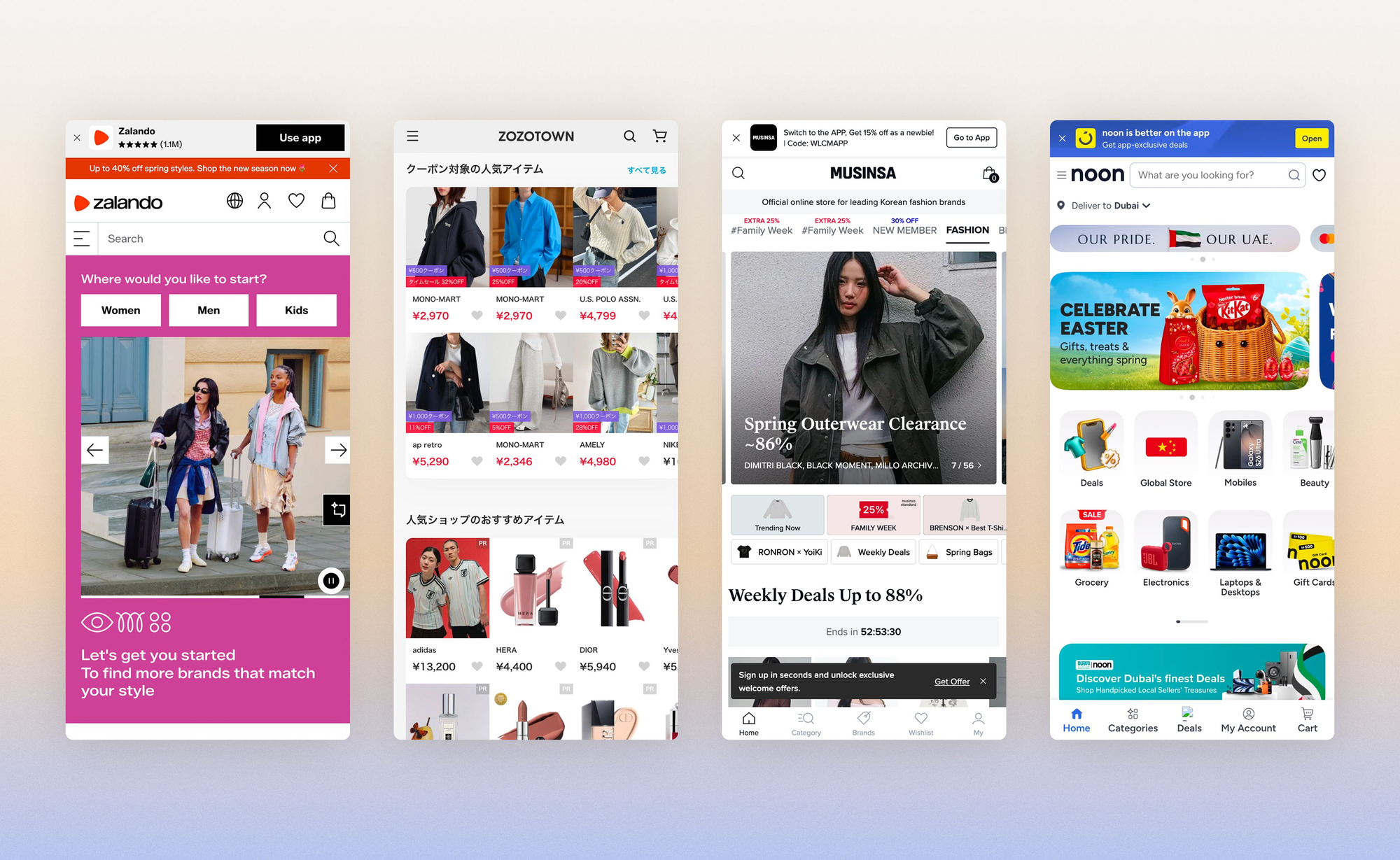
- In Germany, Zalando gets 28 million monthly visits.
- In Japan, ZOZOTOWN is the must-know player: with 40 million monthly visits and more than 11,000 brands listed, the platform is the undisputed champion of local fashion e-commerce.
- In South Korea, Musinsa rules Gen Z fashion, while Naver Shopping and Coupang split the rest of the pie.
- In the Middle East, Noon captures more than 30% of e-commerce in the Emirates, and Namshi offers a catalog of more than 1,200 fashion brands.
Marketplace or your own site: which entry strategy should you choose?
Across Europe, marketplaces capture roughly 70% of cross-border revenue (mainly for risk-management reasons).
Before localizing your site for a new market, the strategic question to ask is: do you need your own site, or should you first test the market on its dominant marketplace?
French brands that succeed internationally have different answers.
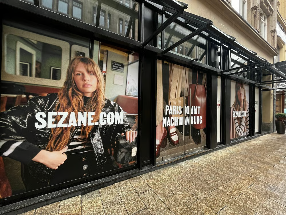
Sézane chose pure DTC: a first pop-up in Hamburg in October 2023, then Berlin in October 2024, each time recreating the Paris "L'Appartement" experience, Saturday line included.
By contrast, to break into South Korea, the SMCP group (Sandro, Maje, Claudie Pierlot) signed a distribution partnership with Samsung.
In Japan, 95% of e-commerce purchases are domestic. A foreign brand with no presence on a local marketplace starts with a considerable trust handicap.
Different strategies, different continents, one thing in common: none of these brands simply translated their .fr site and hoped it would be enough.
How to analyze a new e-commerce market: two lenses
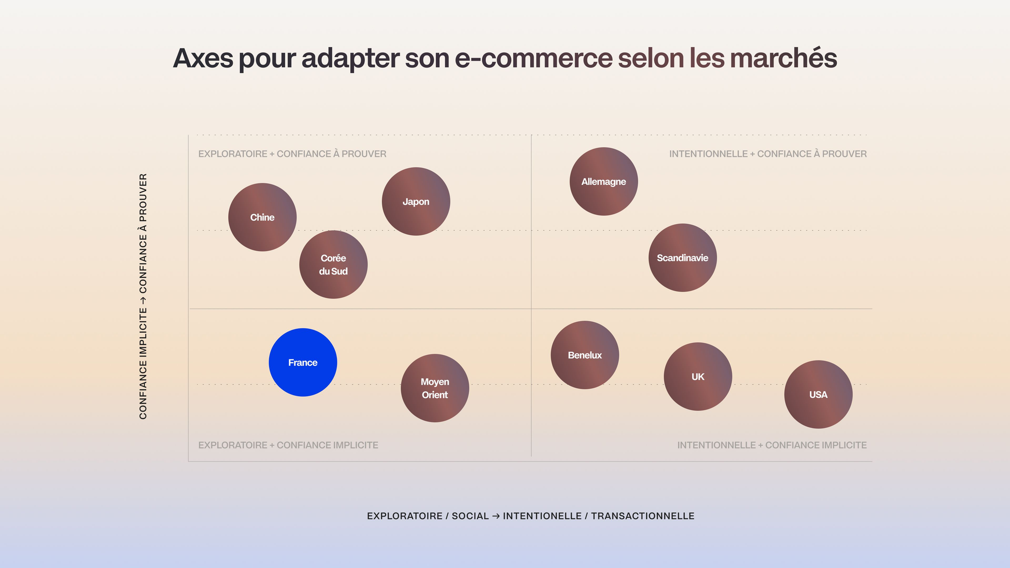
To navigate this article and, above all, to apply it to markets I don't cover here, keep two axes in mind:
Axis 1: Exploratory vs. intentional navigation
Does the visitor arrive to discover or to find? The answer determines your UX, the density of your pages and the role of your visuals.
Axis 2: Implicit trust vs. trust to be earned
Does the visitor trust you by default, or do they expect proof first? Understanding their expectations means knowing how to set your reassurance hierarchy and the UX that follows from it.
Other markets deserve specific attention. Italy and Spain, culturally close to France, still have different price expectations
Spain is the home market of Zara and Mango, and shoppers there have value-for-money reflexes that your premium positioning will have to address head-on. Australia shares a language with the UK but not its seasonality (summer in December) or its delivery times.
Southeast Asia, with Singapore as a luxury hub and Indonesia as the world's biggest market for modest fashion, is a continent in itself.
For all these markets, the two axes remain your best decoding tool before you invest.
E-commerce homepage and navigation: adapting UX by country
Browsing behavior by market
The Contentsquare study of 35 million sessions across 7 countries shows that interface elements such as the menu, the search bar and the carousel aren't used the same way from one market to another:
- In France, the menu is king. Combined interaction rate: 53%, the highest. French visitors enter through categories, methodically.
- In Germany, the logic is the same but visitors don't scroll. If the essentials aren't above the fold, they leave. Menu: +11% vs. the global average.
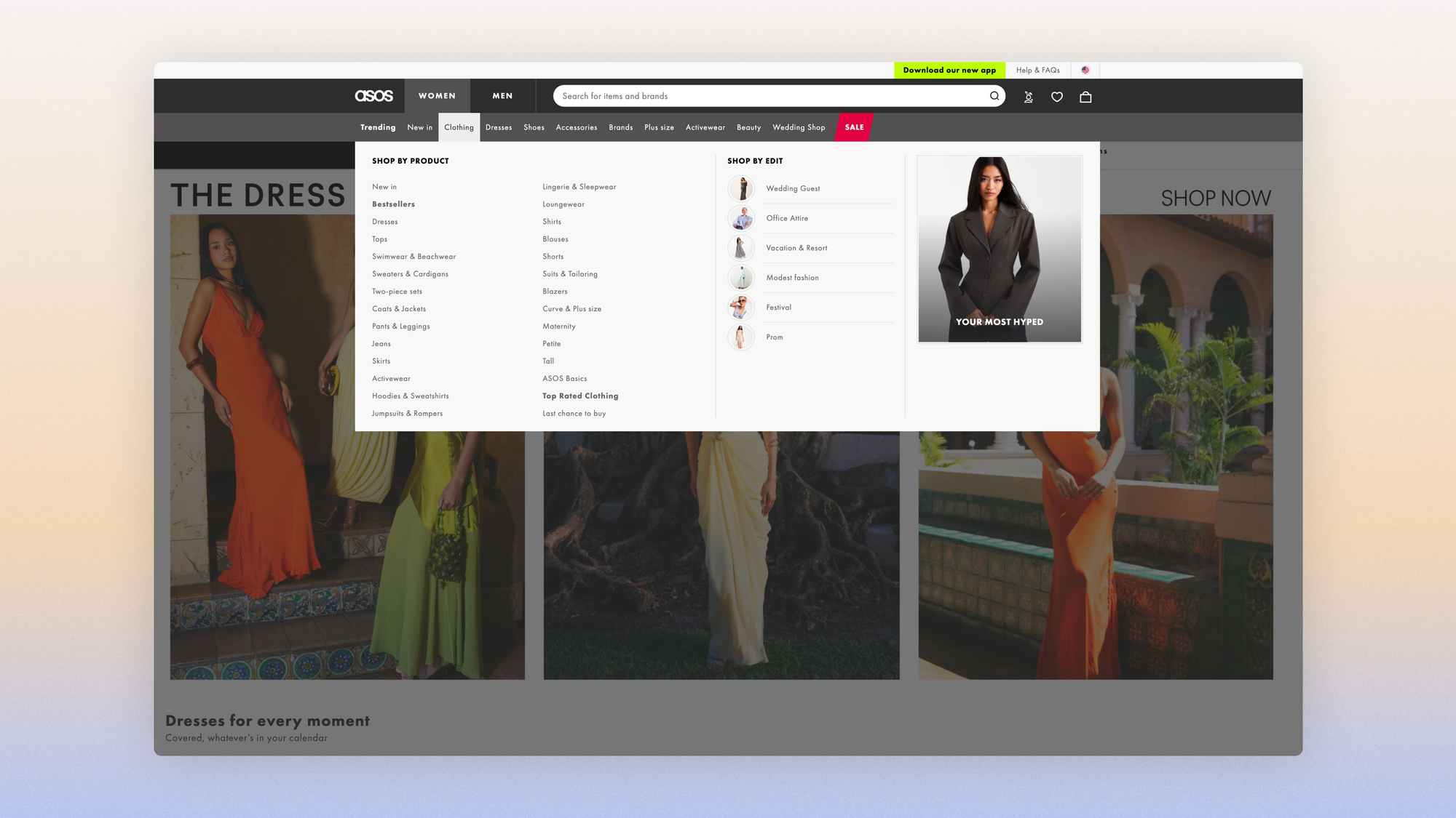
- In the UK, the search bar dominates: +45% usage. Visitors know what they want. ASOS made its search bar the site's best salesperson.
- In the United States, the carousel is ignored (−40%). Visitors arrive from an ad and want to get straight to the point.
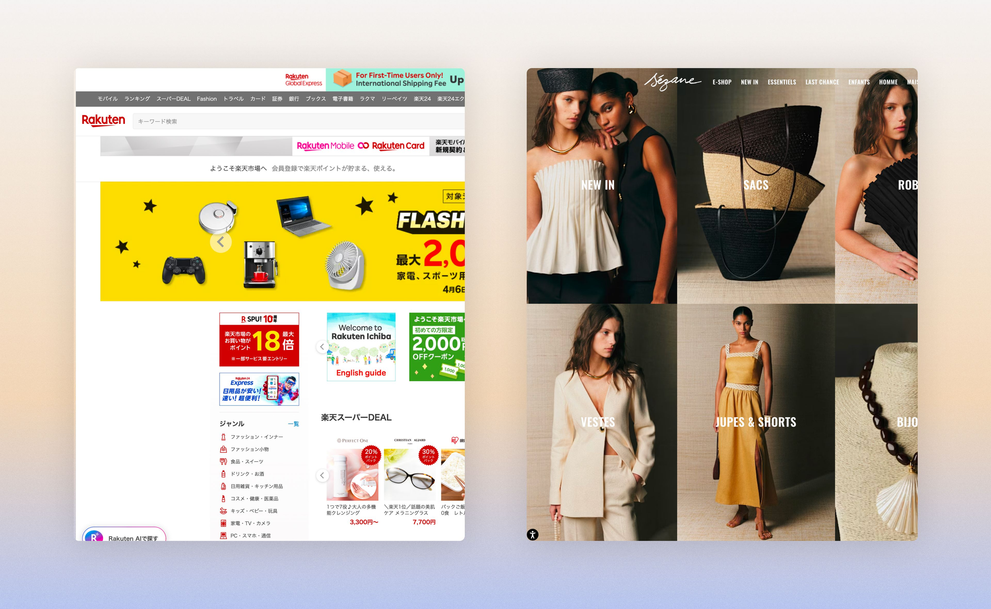
In Japan, information density is a cultural code. Open Rakuten: the homepages are packed with text, banners and simultaneous promotions.
What looks like clutter to a French eye is a sign of abundance and seriousness to a Japanese visitor. Minimalist interfaces like Sézane's, so elegant in France, can look empty and untrustworthy in Japan.
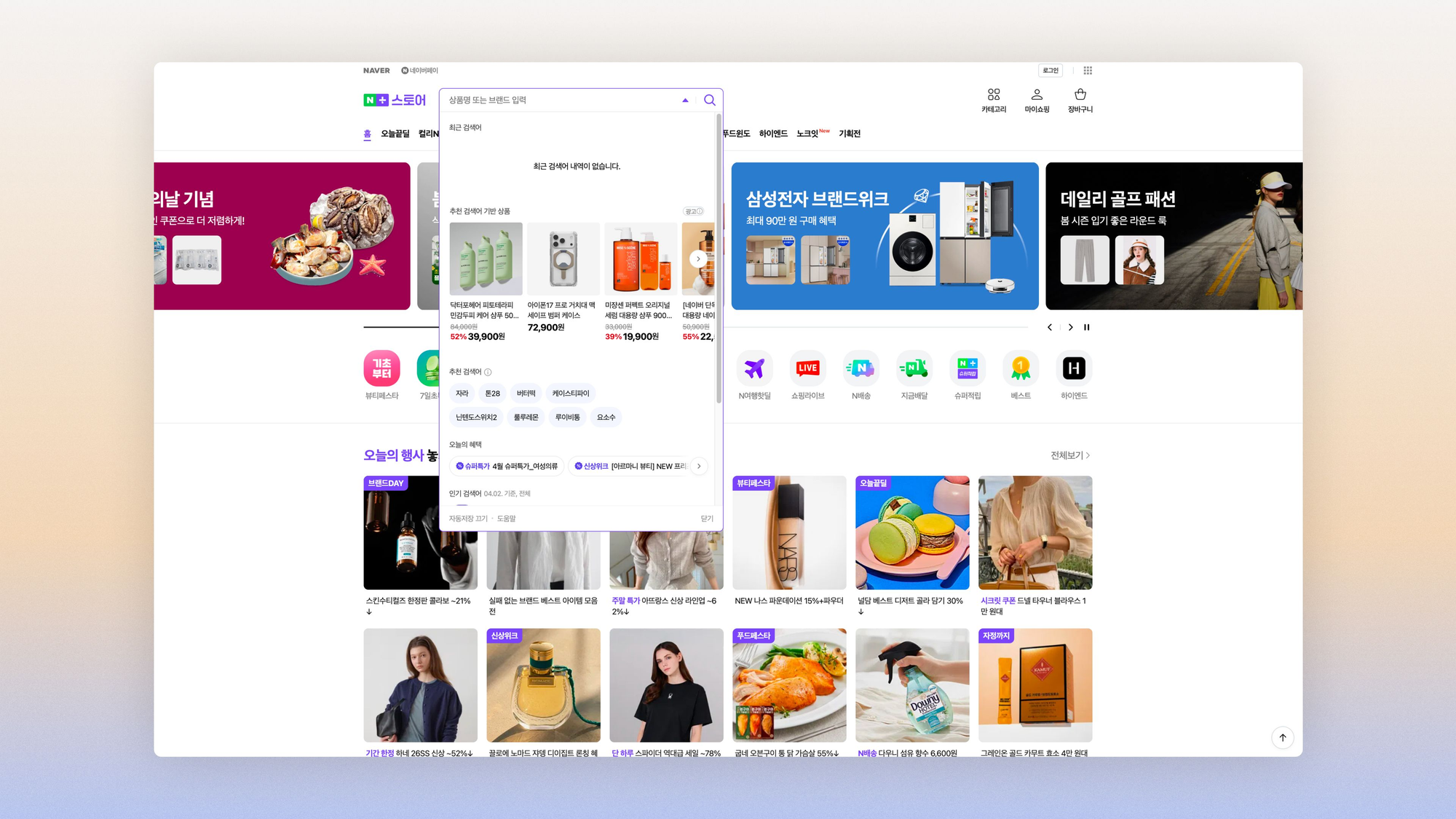
In South Korea, the homepage is almost secondary. Naver Shopping works like a built-in search engine: visitors don't "browse" a homepage, they search through Naver and land on a product listing.
Discovery happens on social media and through live commerce: 60% of Koreans have already bought through a live format.
In the Middle East, more than 70% of e-commerce transactions go through the mobile homepage. The mobile homepage is the only one that matters, and its content has to alternate between aspirational (lifestyle campaigns) and functional (quick access to categories).
Noon and Namshi build their homepages around a simple alternation:
- promo carousel
- popular categories
- "trending now"
A format that speaks to a population where 55% are under 30.
Editorial menu vs. taxonomic menu: which format for which country?
How you categorize your navigation items varies by market:
- your labels "The collection of the moment" and "Our essentials" work in France
- German visitors search for "Kleider → Leinen → Größe 38".
- Japanese visitors expect an exhaustive tree with every possible subcategory clearly listed
You need to account for these subtleties in your internationalization strategy: translating "Our essentials" as "Unsere Essentials" is technically correct and culturally useless.
It's like serving a croissant to a customer who ordered a pretzel.
Recommendation by market:
- product taxonomy for Germany and Japan
- a high-performing search bar for the UK
- mobile-first navigation with quick filters for the Middle East
- keep the editorial approach for France (and Scandinavia), which appreciates sustainable storytelling
Category page (PLP): filters and sorting by market
Product filters: what each culture expects
Product listing pages are a key step in the conversion journey, since they guide people to the product they want and so, ultimately, meet the user's expectations.
To build a satisfying UX, behavioral data offers important cultural insights. For example:
- French shoppers explore and view ~5.4 pages per session, a world record
- Americans calculate and filter by price or rating
- Koreans take a social approach before a functional one: how looks are worn matters, and a product is shown in a complete outfit
For each market, I'm sharing an example of a site that faithfully reflects what local visitors expect.
PLP examples by market: UX best practices
France: the magazine grid
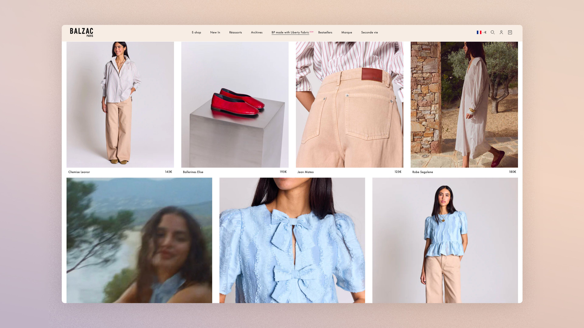
On Balzac Paris: large in-context photos, styled products, evocative item names, filters by "commitments" (GOTS, made in France) rather than by technical specs.
French visitors like discovering the brand world.
Germany: the filter as a precision tool
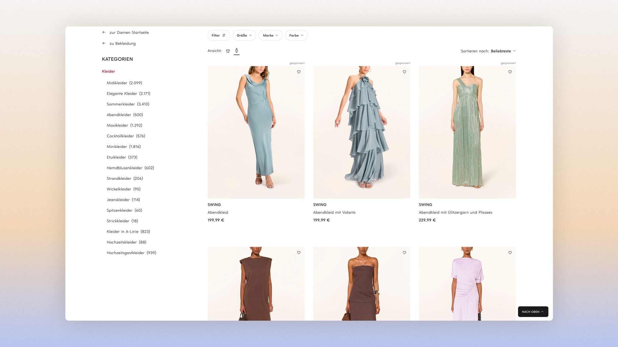
Breuninger is a good example of what the German market expects: the "Materials" filter is accessible without opening the Filter menu, and category entries are directly accessible in the sidebar, letting you narrow by product type in one click.
German visitors want to narrow things down by data, not by inspiration.
What Zalando doesn't do, Breuninger does: the "Material" filter is accessible without opening a "Mehr Filter" menu, and the "Anlass" (occasion) filter lets you search by context of use. A premium department store that understood that German visitors want to narrow things down by data, not by inspiration.
United Kingdom: entry by occasion
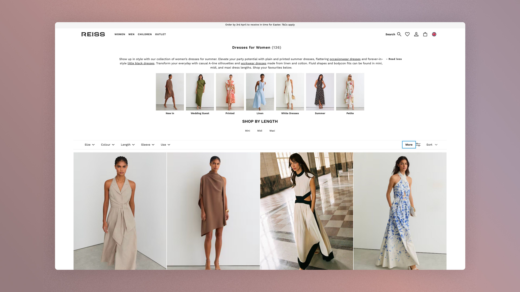
At Reiss, the "Use" filter sits at the top: Wedding guest, Workwear, Partywear, Holiday, Formal, Casual. The UK shopper isn't looking for a dress, she's looking for a dress for Saturday's wedding.
This occasion-based buying reflex partly explains why fashion return rates reach 30% in the UK: people order several options for a specific event, try them on at home and keep the winner.
Reiss's PLP doesn't suffer this behavior, it organizes it.
USA: the pitch thumbnail
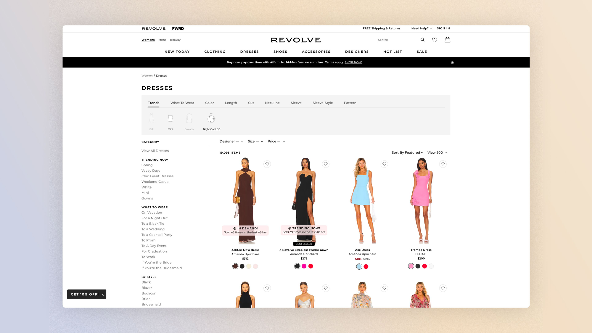
A "Bestseller" badge and a FOMO callout on every thumbnail, discount percentage in red, struck-through price visible.
At Revolve, social proof works through popularity: 93% of US consumers say reviews influence their purchase decisions.
American visitors want proof that others bought and approved before them.
Japan: someone like me
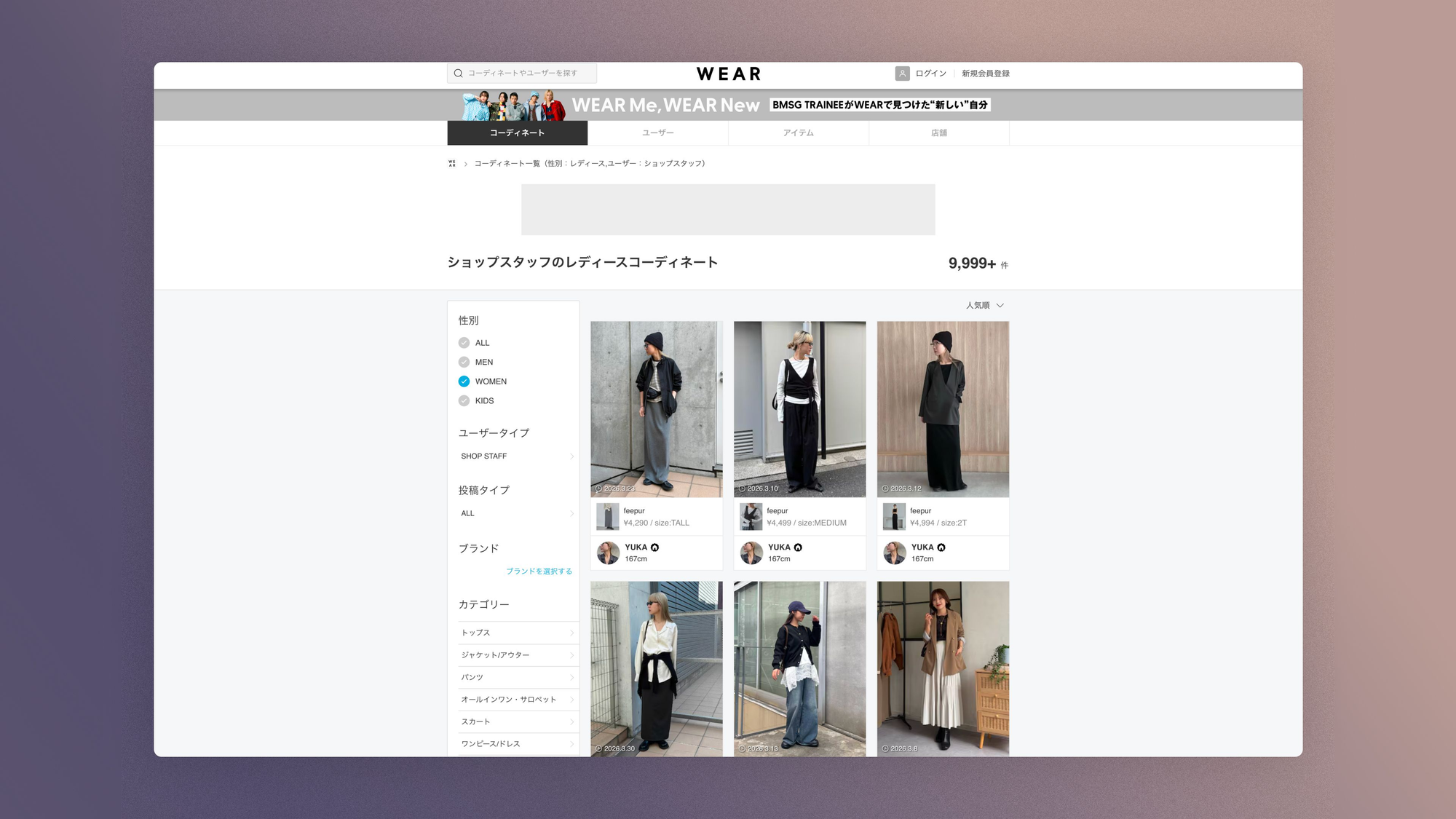
The "Staff Snap" is a format with no equivalent in Europe.
A salesperson who is 5'2" and 115 lbs posts a photo of themselves wearing the product with their measurements displayed. WEAR (19 million downloads) is built entirely on this.
Japanese visitors don't trust a model photo; they trust a real person whose body looks like their own.

E-commerce wishlist: conversion tool or social driver?
I think the wishlist reveals how a market thinks about time in the buying journey.
In Germany, it's an operational tool. On Zalando, the heart appears on every thumbnail, is accessible without signing up, and syncs across devices.
Zalando also uses its customers' wishlist data to generate AI outfit recommendations, which increases basket size by 40%.
In Korea, the wishlist becomes a social object. Musinsa offers personalized feeds and shareable Style Boards: users and influencers post complete looks with tagged, shoppable products.
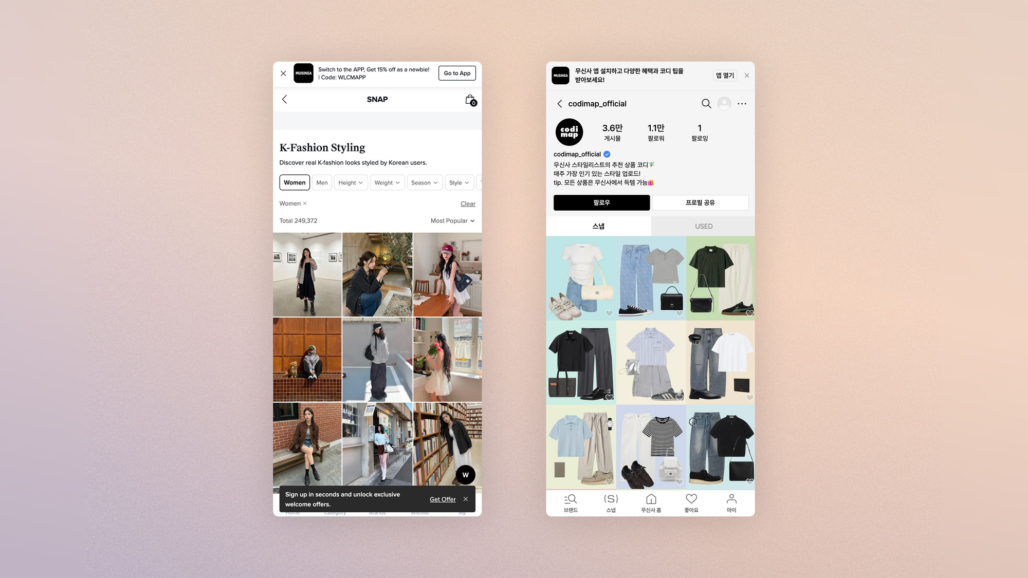
In the Middle East, the wishlist intersects with gifting culture. On Ounass, for example, wishlists are shared as gift guides around Ramadan and Eid.
Namshi sends push notifications when a saved item goes on sale, an essential feature in a market with strong promotional sensitivity. Same-day delivery removes the last barrier between intent and purchase.
Product page (PDP): optimizing the page for each market
The PDP is where everything is decided and where everything diverges
The same garment, presented the same way, can convert at 3.8% in France and 0.9% in Germany: not because the product is bad, but because the page doesn't speak the visitor's language.
A Baymard study confirms this at scale: 62% of leading e-commerce sites have a PDP rated mediocre in their home market.
In cross-border, the problem gets worse because the page has to carry product presentation, trust, brand and transaction all at once, on a single page, for a visitor whose reflexes you don't share.
Lessons from product pages in different markets
France: the image as the argument
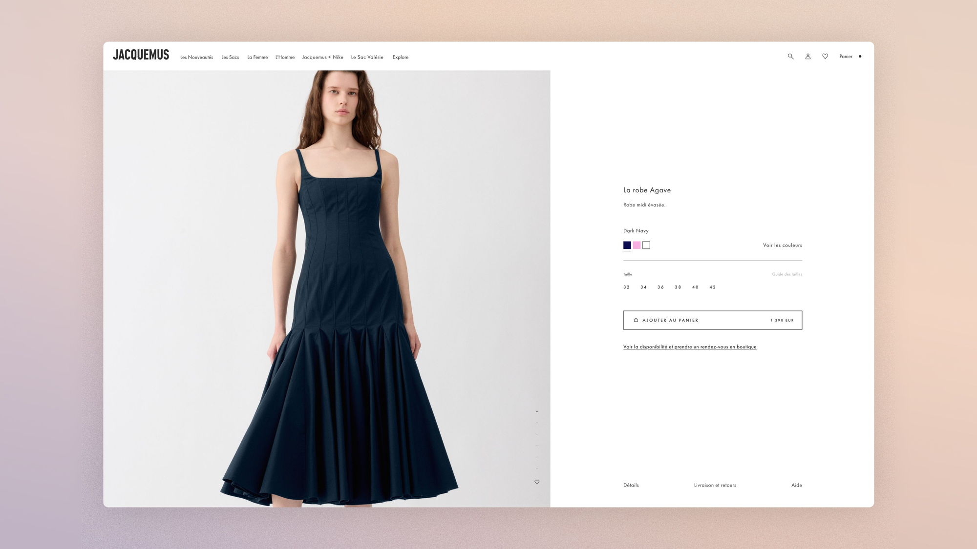
Huge photos, minimal text, zero justification. The Jacquemus PDP assumes visitors already know why they're there.
Desire is built in the image, not in the description. The extreme opposite of a spec sheet, and it works because high-end French visitors don't buy a product page, they buy a vision.
Sweden: the importance of the environment
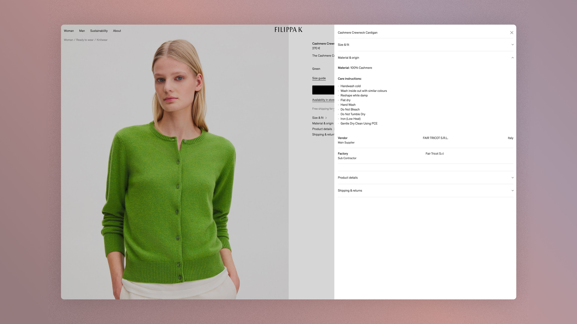
At Filippa K, the PDP includes traceability, sustainability data, and sometimes even a "Preowned" section where the same product is available secondhand next to the new one.
Scandinavian visitors don't think in terms of purchase, they think in terms of life cycle. Resale is part of the product page, not a separate program. Transparency and circularity aren't marketing arguments: they're now conditions of purchase.
USA: seeing yourself before you buy
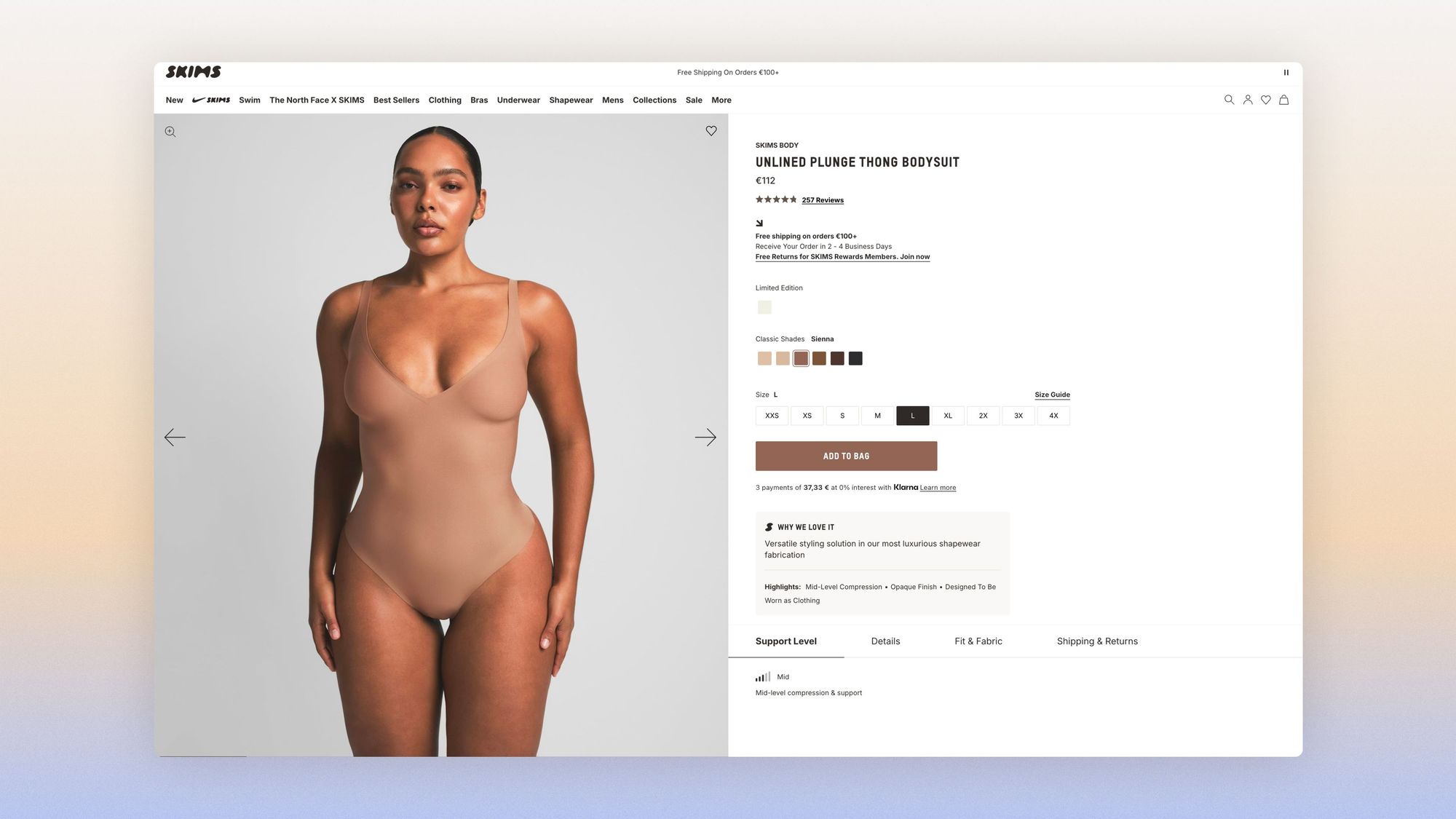
The PDP of Skims, Kim Kardashian's brand, lets you see the product on models of different body types and skin tones.
You toggle between body types right on the product page. Size inclusivity isn't a paragraph in a manifesto under an "About" tab; it's the UX of the product page.
In the United States, representation is a conversion argument, not a CSR commitment.
Singapore: clothing cut for the local body
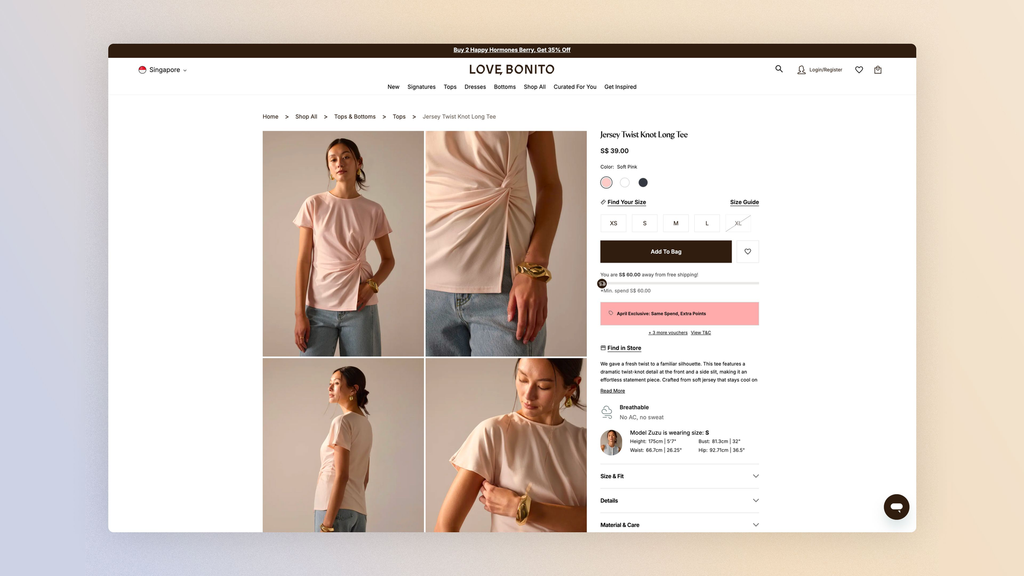
Every piece is fitted on models calibrated to Asian proportions, not on an industry "standard" model. The brand Love Bonito was born from the realization that Western sizes don't work for the Asian market.
For a French brand entering Singapore or Southeast Asia, the PDP can't just convert sizes to S/M/L. It has to recalibrate the promise of fit for a body different from the European body.
Dubai: the page that starts a conversation
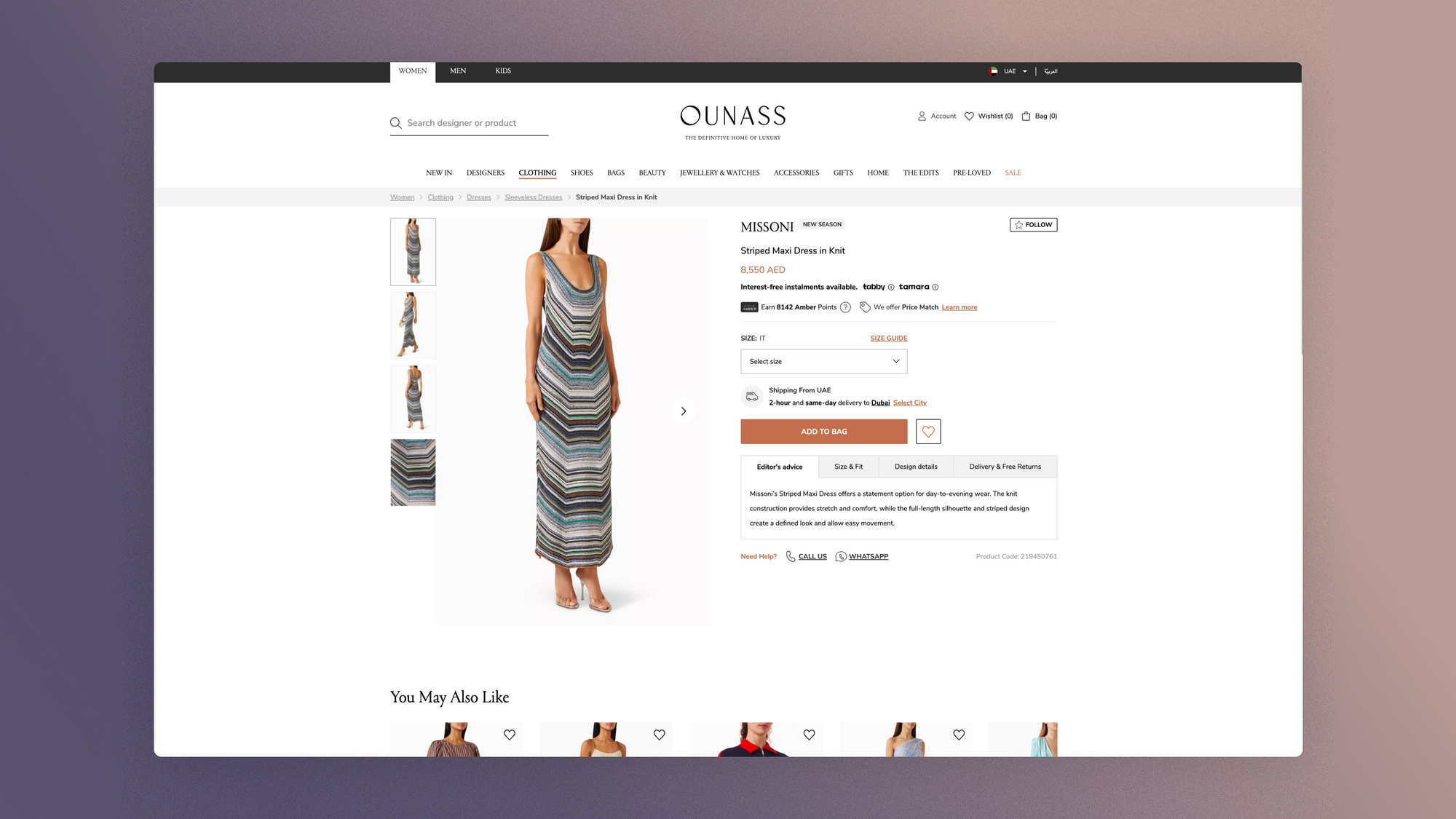
A WhatsApp button on every product page. The customer sends a request, and the personal shopper replies with a selection, in-store photos and in-stock alternatives.
At Ounass, the online product page is the entry point, not the decision point. In the Middle East, the premium buying journey is conversational: screenshot, WhatsApp, advice, purchase.
A French brand that puts an email form at the bottom of the page misses the local reflex. The best PDP is the one that triggers a conversation, not the one that replaces it.

The size selector: a global case study
An S/M/L dropdown and a size chart in a popup: that's what 90% of fashion brands offer as a "size guide" when they launch internationally.
The same component, translated into six languages, deployed in ten markets. And it's the component that generates the most invisible friction.
In the UK, size is a gamble people accept and bracketing is routine behavior: shoppers order two sizes of the same item, try them on at home and return the one that doesn't fit.
The selector doesn't have to be perfect, it has to be fast:
- Selection from the PLP grid without going to the PDP
- Multiple add-to-cart
- "Free returns" displayed everywhere
Like it or not, size is a problem you solve after delivery, not before ordering.
In the United States, size is political and size inclusivity is a condition of credibility.
Savage x Fenty offers sizes XS to 3XL in lingerie and shows every product on models of different body types, skin tones and ages, right on the PDP, not in a separate campaign.
Even stronger: the Club format requires creating an account, and the onboarding process smartly asks for the customer's measurements, so it can give the best advice.
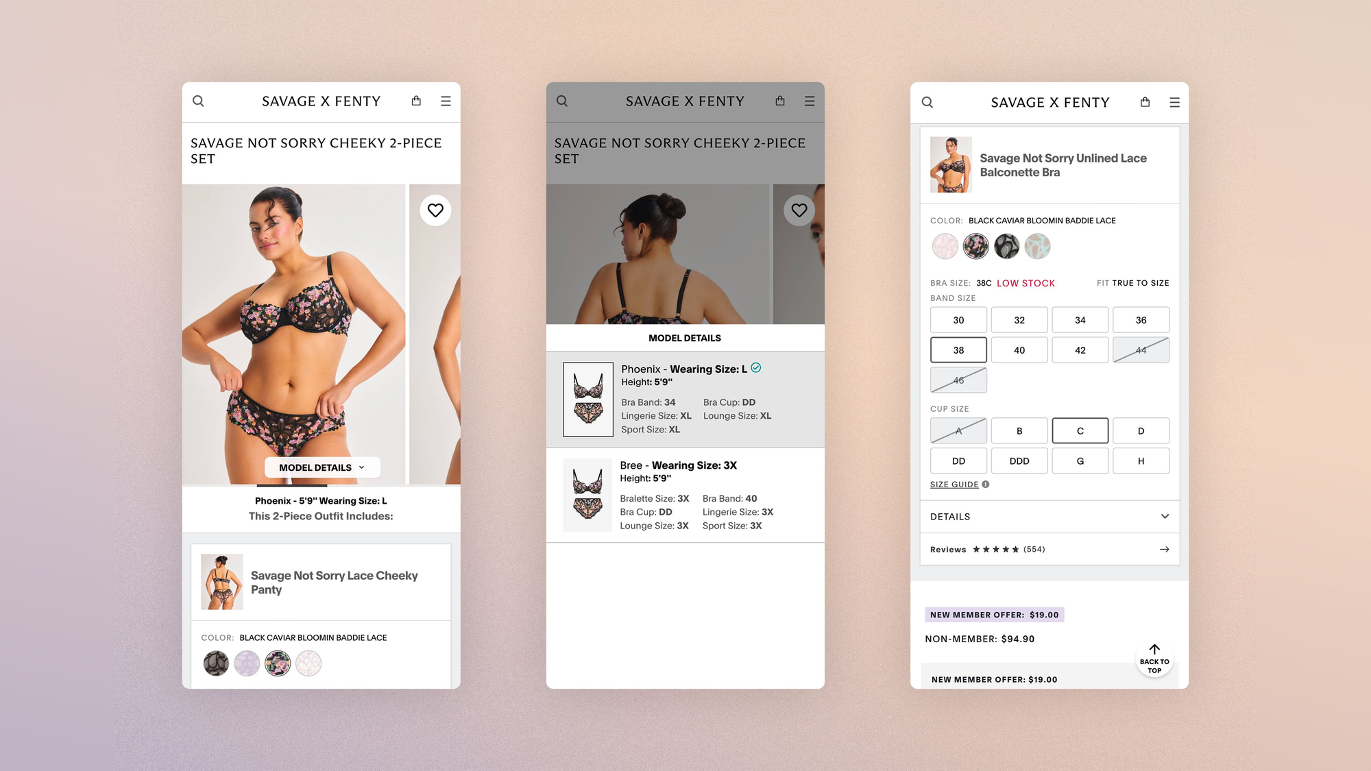
A selector that stops at XL excludes part of the market. But beyond the size range, it's representation that converts: American visitors need to see the garment on a body that looks like their own.
A size guide with a single model who is 5'10" and 121 lbs speaks to no one.
Ultimately, the question isn't so much "what's the best size selector?" but rather "what's your visitor's relationship with their own size?"
If you don't have the answer, your selector won't give it to you.
Optimizing your e-commerce checkout to sell internationally
A dedicated article on this topic is available here:
 Jérémie Werner


Trust is relative
The classic mistake in international rollouts is treating trust as a checklist of badges. Every market has its own signals, and every inconsistency sets off a silent alarm for the user.
Cultural specifics
France: the legal framework on display
- "30-day money-back guarantee"
- "100% secure payment"
- "Customer service in French"
These mentions seem mundane, but as we know, their absence on a site triggers immediate doubt. Avis Vérifiés is a local review platform that carries weight, whereas Trustpilot of course exists but isn't as powerful as in the UK.
"Made in France" is a trust signal as much as a product argument, and interest-free installments in 3 payments (Alma, Scalapay) shown on the PDP aren't just a financial service; they're also a reassurance signal that says "this site is professional and established."
United States: trust is built on proof that others have already bought
- Number of reviews
- Star rating
- UGC photos
- "Best Seller" badge
Everything converges on the same reflex: if others did it before me, it's safe. The BBB (Better Business Bureau) is a legitimacy signal for unknown brands. Of course, in daily life we don't rely on it to make every decision, but its absence can alarm a wary consumer.
The "100% Money-Back Guarantee" and "Hassle-Free Returns" wordings are expected.
Brazil: mind your reputation
Reclame Aqui is the Brazilian Trustpilot, but far more powerful. The platform records 1.4 billion page views and has more than 650,000 registered brands!
It's THE reflex for more than half a million consumers in their everyday purchases. A brand's reputation score, and above all its complaint resolution rate, is as important a decision factor as price.
Google Brazil has integrated Reclame Aqui reviews directly into Google Shopping, with more than 250,000 reviews covering around 1,500 retailers.
Italy: offer payment on delivery
Trust runs through "pagamento alla consegna" (payment on delivery).
As in the Middle East, Cash On Delivery remains a strong reflex, especially for a first purchase from an unknown brand. "Made in Italy" also carries enormous domestic trust (Italians trust their own textile industry more than any other).
Family word of mouth outweighs online reviews: a recommendation from the sorella or the mamma is worth more than 500 stars on Trustpilot, so keep that in mind in your CRM strategy!
Brands that perform in Italy invest in referral programs more than in reviews.
Poland: offer the right delivery options
Allegro is the dominant marketplace (comparable to Amazon in local penetration), and e-commerce trust starts with it.
InPost (automated parcel lockers) has transformed logistics with its 20,000 pickup points across the country, and locker delivery is often preferred to home delivery.
BLIK is the local mobile payment method (the equivalent of Swish in Sweden), used by most Polish online shoppers.
A foreign site that offers Visa + DHL but not BLIK + InPost in Poland misses the local reflex.
Microcopy: where it all plays out
The level of formality is an invisible divide:
- Germany uses the formal "you" (Sie)
- Korea has multiple levels of formality
- France and Scandinavia are moving toward the informal "you"
A CTA that "sounds translated" rather than native sets off the inconsistency alarm in every market. A humorous error message ("Oops!") works in France and the UK… in Germany, it's a clown at a funeral… in Japan, it comes across as disrespectful!

After the order: where loyalty is won
International e-commerce calendar: key dates by country and region
Your promotional calendar is probably built around four peaks: winter sales, summer sales, Black Friday, Christmas. That's the French calendar. It only works for France.
Every market has its own commercial peaks, and some are bigger than Black Friday in their country. Ignoring them doesn't mean "missing a promo," it means being absent at the exact moment local consumers are in buying mode.
And when you show up with your Black Friday campaign in a market where the key date was three weeks earlier, you're talking to an audience that has already spent its budget 🙃
Here are a few examples of specific peaks to know for each region:
| Region | Date | Event | |
|---|---|---|---|
| Western Europe | December 5 | Sinterklaas (Netherlands, Belgium) | Bigger than Christmas for gifts in the Netherlands. |
| United Kingdom | December 26 | Boxing Day | The real British sales day. Email campaigns from December 26 to 31 overperform. |
| Scandinavia | ~June 21 | Midsommar | Scandinavia comes to a halt. It's not a commercial peak; it's a moment when you should absolutely not send an aggressive promo campaign. The tone should shift to light and outdoor, or you risk cultural dissonance. |
| Southern Europe | January 6 | Reyes Magos (Spain) | The Three Kings matter more than Christmas for gifts. The buying peak runs from December 26 to January 5. |
| Middle East | Variable (night) | Suhoor shopping (during Ramadan) | Gulf consumers shop between 11 p.m. and 4 a.m. during Ramadan. Ounass delivers until 5 a.m. If your email campaigns are scheduled for 9 a.m. local time, they land while your audience is asleep. |
| United States | Mid-July (variable) | Amazon Prime Day | Originally exclusive to Amazon, it has spread across all of US e-commerce. Brands that plan nothing between the summer sales and Black Friday miss the biggest traffic peak of the June–October period. |
| Japan | January 1 | Fukubukuro (福袋) | The "lucky bags": brands sell surprise bags filled with fashion items at a fraction of the retail price. The line starts on the evening of December 31. It's a massive tradition that Europeans don't know, and a moment when brands clear stock with a gamification mechanic that Japanese consumers love. |
| South Korea | November 11 | Pepero Day + Singles' Day | A double event on the same day. Pepero Day is a Korean tradition of exchanging gifts among loved ones. China's Singles' Day (11.11) spills over into Korea through cross-border platforms. The two reinforce each other right before BF. |
Go further
 Jérémie Werner


The post-purchase email: a channel that changes by time zone
In France, a fashion brand can easily follow up with "Complete your look," aspirational cross-selling that extends the emotion of the purchase.
It works because the French relationship to fashion is narrative: you don't buy an item, you build a wardrobe. The ideal French post-purchase email tells the next part of the story, not a transactional upsell.
In Germany, it's the opposite. The email that overperforms isn't "Discover also..." but "How to care for your linen so it lasts 10 years."
Hessnatur sends care guides by material after every purchase. Durability, longevity, product care: the values that resonate locally are the ones that bring customers back. The cross-sell comes later, once trust is consolidated by proof that the brand thinks beyond the transaction.
In Japan, the post-purchase email is an exercise in formality. Keigo (the honorific politeness register) is mandatory. The email thanks the customer abundantly: not one line of thanks, several. It includes detailed care instructions and precise delivery tracking.
In South Korea, by contrast, email is almost secondary: post-purchase communication goes through KakaoTalk, which isn't just a WhatsApp equivalent but the country's dominant app, with a penetration rate above 90%.
Brands that succeed in Korea have a KakaoTalk Channel account with tracking notifications, personalized promos and a direct link to customer service. Email comes as a complement.
As mentioned earlier, in the Middle East WhatsApp Business is the dominant loyalty channel. A WhatsApp message confirming the order with a tracking link and a personalized "We're here if you need anything" performs better than any automated email.
Customer relationships in the Gulf are conversational from end to end, from first contact on the PDP to delivery tracking. Going from a human, responsive WhatsApp to a generic [email protected] email breaks the service contract you implicitly signed at checkout.
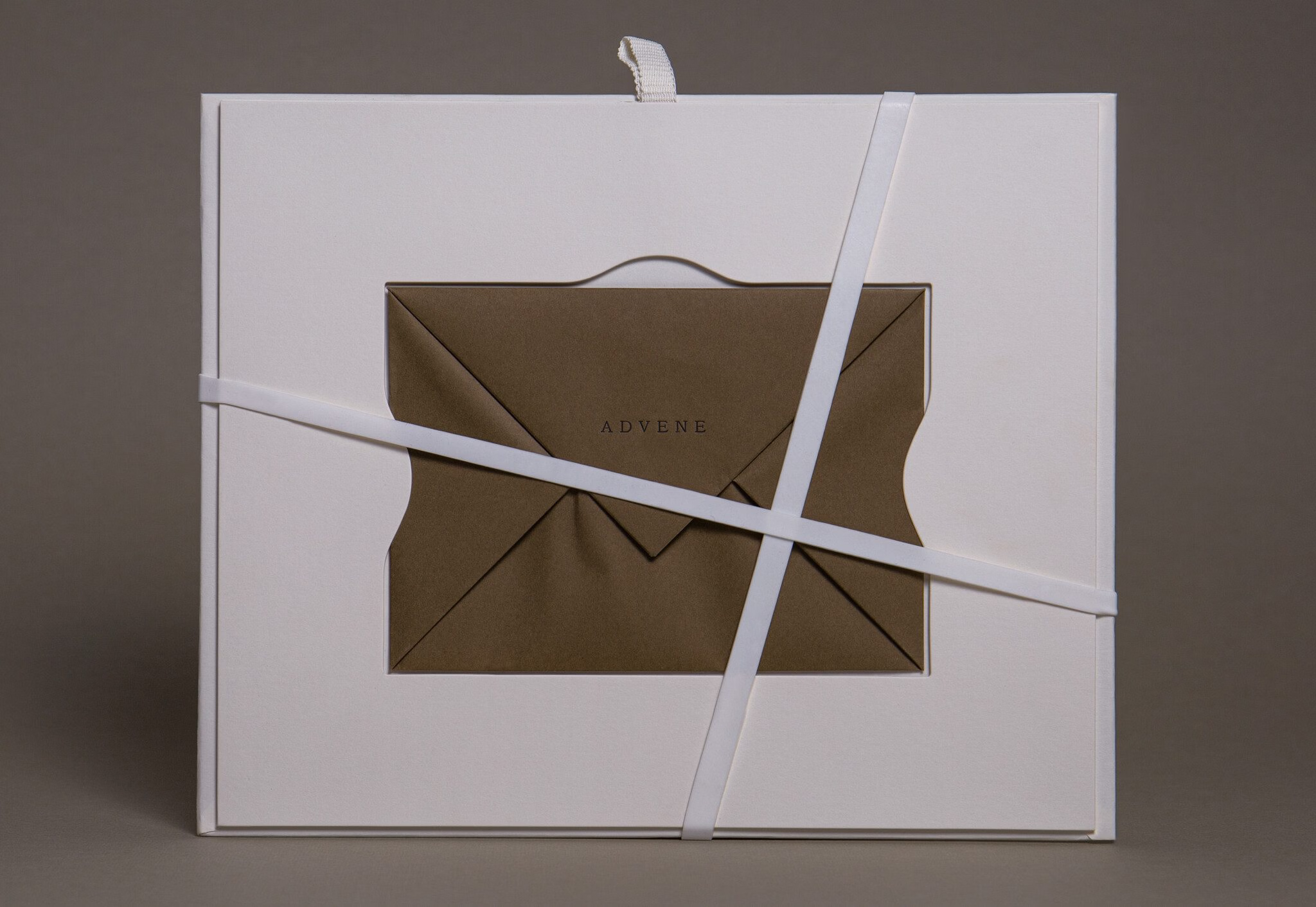
Packaging: the last brand message
- Tissue paper wrapping
- Handwritten card
- Cotton bag
A Parisian ritual that works in France and elsewhere: Japanese shoppers appreciate the art of wrapping (tsutsumi), and careful packaging is a sign of respect toward the customer.
The same goes for the Middle East, where luxury packaging is a standard expectation in the premium segment and where many fashion purchases are gifts, so packaging is part of the product.
In Germany or the Scandinavian countries, though, it's more nuanced: too much packaging is seen as environmentally irresponsible. In fact, 67% of Germans prefer to wait longer for a more responsible delivery.
The question isn't "how do I translate my brand?"
The question is: what is your customer's first question in each country?
This reflex is human. We build from what we know. The problem is that what we know is exactly what needs to be questioned. The "commitment" filter that works on Balzac Paris means nothing in Düsseldorf. The minimalism of Jacquemus that sells a dream in Paris can look empty and suspect in Tokyo. The tissue paper that enchants in Dubai annoys in Stockholm.
Every domestic certainty is a hypothesis to test elsewhere, and most don't survive the test.
Internationalization isn't a project with a deliverable and an end date. It's a stance.
The stance of accepting that you don't know how your visitor thinks, and that the only way to learn is to observe, test and be wrong, a bit like a CRO strategy, really.
The brands that succeed aren't the ones with the biggest translation budget. They're the ones with the greatest capacity for unlearning.
There's something uncomfortable about this idea. Unlearning means admitting that what made you successful at home won't necessarily serve you elsewhere.
It means accepting that your instinct, the one telling you "this visual is perfect," "this PDP is clear," "this checkout is smooth," is a French instinct, forged by years of French consumption, French codes, French reflexes. And that it blinds you as much as it guides you.
The good news is that the compass exists. The two axes, navigation and trust, work for any market, including the ones this article doesn't cover.
The next time your team proposes opening a new market, don't start with the media budget or the translation plan. Start with a simpler and harder question: what are we ready to unlearn?