A complete e-commerce post-purchase audit: post-checkout offer, confirmation page, delivery tracking and repurchase drivers, backed by real data from a database of thousands of orders.
Everyone optimizes up to the payment. After that, no one looks. The pillar of this series said it in one sentence: the confirmation page is the most profitable page on the site and the least worked on. This final guide exists to fix that imbalance, and it starts with the number that shows what it costs.
On a fashion brand with a drop model that we analyzed, 72% of the customer base stopped after the first order.
Almost three customers out of four, acquired at full price, gone after a single trip through checkout. And in the same database, the customers who came back built an LTV above €500 over 18 months, on an average basket of €140 to €150: three and a half orders' worth of value, versus one.
The gap between these two groups isn't decided in the ads. It's decided in what happens right after payment, in the zone almost no one audits.
The thesis of this guide fits in one sentence: post-purchase isn't the end of an order, it's the start of the next one.
And the second order isn't just one more order: it's the entry into the loop, the moment a buyer becomes a customer and each order makes the next one more likely.
Three surfaces make up the zone, in the order the customer moves through them:
- the post-checkout offer,
- the confirmation page,
- and the tracking page
This guide is the eighth and last in our CRO audit series, built around this 194-point checklist. The method stays the pillar's method to the end: checks scored by impact and cost, and hypotheses ready to enter your testing program.

The post-checkout offer: the golden window
Between validated payment and the thank-you page opens the most distinctive window in e-commerce, and the checklist devotes two checks to it.
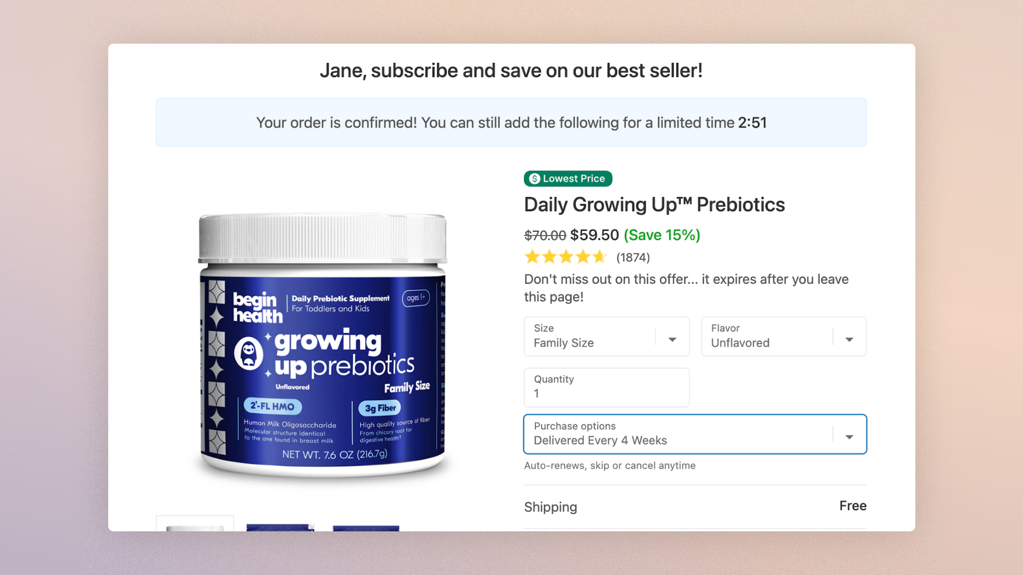
- An upsell is offered after checkout but before the thank-you page, letting shoppers add a product to the order in one click, without re-entering a single field.
- The page offers additional or complementary products at a discount, clearly stating that they will ship together with the order.
The checkout guide set out the mechanics, and the cart guide set out the hierarchy: the same offer, shown after payment rather than before, converts better and puts conversion at no risk, because it speaks to someone who has already decided.
It's the only offer on the site that can't break anything. On Shopify, post-purchase extensions make it available without Shopify Plus, through compatible apps.
Two rules of execution, carried over from the whole series:
- Relevance first: the offer complements the current order (leather care with the boots, the belt with the jeans). It doesn't open a second shopping journey.
- Modesty second: a price well below the validated basket, so that adding it stays a small gesture and never a new decision.
The line "ships with your order" does the rest: no second shipping fee, no second wait, no second hesitation.
If the post-checkout offer presents a single complementary product priced under 25% of the order amount, with a discount and combined shipping, then average order value will rise with no effect on conversion rate, because the offer comes after the decision and accepting it requires no data entry and no trade-off.
The confirmation page: confirm first
Before it's a sales surface, the thank-you page is a surface of relief. The customer has just handed her money to a screen; her first question isn't "what else can I buy" but "did it work." The checklist answers in order:
- The page clearly states that the order is complete: an unambiguous message that also says no further action is needed.
- The page shows an order summary: items, quantities, prices, shipping address, payment method. People check one last time, then file it away.
- The page includes delivery information (timing, deadline, carrier) and explains how to track the order. Waiting is the first source of post-purchase anxiety, and every answer given here is one less request to customer service.
- Contact options are offered (chat, phone, email): the availability shown is itself a reassurance message.
- All the order information goes out in a summary email. The page closes, the email stays: it's the one the customer will reopen three times before delivery, and it's the most consistently opened email in your whole stack. Making it clean, complete and on-brand isn't a template detail, it's an audit point.
The classic mistake on this page is getting priorities in the wrong order: trying to sell before you've finished reassuring. The sequence that works respects the psychology of the moment: confirmation, proof, and only then the invitations.
The second order starts here
Once confirmation is done, the thank-you page becomes what the opening number demands it be: the first sales page of the next order.
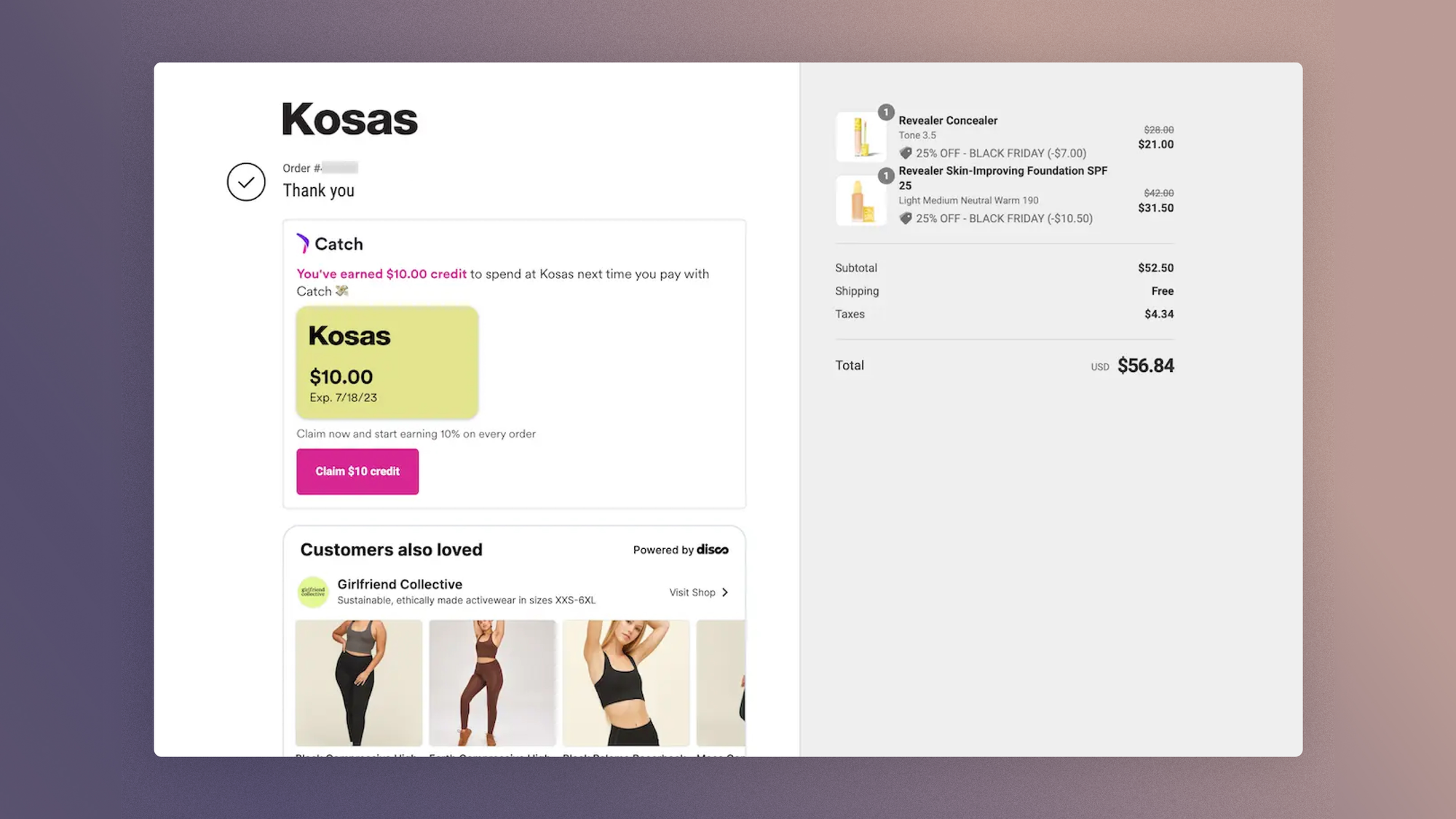
- The page offers a discount code for a future order. Retaining costs less than acquiring; the code turns confirmation into an appointment. How it's presented matters as much as its amount: dated, it creates a deadline; personalized, it creates a sense of attention. And for premium brands, the alternative to a code deserves consideration: systematic discounting teaches customers never to pay full price, whereas an access privilege (early access to the next drop or the next collection from the second order on) rewards without devaluing. It's the promise of a loyalty program without the infrastructure, and often the right first step before building one.
- Account creation is offered here, and it's the best moment on the site to do it: the checkout guide put forward the hypothesis (offer the account after confirmation rather than before payment), and this page is where it gets measured. All the information is already entered; only a password is missing, and the promise of order tracking is enough to motivate it.
- An attribution question ("How did you hear about us?") finds its best placement here: asked of every buyer, at the moment when answering costs the least, it captures the self-reported source that ad tracking no longer fully sees since the privacy updates. One question, not a questionnaire: it's an answer you ask for, not a survey.
- It's also the right time for soft asks: newsletter signup for those who haven't done it, and later, at the right point in the delivery cycle, the request for reviews and content (our UGC guide covers that mechanic). The timing rule is simple: you don't ask for a review of a product the customer hasn't received yet.
For brands with a drop model, this zone carries an extra stake, illustrated by the brand in the opening case: its highest-value customers were precisely those who combined both models, the drop and the permanent restock.
The post-purchase moment of a drop order is the best place to open the door to evergreen products, and vice versa; it's the flow of value that scarcity strategies only succeed with on this condition.
If the discount code on the confirmation page is dated (valid for 30 days) rather than permanent, then the 60-day second-order rate will rise, because a deadline turns a possibility into a decision to make.
Between confirmation and delivery, the customer comes back. Several times. Relative to its audience, the order tracking page is one of the most visited pages on the site, and it's almost always a default template no one has opened since launch.
The audit checks two levels here. Functional first: the status is up to date, the carrier and delivery date are named, the tracking link works, and contact options are there.
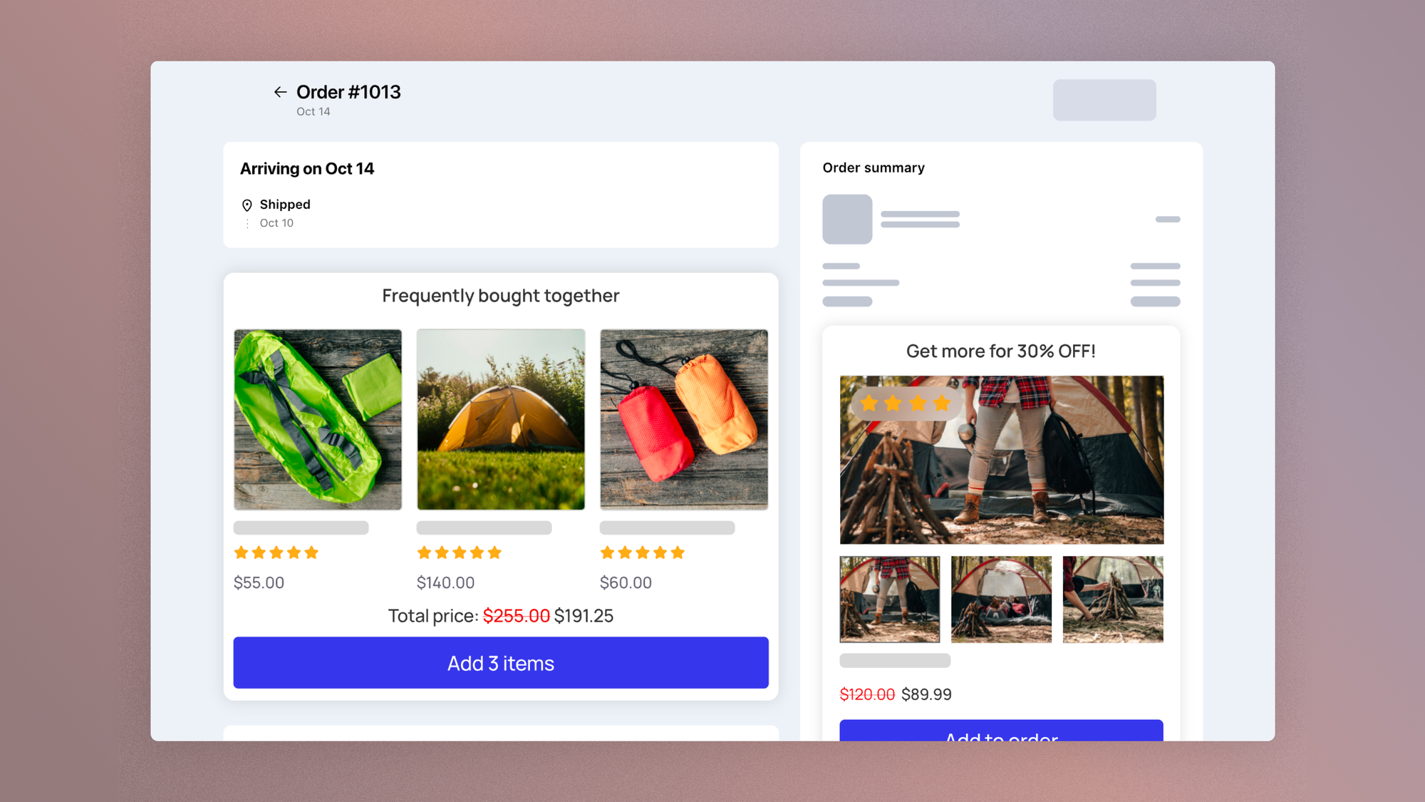
Editorial second: these repeat visits, high in attention and zero in acquisition cost, can carry content that prepares for arrival (how to care for the piece, how to wear it, the story of the workshop) and one discreet suggestion. Not a sales carousel: a single proposal, in the brand's tone, for an audience that has already bought.
If the tracking page includes a content module to prepare for arrival and a single product suggestion, then the 90-day second-order rate will rise, because waiting visits become brand touchpoints instead of staying logistics checks.
Measuring post-purchase
Post-purchase is measured over a horizon the rest of the site ignores: not the session, the cycle. The two pages in this guide are only the first squares of a calendar, and the whole calendar decides the second order. Five indicators judge it:
- The post-checkout offer acceptance rate, the only indicator in the series that reads without any setup (your upsell app provides it).
- The post-purchase account creation rate, which settles the hypothesis inherited from the checkout guide.
- The second-order code usage rate, to be read with its average time to use: it maps the real repurchase window of your customers.
- The second-order rate (the share of new customers who order again within 90 days), which is the underlying measure of the whole zone.
- And the time from first to second order, which sets the rhythm of your follow-ups to your customers' real rhythm rather than the default settings of your email tool; our email marketing guide picks up from there on that sequence.
The brand in the opening case shows the scale of the stake: moving even a fraction of the 72% of first-time buyers to a second order weighed more, in its plan, than any acquisition optimization. Retention was reclassified there as what it really is: an acquisition channel whose cost has already been paid.
FAQ
What should an order confirmation page contain?
In order: explicit confirmation that the order is complete, the full summary (items, amounts, address, payment), delivery information with a way to track the order, contact options, then the invitations: a discount code for a future order, one-click account creation, newsletter signup.
The architecture rule: fully reassure before proposing anything.
Does the post-purchase upsell really work?
Its mechanics are the least risky in e-commerce: the offer appears after payment, declining it costs nothing, and accepting it adds to an already validated order, with no new data entry.
The conditions for performance are relevance (a complement to the current order), a modest price and combined shipping.
Acceptance rates published by app vendors should be taken with a grain of salt: measure your own, which depends only on the quality of the offer.
How do you turn a first purchase into a second order?
Four drivers, in the order of the cycle: a flawless, well-documented delivery experience (clear tracking, preparation content), a dated discount code given at confirmation, easier account creation after purchase, and an email sequence timed to your customers' real repurchase delay rather than default settings.
All of it is measured on a single underlying indicator: the 90-day second-order rate.
Get the complete checklist
The post-purchase checks, with their impact and cost scores, their explanations and their visual examples, are part of the 194-point CRO checklist, available as a duplicable Notion database reserved for Conversion Club members.
 Jérémie Werner
This guide closes the series, and the series closes like an audit: it doesn't end, it starts over. One full pass per quarter, one targeted pass after every redesign, and the checklist in your hands.