
Seven testers explore the website of a DTC women's wellness brand, one hour each. Their first impression is unanimous: "a pharmaceutical site."
Not one of them can say what the brand promises. The site gets about 200,000 visits a month, but only a few thousand visitors go through the homepage; nearly half of visitors arrive via the blog.
During the debrief, the cofounder doesn't wait for it to end:
"We can't figure out our positioning. We're not yet a brand like [a well-known skincare brand], and none of us is a pharmacist or a doctor, so we can't claim to be a pharmacy either. We need to go back to basics: who we are."
The brand borrows two codes that aren't its own, without building anything between them.
This guide fills that gap. It approaches the UVP as a conversion issue rather than a branding one: how to build it, word it, present it on the site and test it without fooling yourself about traffic.
The examples rely on a fictional skincare brand, because beauty is the segment where promises look the most alike from one store to the next. The scenes, though, are inspired by real brands, anonymized.
The unique value proposition (UVP) is the promise that explains, in under ten seconds, why to buy from you rather than elsewhere: what result you deliver, for whom, and what sets you apart from the alternatives. In e-commerce, it reads on the homepage, then carries through to category pages, the product page and the terms of purchase.
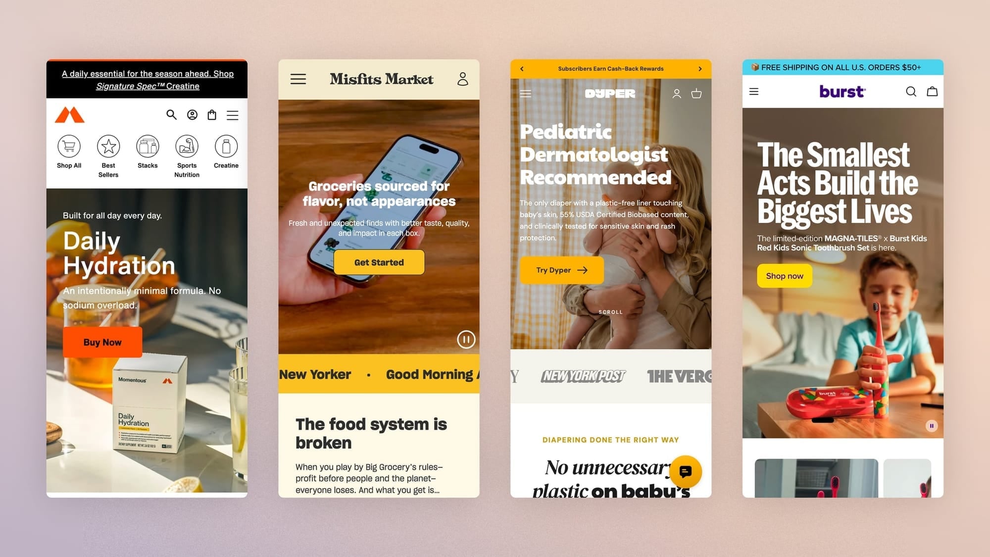
Why is the value proposition first a conversion issue?
Research has shown that a visual appeal judgment of a page forms in barely 50 milliseconds and stays consistent with the one made after ten times longer exposure. In short, first impressions matter most, since that judgment then shapes judgments of credibility and usability.
Nielsen Norman Group analyses show that the risk of leaving a page peaks during the first ten seconds, stays high until thirty seconds, then declines.
An e-commerce site that passes this first filter often holds attention for two minutes or more. The obvious conclusion: you need to communicate your value proposition in under ten seconds to hope to earn several minutes of attention.
In its Conversion Benchmark Report based on 57 million conversions, Unbounce finds a negative correlation of 24.3% between the number of "difficult" words (three syllables or more, no comment) and conversion rate. A differentiating but hard-to-read promise fails the same test as a vague one.
A caution, though, as always in CRO: read these figures carefully. None of these sources measures a UVP; they indicate instead how fast it has to work.
Here is a slightly more specific example, drawn from our experience with a French craft brand. Two versions of the same site were compared over the same quarter, with the same products:
- From the French homepage, 17.9% of visitors reached a product page;
- From the English version, 32.5%.
The 14.6-point gap comes from what sat at the top of the page: the French version told the story of the house, while the English version put the catalog front and center on the first screen.
That gives us the cold visit test: does someone discovering your homepage or product page immediately understand what you offer, who it's for and why your offer beats the other options?
Shopify suggests a simple method: show a draft of the UVP to an outsider for five seconds, then ask what it's about and why it matters.
In beauty, the problem is less vagueness than sameness. "Clean," "formulated with dermatologists," "backed by science": these promises show up at every competitor.
Repeated often enough, a universal promise becomes decoration, like a texture photo in the background of a hero.
UVP, USP, tagline, positioning: what's the difference?
In the same meeting, you hear "our USP is clean," "our tagline is Bare Skin," "our positioning is mid-premium." Three sentences, three topics, and still no promise.
- The UVP (Unique Value Proposition) is precisely that promise. The first reason to buy from you rather than elsewhere, easy to read and understood in five seconds flat.
- The USP (Unique Selling Proposition) is the differentiation angle, often a single attribute, and goes into the UVP as a component.
- The tagline is the brand signature; it can be memorable without carrying a promise.
- Positioning is the strategic choice upstream (category, reference alternative, target); the UVP is its visible expression.
One point often forgotten: the value proposition adapts across four levels. Here they are applied to a skincare store, with a column dedicated to the AI agents that will read your store in place of your customers.
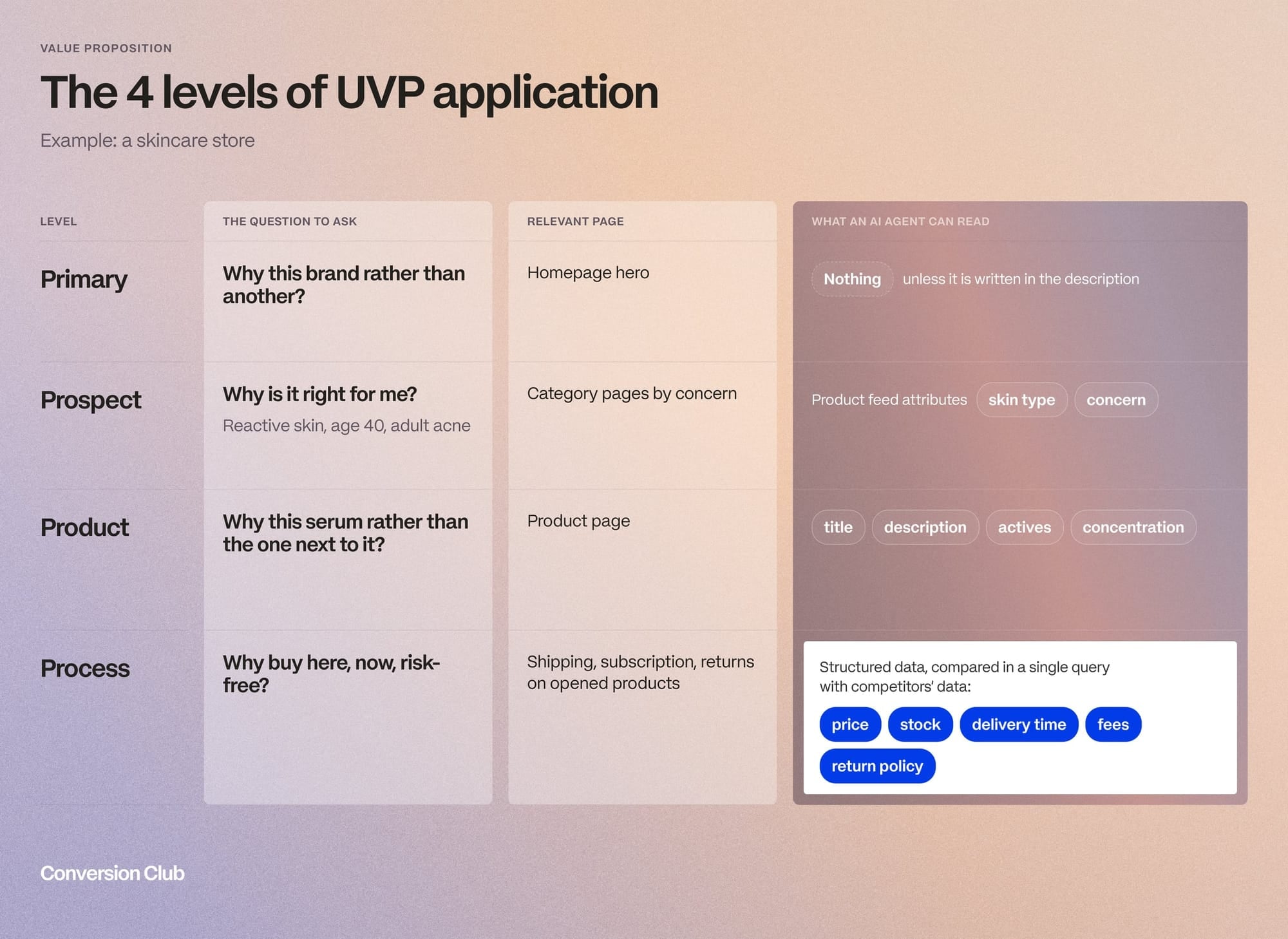
| Level | Question to ask | Relevant page | What an AI agent reads from it |
|---|---|---|---|
| Main | Why this brand rather than another? | Homepage hero | Nothing, unless it's written in the description |
| Prospect | Why for me (reactive skin, age 40, adult acne)? | Category pages by concern | Feed attributes (skin type, concern) |
| Product | Why this serum rather than the one next to it on the shelf? | Product page | Title, description, actives, concentration |
| Process | Why buy here, now, with no risk? | Shipping, subscription, returns on opened products | Price, stock, lead time, fees, return policy |
What four tests must a value proposition pass?
A good value proposition must meet four criteria: relevance, quantified value, differentiation and readability.
- Does the promise address a problem the target segment recognizes as its own (relevance)?
- Does it deliver a concrete benefit, ideally with a number, rather than settling for an adjective (quantified value)?
- Could a competitor reuse this sentence on their site without anyone noticing (differentiation)?
- And if the differentiation requires difficult words, rewrite it (readability).
In his book How Brands Grow (2010), Byron Sharp argues that brands grow through mental and physical availability, and that you should aim for "meaningless distinctiveness": recognizable codes rather than perceived differentiation.
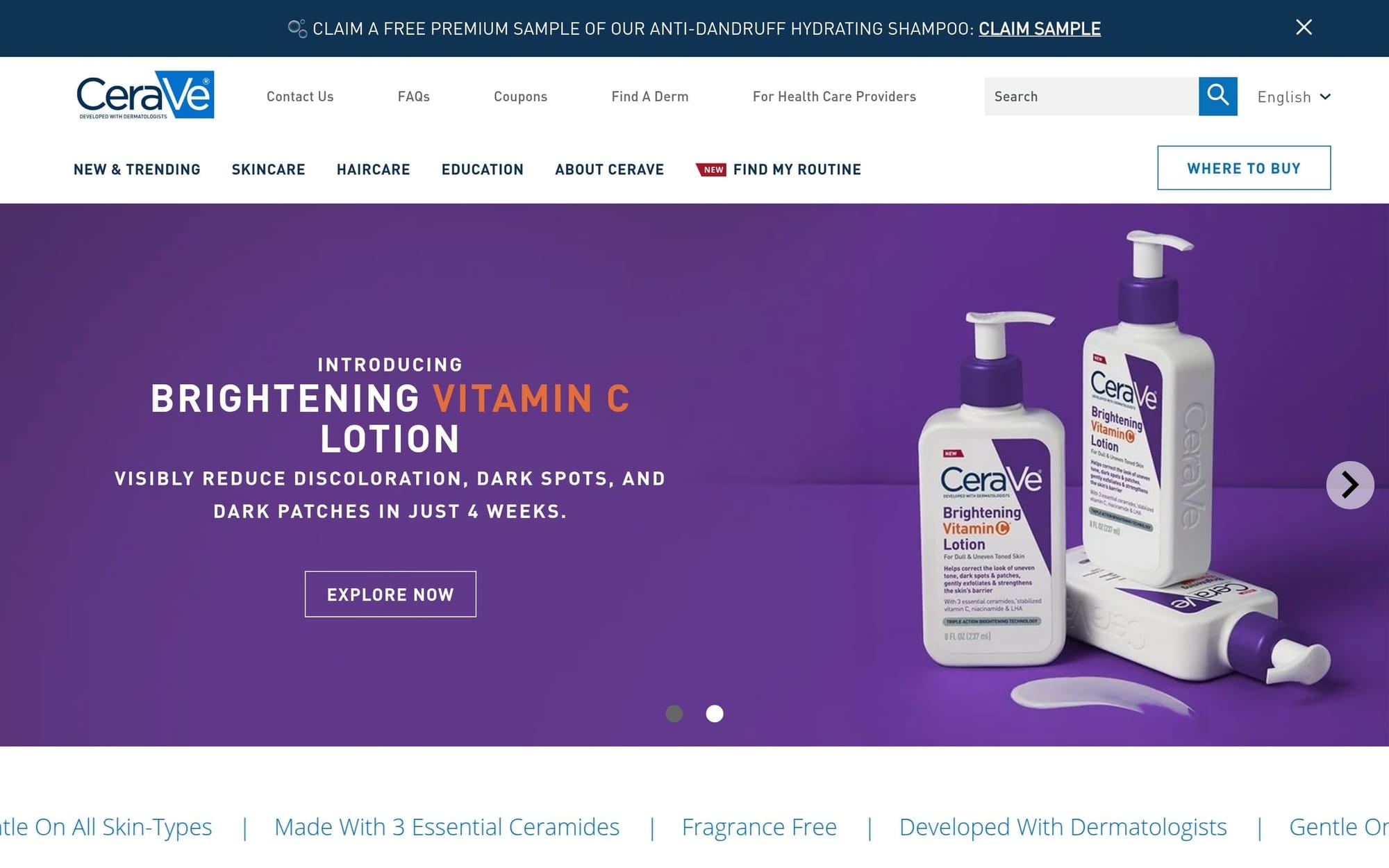
CeraVe is the most awkward proof of this for an article on the UVP: €2 billion in sales at L'Oréal in 2025, with the most copied claim in the category, "developed with dermatologists."
So save the differentiation effort for the homepage hero. For a cleanser or a sunscreen that rounds out the range, an openly acknowledged "copycat" is enough: same actives as a known reference, a lower price, shipped from a US warehouse.
In the age of AI, the most effective diagnostic exercise is still the one Flint McGlaughlin invented 20 years ago:
"If you had ten words to explain why to buy from you rather than a competitor, what would they be?"
Have each of these people do it separately:
- the person who founded the brand,
- the person who runs e-commerce,
- and the person who answers customer service.
Here's the CRO twist: when the three answers diverge, you generally find the same divergence across the homepage, the product pages and customer service replies!
And since we're talking about techniques that have worked just as well since the 2000s, here's another one that takes twenty minutes and a printer:
- Print the hero sentence of 10 direct competitors, with no logo, one per sheet.
- Shuffle the pile.
- If the person who wrote yours doesn't recognize it, count to 10 before saying so.
Then repeat the exercise with your product titles as they appear in your Google Shopping feed, since that's the version Google and e-commerce agents read.
Example on the hero of a serum-type product, from the fictional brand that will serve as our common thread throughout this article:
| UVP | Relevance | Value | Differentiation | Readability |
|---|---|---|---|---|
| "Visibly more radiant skin, naturally." | Weak (which skin? which problem?) | Not quantified | None | Fine |
| "Post-acne marks reduced in 8 weeks, proven on 112 sensitive skins. Fragrance-free, retinol-free." | Adult acne, sensitive skin | 8 weeks, 112 people | Tolerance as a strength | Acceptable |
How do you find your value proposition with the Value Proposition Canvas?
The Strategyzer canvas remains, in our view, the most useful tool for turning an intuition into a defensible promise. It was designed for a simple case, though: one product, one segment and a person discovering the brand with nothing to compare it to.
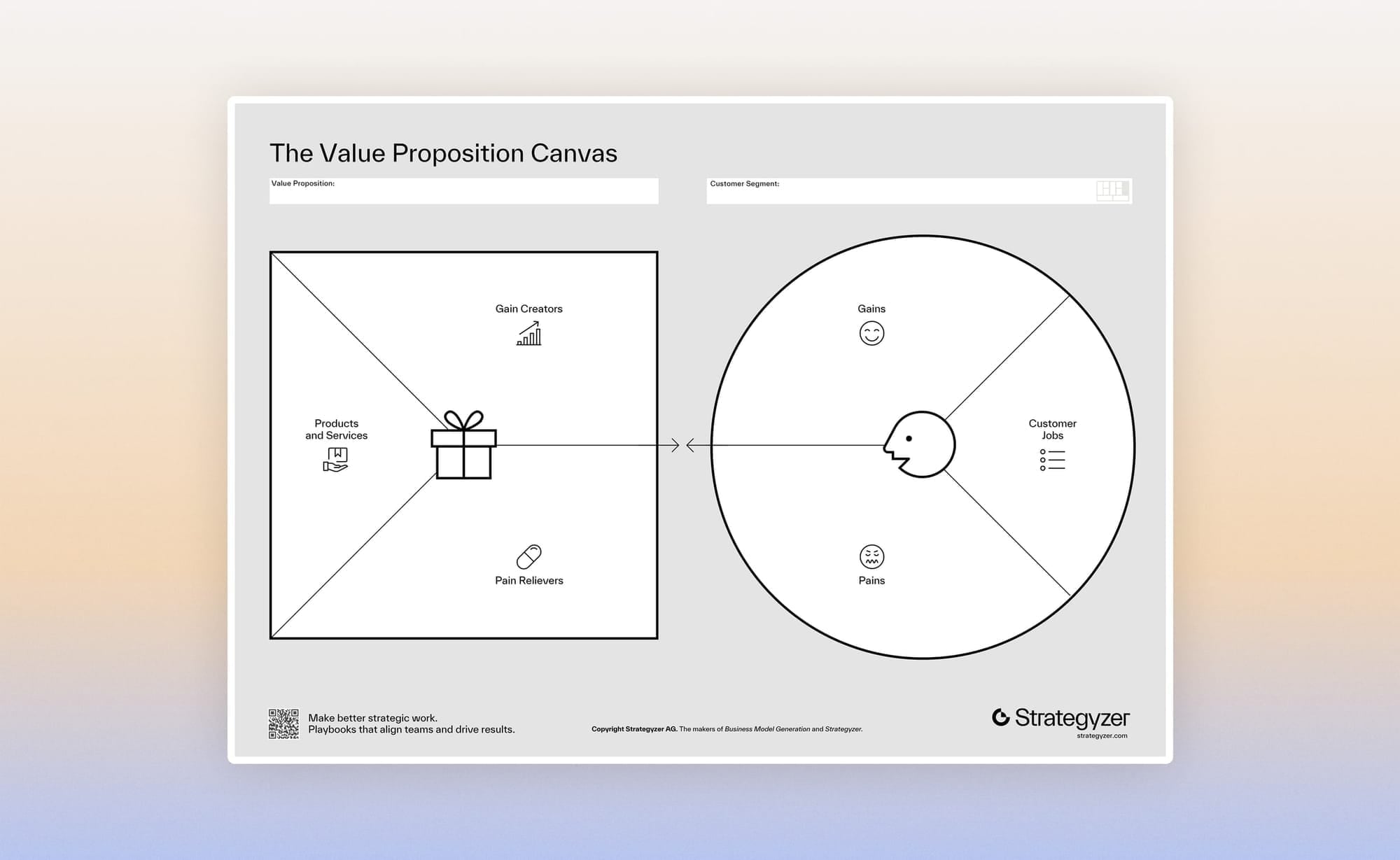
In e-commerce, the journey often varies. Someone clicks an ad and lands on a product page with a specific competitor in mind, but the canvas has no box to mention it.
So we add one, the "unlike" clause (see below), along with a post-purchase question to fill it in.
The canvas splits into two parts:
- On the left, the customer profile describes what the customer is trying to do, what holds them back and what they hope for.
- On the right, the value map presents what you sell and how each element answers one of those points.
The UVP comes from the match between the two.
Define a customer profile
Three lists per segment: jobs, pains, gains. Take a customer from the "adult acne, sensitive skin" segment:
| List | For an "adult acne, sensitive skin" customer |
|---|---|
| Jobs | Make marks disappear (functional), show up to a meeting without foundation (social), stop feeling at war with her skin (emotional). |
| Pains | Irritating routines, broken promises, a bottle finished before any visible result, a high price for a trial. |
| Gains | A visible result within a stated timeframe, a short routine, proof before purchase. |
Prioritize pains and gains
A raw list quickly holds fifteen pain points. Rate each one from 1 to 5 on two axes:
- intensity (how much it bothers people)
- and frequency (how many customers mention it).
Add them up and keep the top five. Do the same for gains.
For each of the five, then note where it comes from: a verbatim comment, a support ticket or a study. If there's no source, write "hypothesis."
Without that note, the canvas becomes an internal projection, and five people projecting together end up convincing one another!
Rate each pain on two axes, intensity and frequency, then keep the top five.
Fill in the value map
It lists your products and services, then what relieves each pain and what creates each gain. Make every link explicit:
- Tranexamic acid reduces post-acne marks;
- The 8-week refund answers skepticism.

What e-commerce data feeds the canvas?
In beauty, thousands of customer reviews are a valuable research source. They reveal the vocabulary used to describe texture, scent and how long results take to show.
Support tickets surface skin reactions, packages damaged by heat and questions about compatibility between actives. Post-purchase surveys, for their part, reveal the alternatives people rejected and why they chose as they did.
On that last source, here's a method overheard in a meeting with a premium shirt brand:
"We segment the list and send a short questionnaire with closed and open questions. No need to reach 5,000 people; around fifty is already nice. What motivated your purchase? What qualities do you find in the product? For you, what is [the brand] in one word?"
The same consultant, to a founder who sells her clothes in drops:
"If 98% of your customers tell you: 'what I love is that there's always something new, the iconic pieces bore me to death'..."
She answers without hesitation: "That's one of my fears."
That's exactly what the questionnaire is for: checking an internal fear against what customers actually say.
For e-commerce, here are five questions to ask on the Shopify thank-you page, one per screen. Each feeds one level of the unique value proposition (UVP):
| Question | Level |
|---|---|
| What almost kept you from buying? | Process level: barriers to purchase. |
| What other product or brand did you consider? | Product level: the alternative to name in the "unlike" clause. |
| In one sentence, why did you choose this product? | Main level: the vocabulary of your UVP, in your customers' own words. |
| How would you describe your skin in three words? | Prospect level: how the person defines their situation. |
| How long have you been looking for a solution? | Prospect level: how long the search has gone on, set against the intensity of the pain. |
In cosmetics, where overblown promises fuel skepticism, the difficulty of believing a new promise deserves a place in the canvas, alongside expectations about efficacy.
Strategyzer publishes the canvas in English, and the full method is in the book Value Proposition Design. To go faster, our two Claude prompts build this canvas from your reviews, your tickets and your post-purchase answers.
How to write a value proposition: structure, proof and legal framework
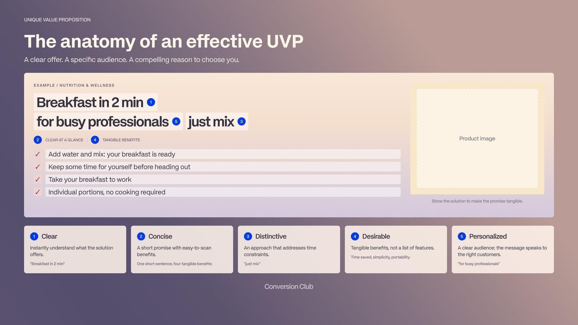
Four key elements for structuring a good value proposition
- a headline that states the end result,
- a subheadline of two or three sentences that spells out what you sell, who you're speaking to and how your offer helps,
- three bullets that highlight the main benefits or features,
- and a visual that supports your message.
To write the headline, Shopify's formula can serve as a starting point:
"[adjective] [product] for [aspiration]"
Add to that an alignment formula for the team, which never appears on the site:
"We help [segment] get [result] through [mechanism], unlike [alternative], which [limitation]"
The "unlike" clause is the missing piece of the canvas; the second question of the post-purchase survey helps you fill it in.
For the hero, Meta Ads training programs suggest a two-step rule: promise, then proof. Start by stating the promise, the product's main value for the customer, then provide the proof that makes it credible.
A major cosmetics brand presents itself as "the No. 1 anti-aging brand in its market," then backs that claim with "innovation, collagen, vegan."
That proof has to be real: the promise binds the brand to its customers, and to the FTC. "Clean" or "dermatologically tested" are not promises, they're proof points!
What visual form should the value proposition take?
The visual form of your value proposition also plays an important role. One study compared four variants of the same page:
- a headline with three bullets,
- three expanded bullets,
- five bullets
- or a short paragraph alone.
The more structured text the proposition contained, the faster participants spotted it; only the paragraph was unusually slow to be noticed.
The most detailed versions are also the ones where participants remembered the most benefits, with no difference in reported trust.
In light of the readability data mentioned above, these observations suggest a rule: provide more structured information, favor simple words and limit competing elements.
In beauty, "one sentence and a visual" heroes, though very common, convey less information than the eye can process.
What claims does the law allow in the hero?
In cosmetics in particular, two safeguards are essential. First, no claim should be made without tying it to a pain or a gain in the canvas.
Second, every word in the headline creates an obligation to provide proof. In the US, the FTC requires a "reasonable basis" for every objective claim before the ad runs, and health or safety claims need competent and reliable scientific evidence. The FDA adds its own line: a product that claims to treat or prevent a condition is a drug, not a cosmetic, and is regulated as one.
Neither agency defines "natural," "clean," "dermatologist tested" or "hypoallergenic." That cuts both ways: no rule tells you what the words mean, and no rule protects you when a customer or a competitor reads a benefit into them that you cannot prove.
Now let's reread our hero against those criteria.
"Fragrance-free" holds up if no ingredient in the formula serves as a fragrance. The FDA has no definition for the term, so a product can carry it and still contain a masking scent, which is exactly what a skeptical customer with sensitive skin will notice.
"Retinol-free" is more debatable. Under the FTC's Green Guides, a "free-of" claim misleads when the ingredient was never part of the product category to begin with, or when the formula contains something that raises the same concern. Retinol is common in the category, so the claim is allowed, but on its own it only trades on fear. Paired with an audience, as in "retinol-free, for skin that can't tolerate it," it becomes useful information again.
Finally, "Proven on 112 sensitive skins" is acceptable if the study exists and can be produced. That same study convinces a skeptical audience and is what you hand the FTC if a competitor complains. Note the wording: "post-acne marks" is a cosmetic claim; "treats acne" would make the serum a drug in the FDA's eyes.
Analysis of the proof needed for our value proposition
| Hero word | Proof required | Who holds it |
|---|---|---|
| Natural | No FDA or FTC definition; ISO 16128 (natural-origin content ≥ 95%) is the usual voluntary standard | Your manufacturer, product file |
| Clean | No regulatory definition anywhere; the FTC can read it as an implied safety claim you then have to substantiate | No one |
| Dermatologist tested | No legal definition; a test report under dermatological supervision, kept on file | Your manufacturer or your lab |
| Results in X weeks | Competent and reliable scientific evidence: an efficacy study or consumer test, with sample size and protocol | Your lab |
| Hypoallergenic | No federal standard; the FDA says the term means whatever the company wants it to mean, so keep a tolerance assessment | Your safety assessor |
| Free from [ingredient] | Green Guides "free-of" test: the ingredient is actually used in the category, and nothing in the formula raises the same concern | You, in writing, before going live |
Written version for our serum, corrected
| Element | Corrected version |
|---|---|
| Headline | Post-acne marks reduced in 8 weeks. |
| Subheadline | A tranexamic acid serum formulated for sensitive skin prone to adult acne. Tested on 112 people. Fragrance-free, retinol-free for skin that can't tolerate it. |
| Bullets | Visible results measured at 4 and 8 weeks; One-step routine, morning or evening; Refund if no improvement at 8 weeks. |
| Visual | Dated before/after on real skin. |

Where should you place the value proposition on an e-commerce site?
A value proposition doesn't fit in a single block. It unfolds at four points in the e-commerce journey:
- the homepage,
- category pages,
- the product page
- and the elements surrounding the purchase.
This fourth level, the process level, is often the least developed.
On the homepage: what you sell, to whom and why choose you
The hero must make this promise easy to read, with a headline, a subheadline, a few benefits and a visual that supports them.
A video alone can set a mood without explaining the offer. A carousel doesn't solve the problem either: on a brand whose analytics we were able to review, it drew only 1.07% interactions, with 84% of clicks concentrated on the first slide.
Better one immediately understandable promise than five messages almost nobody will see.
On category pages: meet the prospect's concern
Organizing the range by marks, redness or adult acne, rather than only by product type, helps people start from their needs.
The category no longer just sorts the catalog: it becomes an entry point to a solution.
On the product page: make the promise concrete
- What is this product for?
- What does it do differently?
- Why is it worth its price?
The first answers should appear above the fold, then be expanded in the description.
A few illustrated highlights make the benefits easier to explore than a long block of text. Reserve the first lines for what helps people understand and choose, not for an interchangeable marketing intro.
Near the buy button: the process level
At this point, value no longer depends only on the product, but also on the conditions under which it can be bought: shipping cost and time, free-shipping threshold, return terms, subscription flexibility.
This information seems secondary until the moment it blocks the decision.
At a high-end textile brand, sales reps have to add an item to the cart themselves, enter the customer's country and go all the way to checkout to find out the shipping fees. If your team has to simulate an order to find the answer, so do your visitors.
The fix is sometimes a single line under the button:
"Free shipping on orders over $250"
The point isn't to add a promise, but to make an existing condition visible. Put the answers where the questions come up, near the price and the button, rather than leaving them in the footer or in a faraway banner.
For a subscription offer, this level deserves special attention. The freedom to cancel, skip a delivery or move its date can be part of the value proposition, as long as the offer really allows it. Don't leave these options buried in the account area: make them easy to see at the moment of choice.
Also spell out the cadence and what it means in use. For a 1 oz (30 ml) bottle meant to last six to eight weeks, explain the delivery rhythm and the price per day. People should be able to understand what they receive, how long it lasts and what freedom they keep.
Vocabulary matters too. "Subscription" describes a billing mode; "food diversification support" describes what the parent is looking for. Name the value being bought first, without hiding the terms of the commitment.
Ultimately, a product page has to answer three questions before the click:
- Is this offer worth its price?
- Is the product good quality?
- Can I trust this company?
So the value proposition isn't just a hook at the top of the page. It's a continuous thread:
- a promise on the homepage,
- an answer to the need in the categories,
- proof on the product page
- and clear terms at the moment of purchase.

How do you test a value proposition, with or without traffic?
A value proposition is a hypothesis until proven otherwise. Validating it takes three steps, and the first doesn't require changing the site.
1. Off-site pre-test
Before touching the homepage, run each variant as a paid ad headline and compare click-through rates.
The logic is progressive: test the customer profile with keyword ads, the value map with a "Buy a Feature" game, and the price with fake sales pages.
2. On-site test
A/B test the hero and the above-the-fold area of product pages for at least four weeks.
The primary metric is revenue per visitor (RPV): a stronger promise can also shift average order value, up or down.
In addition, track the share of sessions lasting more than 10, then 30 seconds, as well as the add-to-cart rate.
3. Choosing the method by volume
Most brands with $1M to $20M in revenue don't reach the volume needed for a hero A/B test.
As a guide, for a four-week test with two variants, 80% power and a 5% risk level:
| Conversions per month | Minimum detectable relative effect |
|---|---|
| 100 | ≈ 28% |
| 200 | ≈ 20% |
| 500 | ≈ 12% |
| 1,000 | ≈ 9% |
| 2,000 | ≈ 6% |
A new hero that lifts conversion by 8%, which would be an excellent result, stays invisible below 1,000 conversions a month. Hence the ladder:
- Under 200 conversions a month: five-second test with strangers, preference test, ad headlines compared on click-through. No hero A/B test, even if your tool offers one.
- Between 200 and 500: A/B test on a proxy metric more frequent than purchase (add to cart, sessions over 30 seconds), six to eight weeks, and a bold change rather than a comma moved.
- Above 500: RPV, four weeks, with duration and stopping criterion set before launch.
What mistakes come up most often?
The pile of sheets nobody claims, after the printer exercise, almost always contains the same three sentences.
The category promise, "Natural care for beautiful skin," doesn't set any brand apart from its competitors. Shared claims, "clean," "dermatologically tested," "vegan," have become the price of entry to the category.
And "clean" doesn't even have a regulatory definition.
As for feature lists, they often produce the same scene: fifteen actives on a product page, a consultant asking what each one does, and no one able to answer.
Many brands sell their house rather than what their online customers are looking for.
During a workshop with an artisan pastry house that sells online, a CRO consultant sums up the trap:
"It keeps selling its house instead of selling what its web user wants. Nobody goes looking for the house, apart from people who already know you."
A benchmark of four competitors helps shift the perspective:
- one sells the occasion,
- another the recipient,
- the third the budget,
- the fourth repeat purchase.
None puts the product or the house first. The house only becomes useful once the person is on the site: lower on the page, it reassures; at the top, the occasion is what sells.
In beauty, the "laboratory" or the person behind the brand plays the same role as the house.
A differentiating promise can also be undermined by shipping fees revealed at the cart.
Figures from a DTC kitchen accessories brand illustrate this: across 95,000 sessions, a full-screen hero lost 71% of mobile visits before visitors reached 20% scroll depth.
A cart showing "shipping fees calculated at checkout" lost 54% of visitors before checkout. The free-shipping threshold should be decided, then displayed, well before the cart.
Promotional framing is subtler for a premium brand. Round prices signal quality (Stiving, 2000), while prices ending in 9 suggest a discount (Schindler and Kibarian, 2001). A premium UVP displayed above a crossed-out price of 9.99 therefore sends two contradictory signals.
The "beautiful empty hero banner" raises a simple question: why does the budget go to the hero image, when the sentence sitting on top of it would cost almost nothing to test?
Frequently asked questions
What is a unique value proposition (UVP) in e-commerce?
The promise that says why to buy from you rather than elsewhere: what result, for whom, and what sets you apart. It should be understood in under ten seconds on the homepage, then carried through to category pages, the product page and the terms of purchase.
What's the difference between UVP, USP and tagline?
The UVP is the complete promise. The USP is the differentiation angle, often a single attribute, that goes into the UVP as a component. The tagline is a brand signature, memorable but without a promise. Positioning is the strategic choice upstream, of which the UVP is the visible expression.
How do I know if my value proposition is good?
Four tests: relevance, quantified value, differentiation and readability. Two exercises are enough to start: the cold visit (five seconds in front of an outsider) and the pile of ten competitors' heroes printed without logos, in which yours should be recognizable.
Where should you place the value proposition on an e-commerce site?
In the homepage hero headline, then by concern on category pages, as concrete benefits above the fold on the product page, and as clear terms (shipping, returns, subscription) near the price and the buy button.
Can you test a UVP without much traffic?
Yes. Under 200 conversions a month: five-second test, preference test and ad headlines compared on click-through. Between 200 and 500: A/B test on a proxy metric such as add to cart, for six to eight weeks. Above 500: A/B test on revenue per visitor over four weeks, with a stopping criterion set before launch.
What are the risks of using "clean" or "fragrance-free" in the hero?
Every objective word in the hero needs substantiation before the ad or the page goes live: the FTC calls it a "reasonable basis," and health claims need competent and reliable scientific evidence. "Clean" has no regulatory definition, so you own whatever a customer reads into it. "Fragrance-free" holds up if no ingredient serves as a fragrance. "Free from [ingredient]" passes the Green Guides test when the ingredient is common in the category and the formula raises no similar concern, and it serves the reader when it names an audience, as in "retinol-free, for skin that can't tolerate it."