A good homepage gets people out fast, and in the right direction. Everyone in the company has an opinion about it. The committee reviews it, the art direction defends it, and it's almost always the least measured page on the site: it's judged on taste, never on rate.
Yet its job is brutally simple: help people understand what you sell, and get them to click through to a product. Two questions, three seconds. Anything that serves neither goal is decoration, and you pay for it in visitors.
This guide is the sixth in our CRO audit series, built on our checklist of 194 checkpoints. The method is the same as in the pillar article: checkpoints scored by impact and cost, and hypotheses ready to drop into your testing program. This guide starts with a story the pillar article left hanging.

A Fourteen-Point Gap, Same Brand, Same Products
The French craft brand from our pillar article sold on two versions of the same site. The French homepage sent 17.9% of visitors to a product page. The English version sent 32.5%. Same products, same brand, same quarter. Nearly double.
What the pillar article didn't say is what the audit found when it took the gap apart. Nothing was broken on the French version: no bugs, no slowness, a decent bounce rate (37%). The difference came entirely from the top of the page: how much of the screen went to the brand rather than the products, how engaging the product sections were, and how well categories guided people.
The French homepage told the story of the house; the English homepage sold the catalog. And 14.6 points of click-through to product pages separated these two editorial choices, which no one internally had noticed, because both pages were beautiful.
A second audit, on another fashion brand (13,344 orders analyzed over 18 months), reached the same verdict: funnel rates above benchmarks everywhere except two steps, one of them the move from landing to product view.
A homepage that doesn't lead to products isn't the exception of a poorly run store. It's the most common flaw of the most polished sites.
The audit that follows exists to catch it before it costs you a quarter.
Above the Fold: What Happens Before the First Scroll
Three checkpoints on the checklist play out on the first screen. Two are quick wins; the third is the hardest investment to put a number on in the entire checklist.
The value proposition is clear
The value proposition is clearly expressed above the fold. Not the slogan: the answer to "what do they sell here, and why buy it here?"
A visitor who has to scroll to understand your business is already leaving. We covered this in detail in the 4 drivers of a distinctive brand; the homepage is where it pays off.
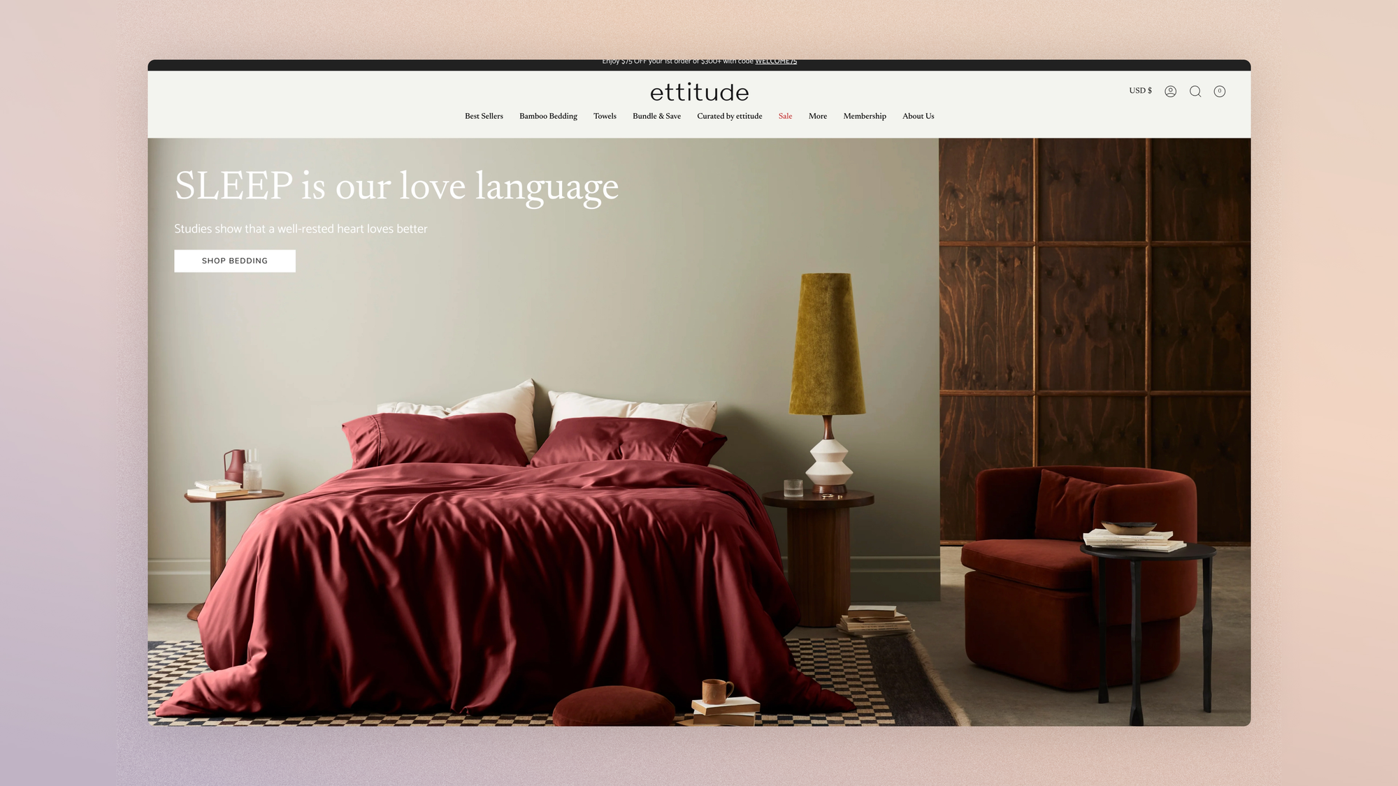
A visible CTA
At least one CTA is visible without scrolling, and it leads to the shop: a collection, a curated selection, the best seller. "Discover our world" isn't a CTA. It's an escape hatch.
The design is flawless at first glance
This is the hardest checkpoint on the checklist to measure and one of the costliest, but first impressions decide the credibility of everything that follows: a site that looks amateur makes every claim suspect. We also broke down how Polène, Rains and Jacquemus turn design into a strategic driver rather than an expense.
A technical corollary for video heroes, common in fashion and luxury: the video should never be the page's LCP element.
A poster image shows first, and the video loads afterward. A hero that pushes first render past Google's 2.5-second threshold trades mobile conversion for brand image, and loses on the trade.
If the hero presents an explicit value proposition and a product CTA instead of a full-screen brand visual, then the homepage → product page click-through rate will increase, because a visitor's first decision isn't to buy into a world but to check that there's something to buy.
Merchandising: The Storefront Is a Table of Contents
The homepage is the catalog's table of contents, and a table of contents is judged on one thing: can you find your chapter? That's exactly where the French/English gap in the opening case played out.
- Products are showcased clearly and visibly, right at the top of the page. Not a promise of products: products, with image, name and price.
- Main categories are accessible from the top of the page. The menu already carries them, but a visual entry point in the page body serves the people who never open a menu.
- Curated selection entries guide different intent profiles: best sellers for cold traffic, new arrivals for regulars, editorial picks for the undecided. Each selection is a door to a collection page, and inherits the requirements of that guide.
- Current promotions are visible. A promo the homepage hides is a promo that weighs only on margins, never on conversion.
- Recently viewed products appear for returning visitors. It's the highest-return checkpoint in the zone and the most overlooked: someone coming back doesn't start their journey over, they pick it back up.
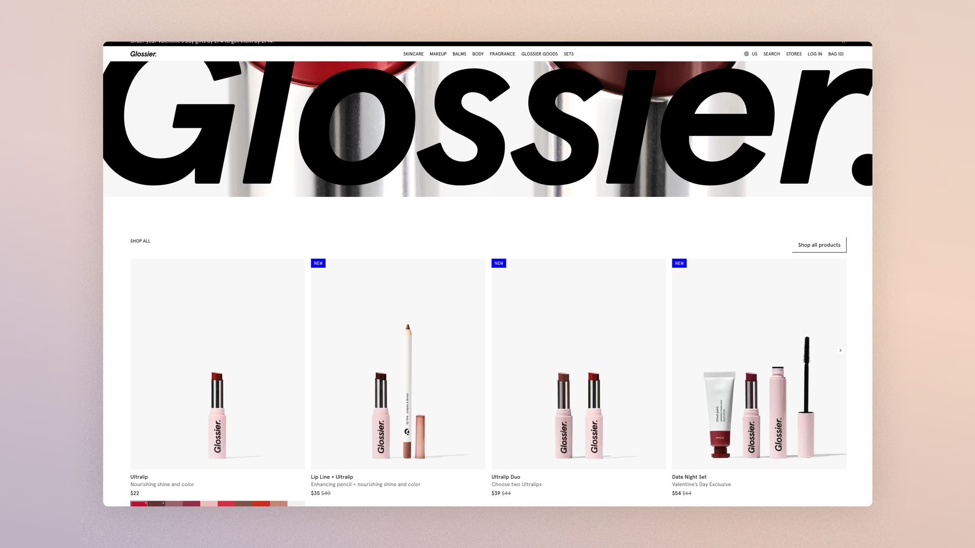
The search bar should stay accessible and visible in the header: for intent that's already formed, it's the shortest path on the site, and its full audit deserves its own read.
If the first section below the hero shows the eight best sellers with prices instead of a brand image block, then the click-through rate to product pages will increase for new traffic, because the table of contents answers the question before the visitor gets tired of asking it.
Social Proof: Trust in Layers
The homepage carries the credibility load for the entire session, especially for first-time visitors who only know the brand from an ad.
The checklist devotes five checkpoints to it, which work as distinct layers.
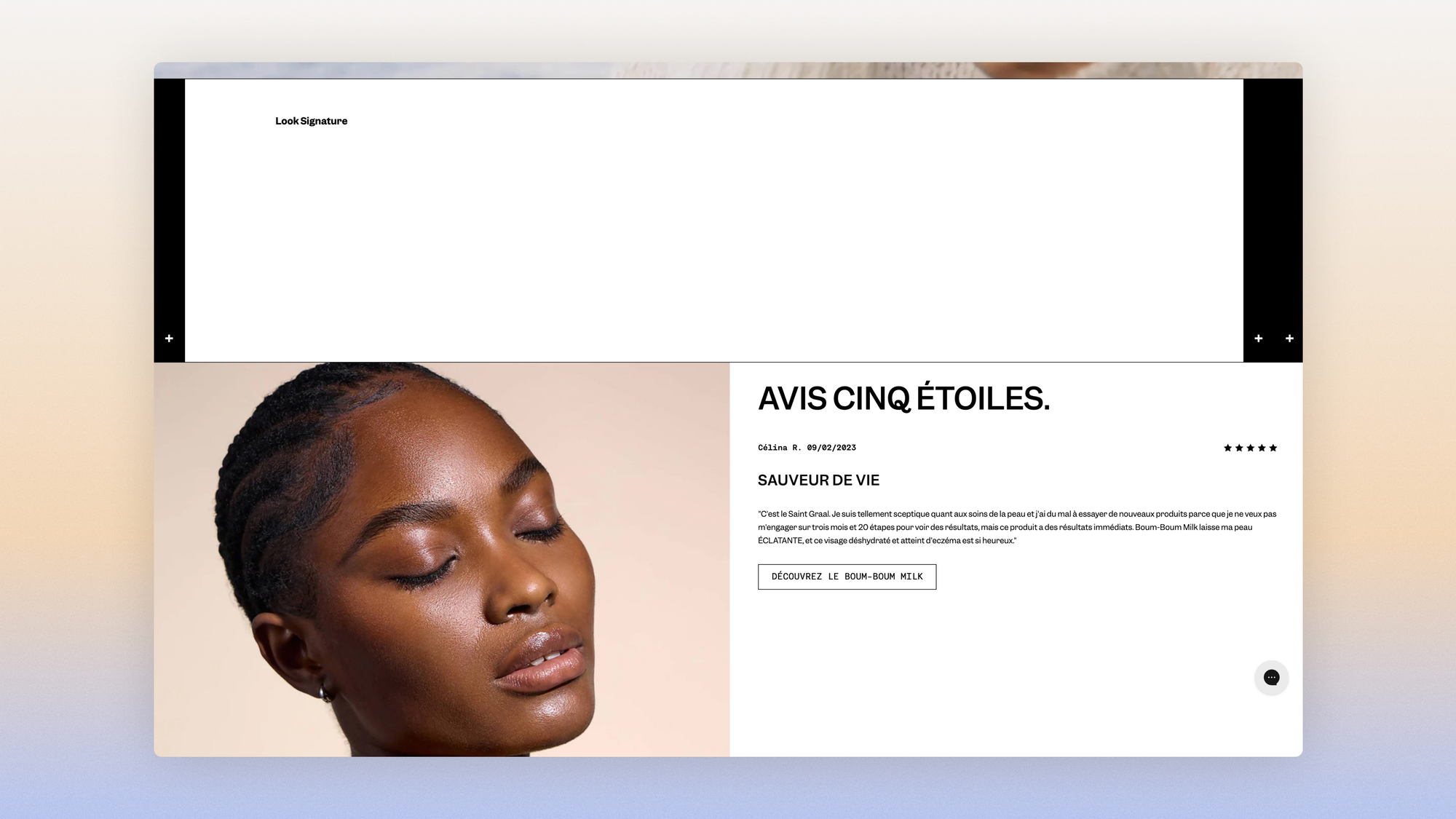
- Customer reviews are featured, and their certification is visible (Trustpilot, Avis Vérifiés): an uncertified review is just text, a certified review is proof.
- Press mentions and celebrity endorsements bring outside validation, in a discreet banner: three logos do the job, ten make a trophy wall.
- User-generated content shows products in real life; we devoted an entire guide to UGC, and the homepage is one of its main stages.
- Certifications and commitments (manufacturing, labels, transparency) are visible for brands where they're the selling point: if the promise is the French workshop, the proof of the workshop belongs in the first scroll, not on the About page.
If a certified reassurance banner (rating, review count, press logo) sits right below the hero, then the click-through rate to product pages for new visitors will increase, because credibility gets checked before product interest kicks in.

Email Capture: The Popup That Fires Too Early
The homepage is the site's first list-building surface, and its most common flaw comes down to one setting: the signup popup that appears on load, before the visitor has seen anything at all.
Asking for an email from someone who doesn't yet know what you sell is like handing over a loyalty card before saying hello. The audit checks the trigger: time spent on the site, or a move to a second page, never arrival.
The popup and the embedded capture banner (below the hero or at the bottom of the page) don't compete, they complement each other: the banner captures without interrupting, while the popup captures more but costs you in interruption.
For brands built around drops, an evergreen banner ("get notified about the next drop") recruits subscribers with stronger intent than a welcome discount.
And in both formats, the forgotten rule: someone who's already subscribed should never see the same signup prompt again. The block changes (next drop, new arrivals since their last visit) or disappears.
If the signup popup triggers on the second page rather than on arrival, then the signup rate per session won't drop and engagement on new visits will increase, because moving the ask until after the first sign of interest doesn't kill the desire to subscribe, it gives that desire time to form.
What the Homepage Doesn't Have to Do
Here's the paragraph redesigns forget: the homepage is not the main entry point for your paid traffic. Catalog campaigns land on product pages, SEO lands on collections and content, and the homepage mostly receives two groups: direct and branded traffic (people who know you or are checking you out), and internal bounces from people heading back up to get their bearings.
This reality changes the audit. The homepage doesn't have to say everything: it's talking to people who have already heard your name, and its job is to confirm and then direct, not to win people over from scratch. Part of this branded traffic also comes for one thing only: to check you out.
Someone who googled your name after seeing an ad isn't looking for your products. They're looking for your reviews, your return policy, a sign that you really exist. For them, the trust layer comes before merchandising, and a homepage that shows them products answers a question they didn't ask.

The audit habit that follows: segment homepage data by traffic source. Branded traffic checks, social traffic discovers, and the same page rarely serves both without a trade-off.
These checkers have, incidentally, gained a colleague: the AI agent that evaluates your brand before recommending it reads the same page with the same questions, but answers them through structured data rather than design. That's precisely what a GEO audit measures.
It also benefits from not being one-size-fits-all along a second axis: the returning visitor and the prospect who's checking you out don't want the same page.
On the brand from the opening case, the gap was tenfold: 0.30% conversion for new visits, 3.04% for known visitors.
Serving both with the same top of page is a compromise that satisfies no one. Recently viewed products for one, proof and best sellers for the other: this is exactly the ground of the segmentation we advocate beyond A/B testing.
If known visitors see a "Pick up where you left off" section (viewed products, new arrivals since their last visit) in first position, then their click-through rate to product pages will increase without affecting the experience of new visits, because the homepage will stop making them repeat their journey.
Measuring the Homepage
One metric judges this page, and the opening case showed why: the homepage → product page click-through rate (the Product View Rate of sessions that land on or pass through the homepage). Bounce rate isn't enough; the brand in the opening case had a decent bounce rate and still lost 82% of its French visitors before the first product page. You can stay, scroll, admire, and never enter the catalog.
Below that metric, measurement goes down to the section level: the click rate of each homepage block, read in Clarity click maps or through link tracking. This is the tribunal of sections: one that generates neither clicks nor qualified scroll hasn't earned its place, whatever its political weight in meetings.
Our test comes down to one ratio: rank sections by share of clicks, compare that to their share of screen area, and any section whose area is more than double its share of clicks is a candidate for removal or demotion.
FAQ
What should go at the top of an e-commerce homepage?
Three elements on the first screen: an explicit value proposition (what you sell, for whom, why you), a visible CTA that leads to the shop, and a credibility signal (certified review rating, press mention).
The brand visual sits alongside these three elements; it doesn't replace them.
Should you use a carousel on the homepage?
For the marketing carousel in the hero, the benchmark data is unambiguous: 1.07% of visitors interacted with the carousel, and 84% of those rare clicks went past the first slide.
A three-slide carousel is, in practice, a page that has given up on choosing its message. The best alternative is a committed static hero, or a direct visual choice between two or three entry points that the visitor activates themselves.
One important distinction: this condemnation targets the marketing banner carousel, not product image galleries, whose interaction is massive and which our product page guide recommends without reservation.
How many sections should a homepage have?
The right number is the one your click data justifies, and it's almost always lower than the current number.
A structure of five to six sections covers the essentials: hero with value proposition, product selections, certified reassurance, social proof or UGC, entry to collections, email capture.
Every additional section has to prove its click rate, or it dilutes the ones that are working.
Get the complete checklist
The homepage checkpoints, with their impact and cost scores, explanations and visual examples, are part of the 194-point CRO checklist, available in a duplicable Notion database reserved for Conversion Club members.
 Jérémie Werner
Next guide in the series: the cart, the last sales page on the site.