White space is the empty space between and around the elements of a design. It's also called negative space, and it's far too often overlooked.
When people design a web page, many feel a voracious urge to fill every inch, as if afraid of wasting precious space. Every pixel counts, and no one wants to risk a user missing a decisive piece of information or an exclusive promotion.
Yet white space is an essential part of information architecture. It should be treated as "an active element, not a passive background," wrote the famous designer and typographer Jan Tschichold in 1930.
"White space should be considered an active element, not a passive background" — Jan Tschichold
In the digital age, attention spans are getting shorter and we sometimes drown in information overload. That is where emptiness should come into its own: a space to catch your breath.
It may seem excessive at first glance, but white space plays a central role in building a satisfying user experience: it improves readability and shapes the user's journey.
From there, it's a short step to seeing it as a powerful conversion tool.
Build a visual hierarchy and improve readability
White space helps build a strong visual hierarchy in a strategic way. Used wisely, it makes content easier to read and, as a result, reduces cognitive load.
And what a relief it is, when you're overloaded with information, to take in a site with clarity.
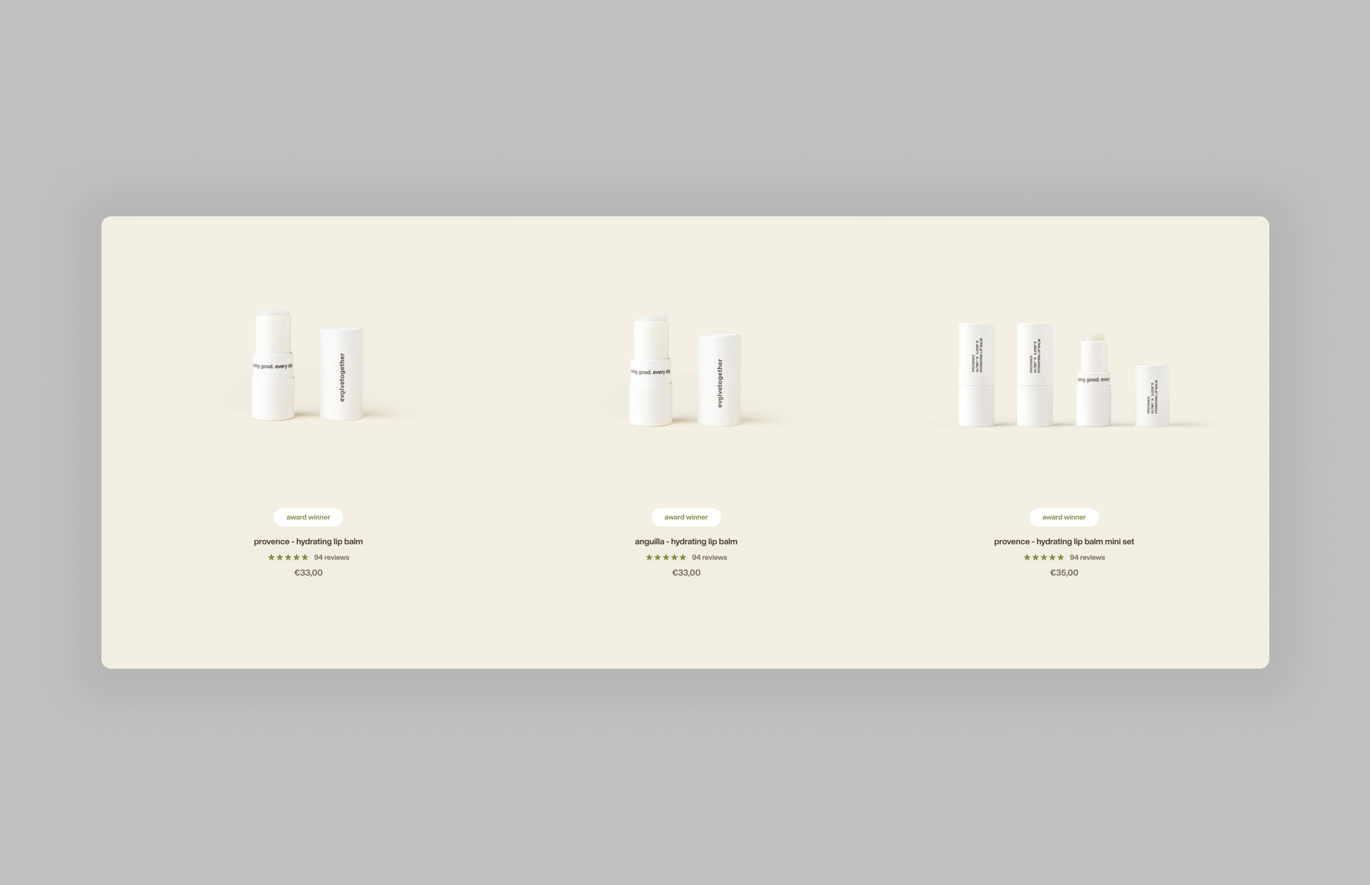
The category page of the e-commerce brand Evolve Together is a good example of how to use white space: by letting the page breathe, the design creates a clear visual hierarchy between the different pieces of information.
Each product is easy to identify, and its details — image, key detail, name, customer reviews and price — are easy to read.
Many other examples could illustrate the impact on conversion: whatever is surrounded by white space stands out, so it's a subtle way to guide users toward decisive elements such as calls to action.
White space therefore serves a dual purpose: it improves readability and sets a visual hierarchy, two essentials for better UX and higher engagement.
Shape brand image and build trust
White space is a powerful way to assert a brand's identity and values.
Depending on context, it can signal exclusivity, innovation or sophistication, and shape perception and personality. Many brands — especially in the premium and luxury segments — have understood this well.
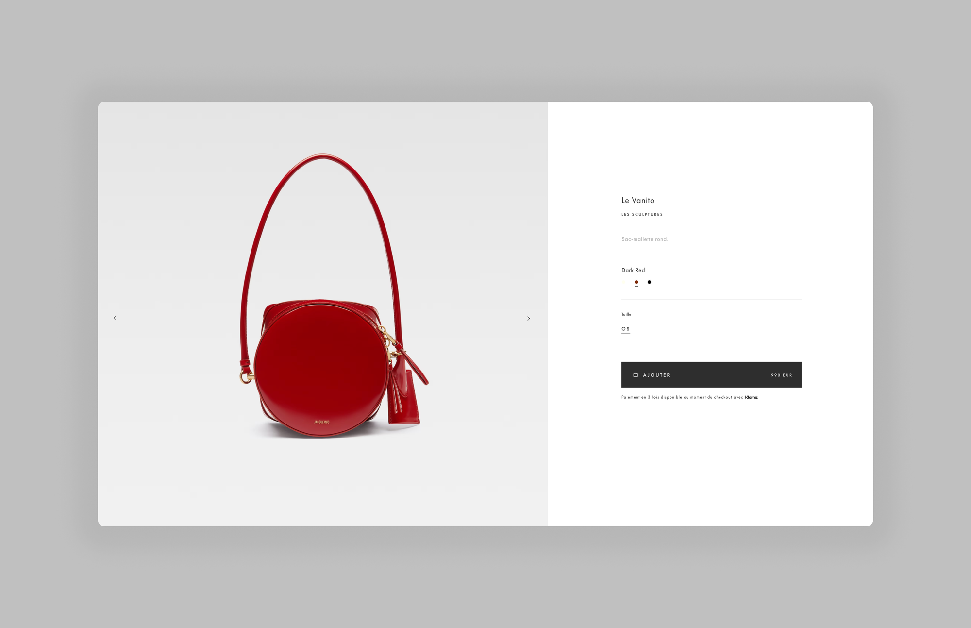
Take a product page on the Jacquemus site: there's very little information, yet everything is said. If we study the page structure in detail, we can identify 3 key zones:
- The packshot, which uses a gray background to showcase the product
- The Buy Box, which breaks down into 5 key zones: the product title and category, an ultra-short description, color options, size options, and add to cart
- Information and reassurance elements: details, shipping and returns, help
The generous white space around each element creates a refined overall look and reinforces the brand's high-end feel.
More broadly, a well-thought-out design with white space can give visitors a sense of trust and credibility. In e-commerce especially, first impressions count, and a well-organized, visually appealing site builds user trust.
If everything is said in few words, and each element is clearly highlighted by negative space, there's nothing left to hide, and the brand's credibility comes out stronger.
Optimize the mobile experience
The rise of mobile brought a challenge: saying as much as on desktop with less room, or at least a different layout of the space. Without a doubt, a strategic balance of white space keeps content readable and accessible across screen sizes.
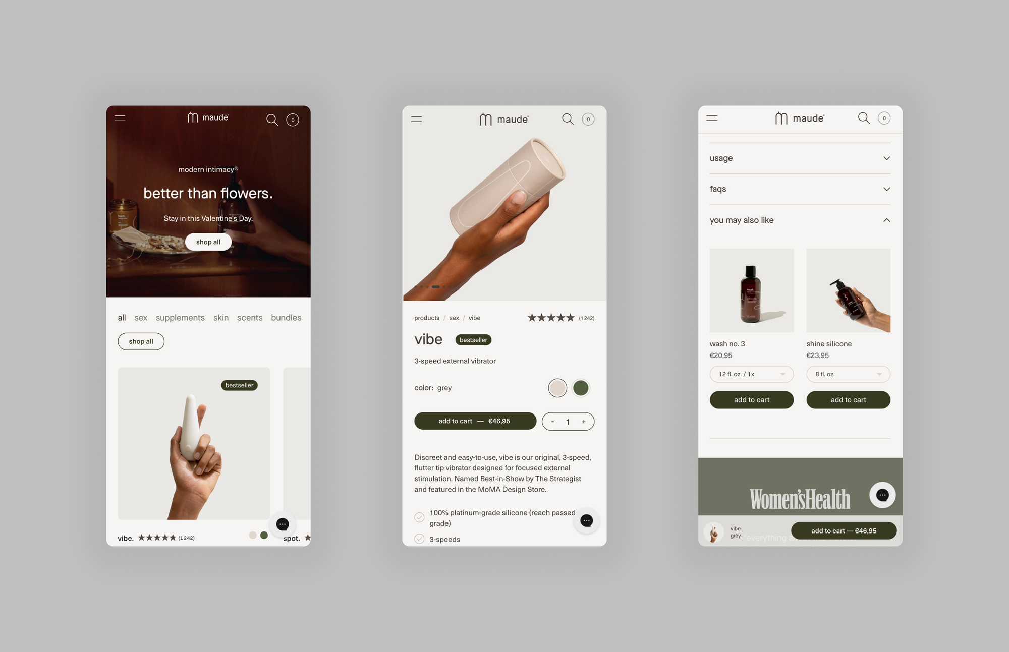
The brand Maude offers an excellent example on its e-commerce site, using white space wisely to keep its user interface balanced and harmonious on every device.
With a clean interface where every zone is clearly identifiable and information is carefully prioritized, the brand makes its content highly accessible. Skillful use of white space encourages users to explore the site further and spend more time on it, which leads to a lower bounce rate.
Beyond readability, white space on mobile plays a crucial role in the interface's usability. Remember the context: a small screen shows many links close together, and the user will tap only one.
In Maude's example, it's clear that everything was designed to make the expected actions easy: browsing the categories, adding one or more products to the cart, viewing their details or the FAQ, and finally encouraging up-sell and cross-sell.
When space is used thoughtfully, it plays a decisive role in creating a responsive design and improves user engagement, contributing to the overall success of an e-commerce site.
In summary
White space is a powerful way to assert a brand's identity and values.
Depending on context, it can signal exclusivity, innovation or sophistication, and shape perception and personality. Many brands — especially in the premium and luxury segments — have understood this well.