You may have been told that e-commerce is a pure optimization game: ultra-optimized product pages, CTAs always in view, explosive promotions packed into a pop-up ready to burst.
A series of screens, each calibrated to the millimeter.
That picture exists for good reasons. It evokes sites we've all come across, most of them with wide catalogs, commodity products and volume-driven logic.
Some brands choose to step away from it, and thank goodness!
A choice to make
Some e-commerce stores dare to make radical visual choices, strip down their navigation and build their product pages like magazine pages.
Far from being aesthetic flourishes, these choices are strategic decisions with major consequences for positioning, average order value and the way a brand earns legitimacy.
Three brands illustrate this strategy particularly well: Polène, Rains and Jacquemus.
Each in its own way, they use design as a growth driver for their business.
Let's break down their approach.
Is “beautiful” ever free?
McKinsey tracked 300 publicly listed companies over five years in its study The Business Value of Design. The study looks at design in the broad sense (products, services, digital experiences) across three sectors:
- Medical technology,
- Consumer goods,
- Retail banking.
Top-performing companies in design posted 32% higher revenue growth and 56% higher returns to shareholders than their competitors.
McKinsey notably cites an online gaming company whose homepage UX redesign generated a 25% increase in sales.
A study published in Harvard Business Review completes the picture: when buying online, consumers mostly rely on their gut, and that gut feeling is largely fed by visual signals: color consistency, typographic quality, professional page layout.
A well-designed site triggers unconscious reflexes of trust.
The respected Baymard Institute points out that 18% of cart abandonments are directly tied to a checkout process that is too long or too complex.
Friction has a measurable cost.
So neither beauty nor smoothness alone decides conversion. What decides it is the alignment between the brand's intent and what the site lets people experience.
Polène: design as a tool for legitimacy
Polène website homepage
The brand appeared ten years ago in a market where some players have been established for more than a century. Hermès, Vuitton, Longchamp, to name just a few.
These are houses whose reputation is a heritage built generation after generation, validated by history, backed by archives and told by the media.
Polène doesn't have that capital, yet its site holds its own.
Taking a position
Minimalist navigation, product photos in natural light, a carefully crafted palette, a chosen typeface, zero commercial noise. It's miles from the dense product grids of marketplaces and the promotional banners found on a good share of DTC sites.
In June 2025, polene-paris.com recorded 1.57 million monthly sessions, a conversion rate between 1.0 and 1.5%, and an average order value of $350-375.
Revenue skyrocketed: from €61M in 2022 to €137M in 2023, or +125% in one year. (Source)
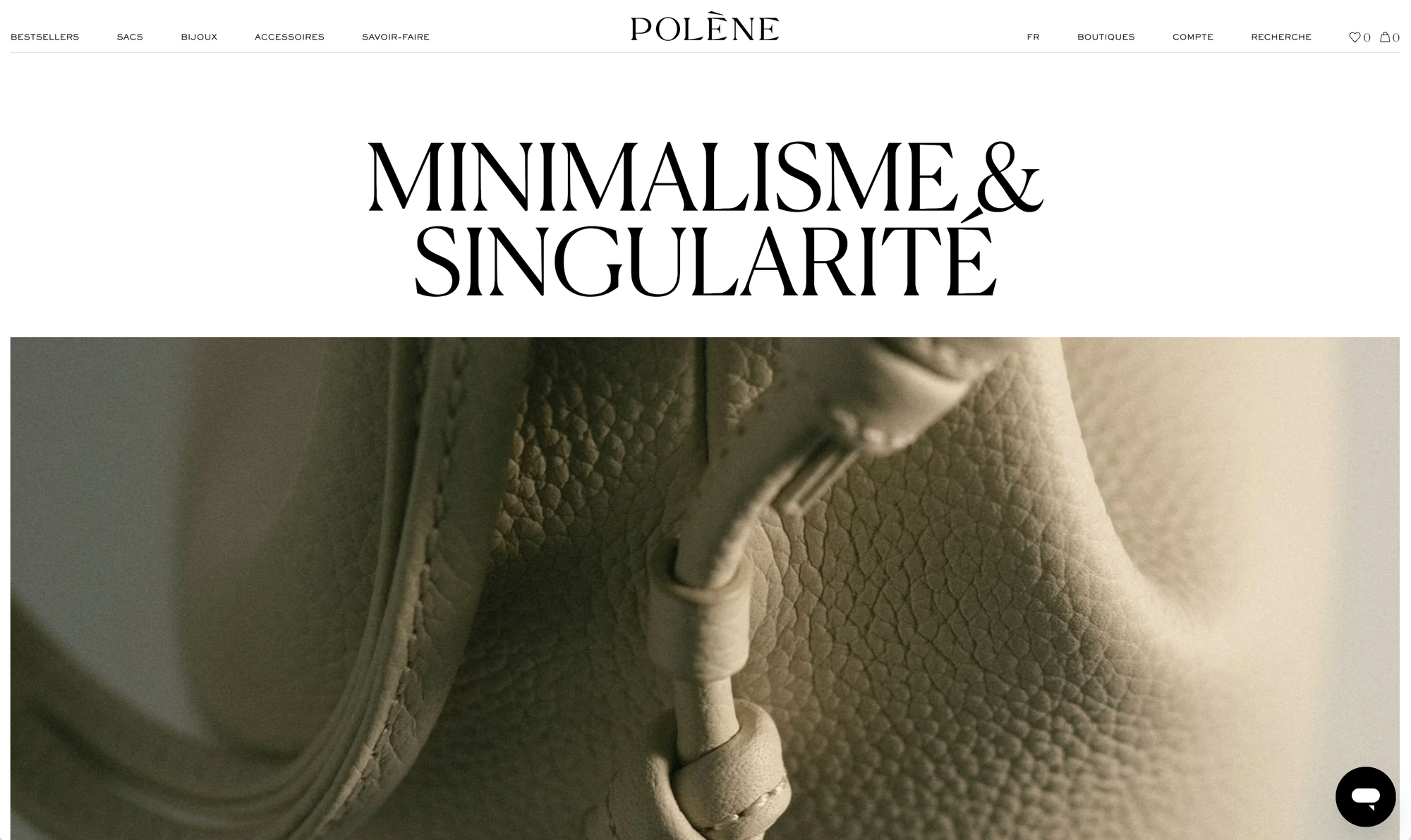
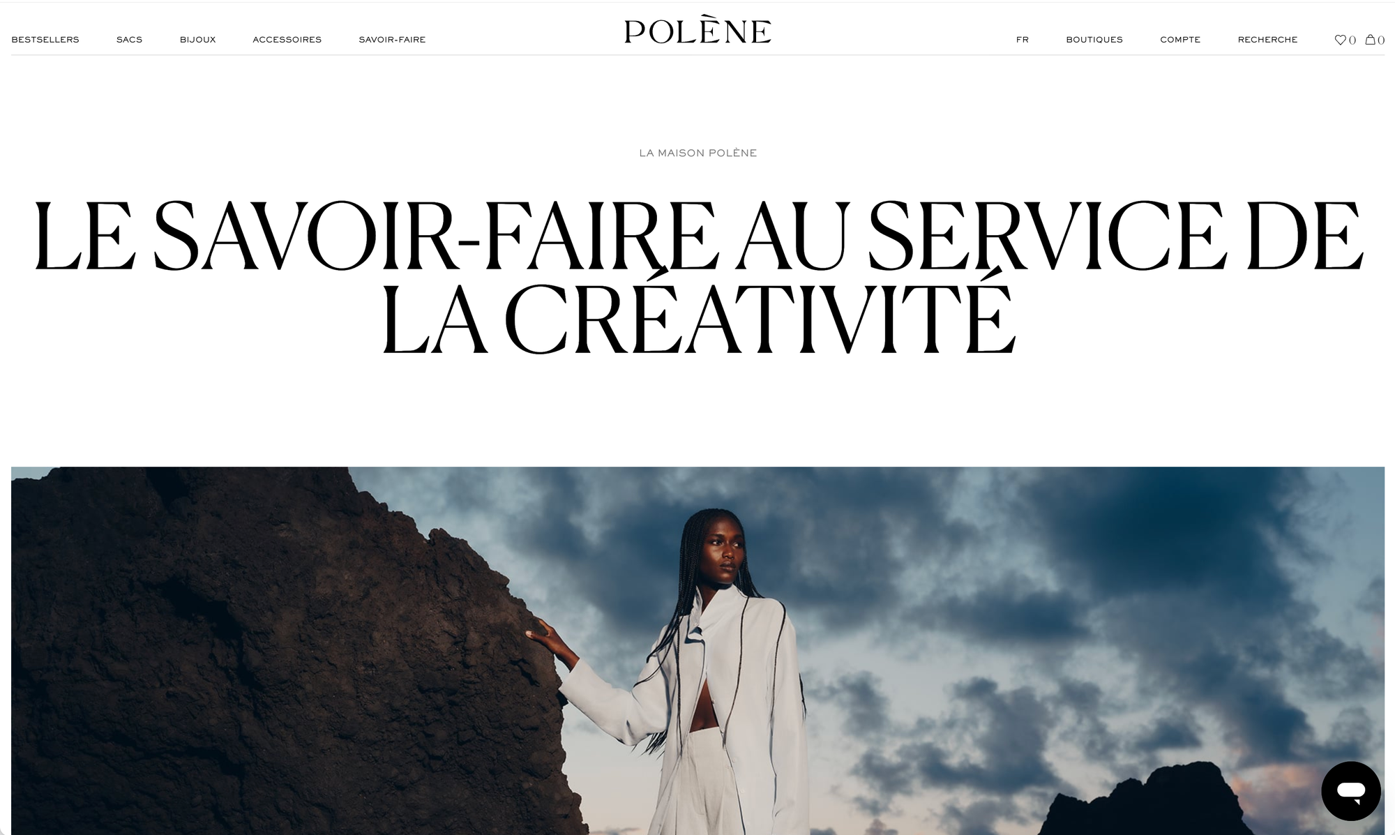
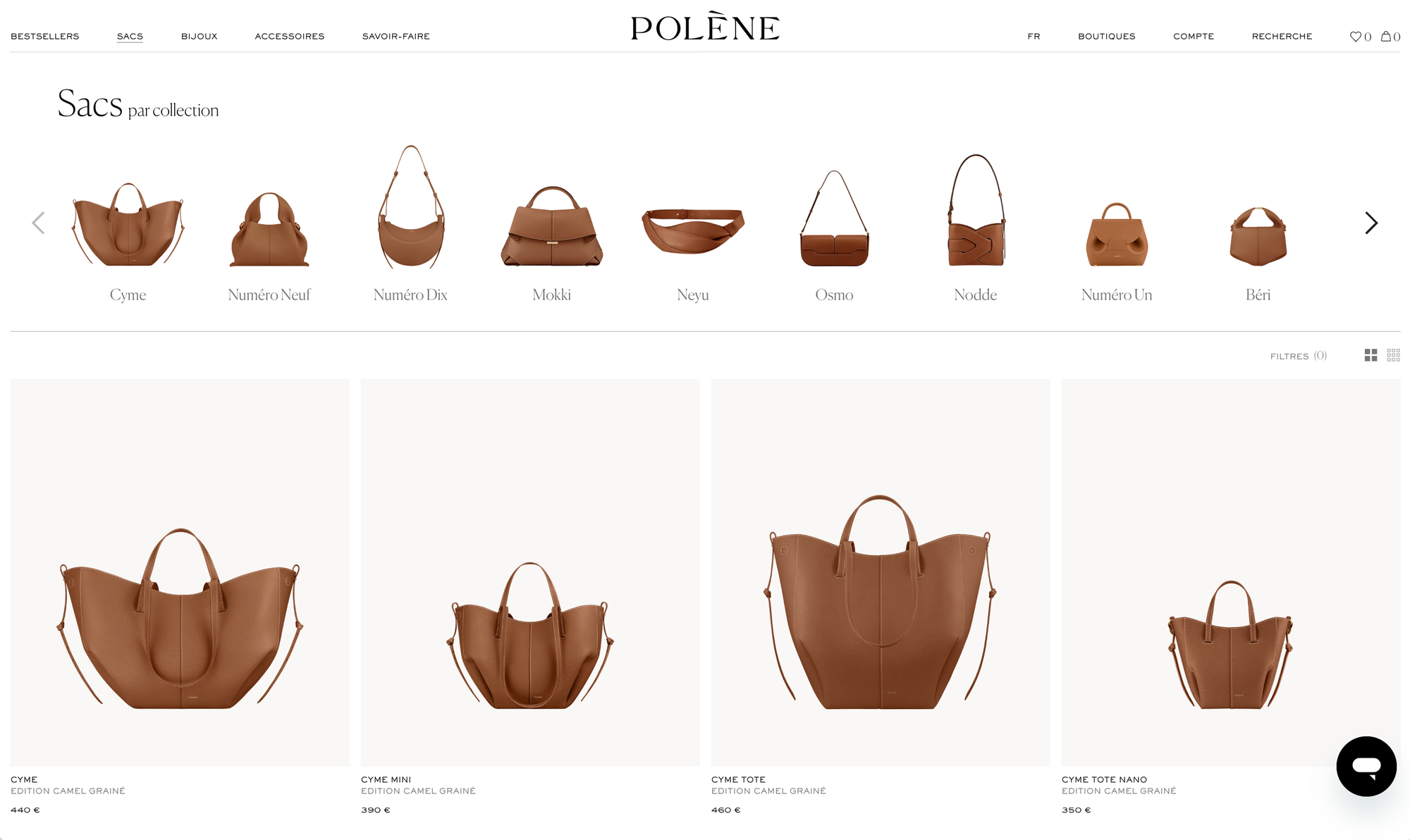
Site screenshots
The lesson here is subtler than a naive “beautiful does convert.”
Polène's design does the job that age does for century-old houses: it builds credibility.
Attention to visual detail becomes an implicit promise of product quality. Visual storytelling builds what the brand can't yet claim through its history.
Polène uses design to buy time, to position itself right away where others took a century to arrive.
It's a strategy of legitimacy through aesthetics.
Legitimacy can also come from a smart UGC strategy:
 Jérémie Werner

Rains: design as a category shift
Rains website homepage
Technical and rain apparel, in the popular imagination... isn't sexy.
Think K-Way, Salomon, Patagonia, The North Face. Respected, often loved brands, but their purchase criteria are clearly defined: build quality, materials, durability, performance in wet weather.
You shop there for functional reasons, not to get dressed up.
Rains chose to step out of that framework.
Clean backgrounds, full-screen visuals with cinematic lighting, carefully styled models, bold typography. The product pages look more like a premium ready-to-wear lookbook than a technical rainwear spec sheet. The message, without a word said: “we're not K-Way, we're not Salomon.”
And the numbers follow.
Rains reached 721.5 million Danish kroner (~€100M) in revenue in 2024, a record for the brand. (Source)
Design doesn't decorate, it shifts the category.
It pulls Rains out of the “technical” mental shelf and moves it into the “fashion” world.
It's not a redefinition of the product (a Rains raincoat is still a raincoat). It's a redefinition of the buying framework.
Visitors are no longer comparing technical specs against three specialist competitors: they're choosing a piece of clothing with style. This shift allows different pricing, a different mental shelf, different purchase trade-offs, and above all, it opens up a customer base that purely technical players don't reach.
It's a strategy of segment repositioning through aesthetics.
And it plays out largely on the site, because that's where visitors form their judgment of the category before they've even read a product description.
Product availability and the way you communicate around launches can also help build attachment to your brand. Check out our dedicated article on the topic👇
Jérémie Werner
Jacquemus: digital built to deliver consistency created off-site

Jacquemus's reputation isn't built on its website.
It's built on 500-meter runways in Provence lavender fields, on presentations at the Château de Versailles, on viral CGI campaigns (giant bags rolling through the streets of Paris), on Instagram, through ambassadors, in pop-ups.
These spaces share one trait: the brand doesn't fully control its content there.
The algorithm reformats it, users make it their own, the media put their own spin on it, influencers reinterpret it.
In this ecosystem, the site plays a very specific role: it's where the brand lays out its world, its narrative, its palette, free of interference.
It's the only digital space where Jacquemus controls absolutely everything: the typography, the layout, the rhythm, the silences between images.
Hence the visually “editorial” choices, far from classic e-commerce conventions: no dense product grid, no promotions, deliberately minimal navigation.
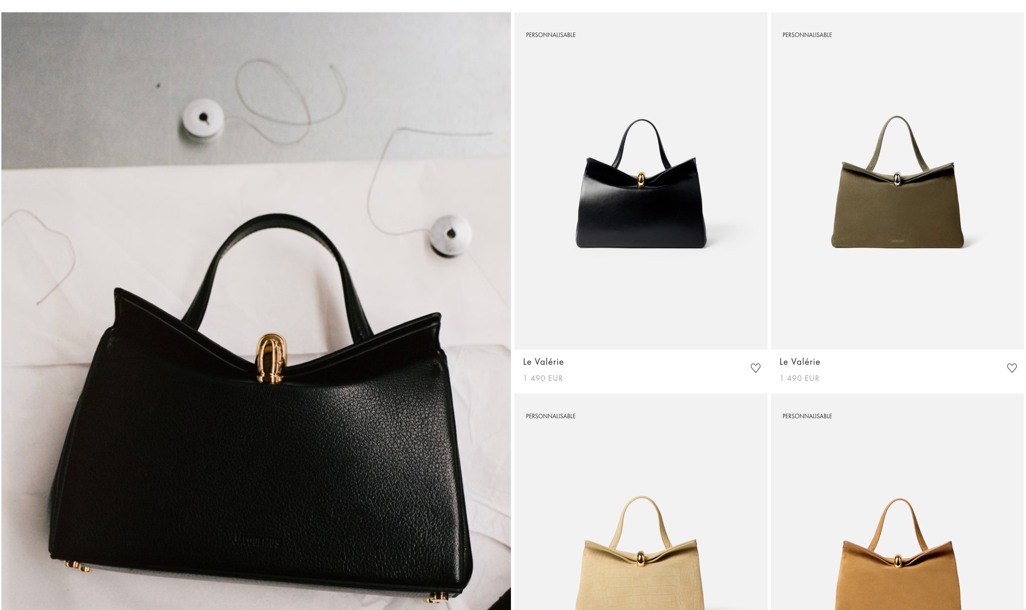
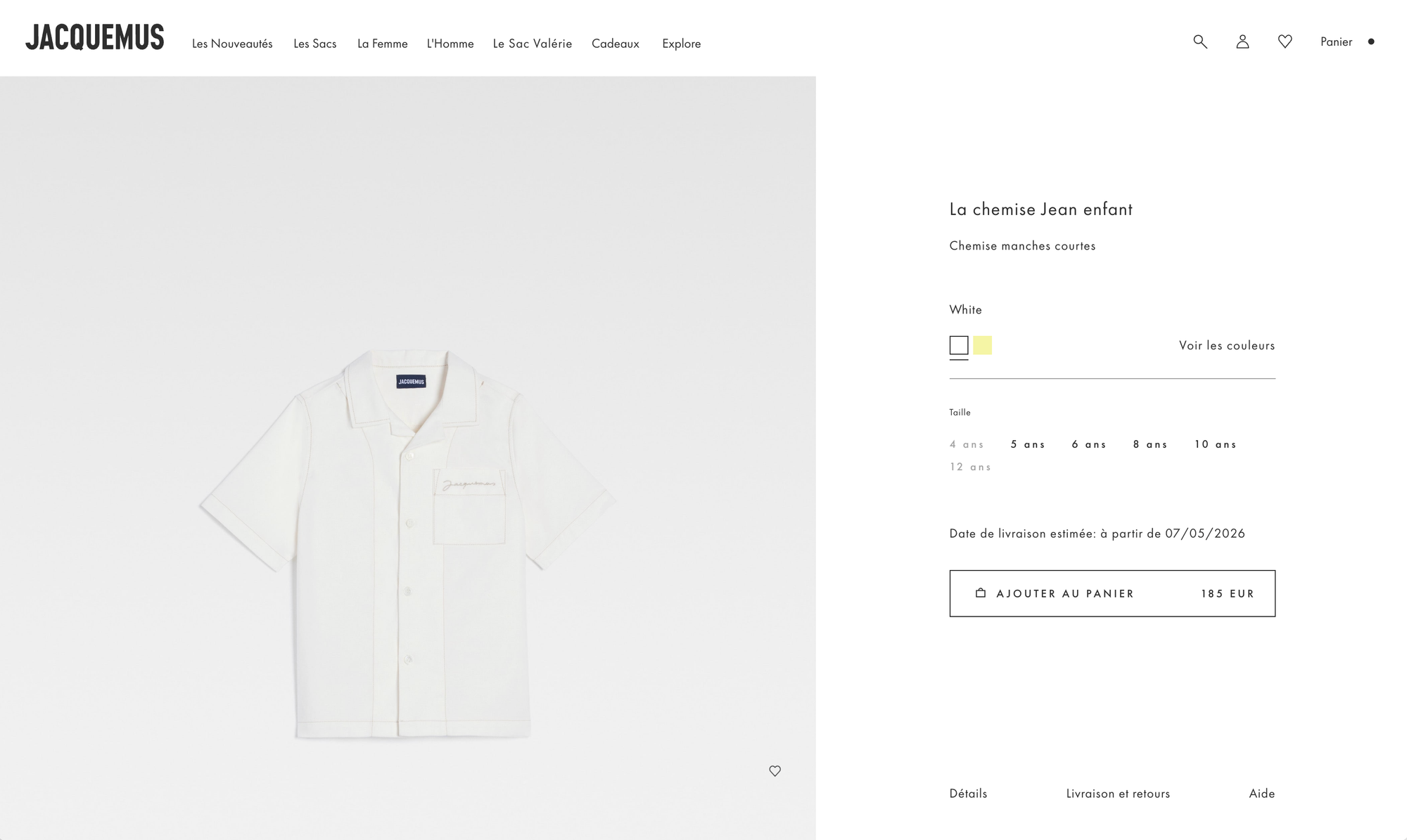
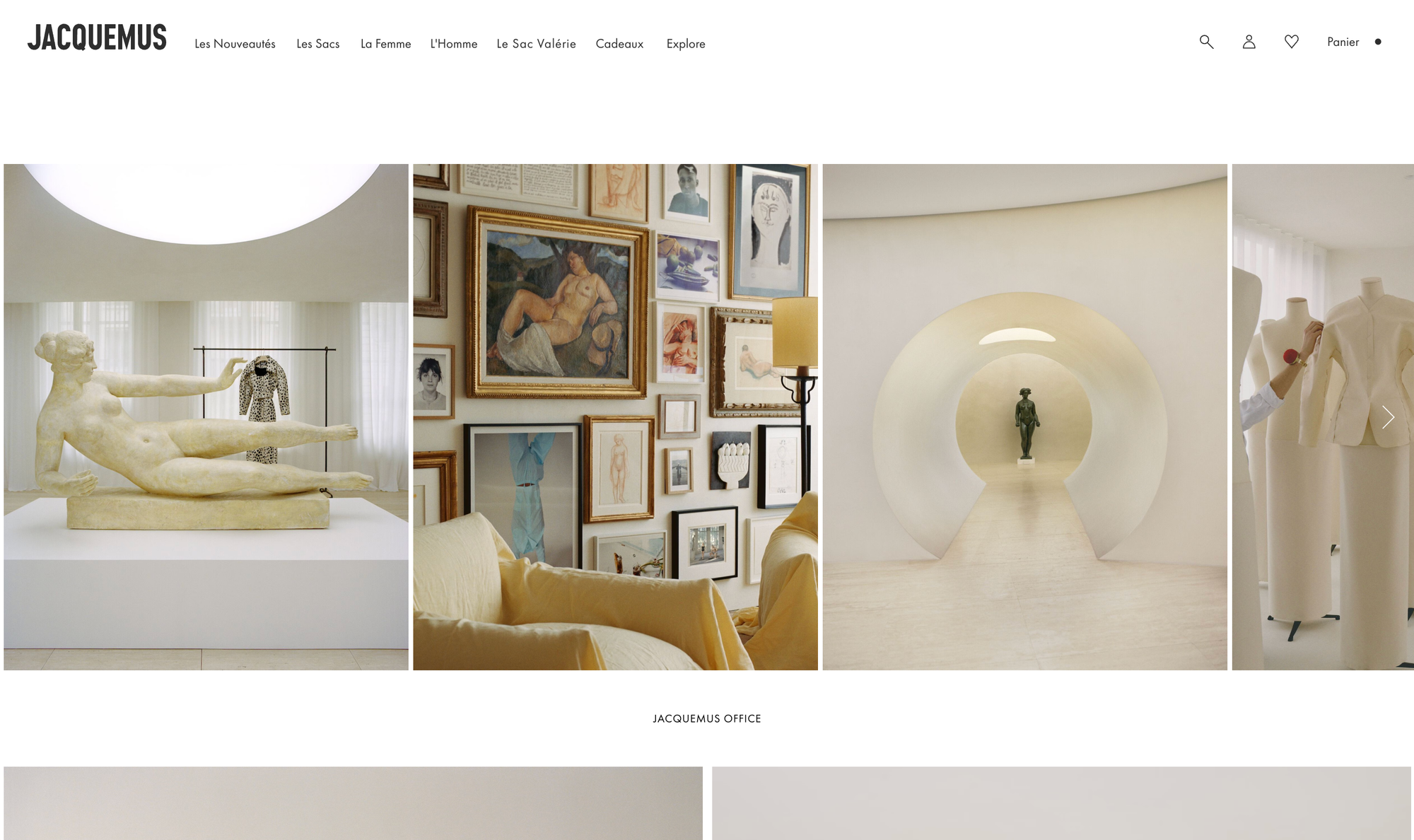
Screenshots of the Jacquemus website
On paper, this approach could hurt product discoverability.
In practice, direct traffic accounts for 38% of visits, a sign of a brand so well known that people come because they already know what they're looking for. The e-commerce conversion rate hovers between 0.5 and 1%, which may look low in absolute terms but is perfectly consistent with an average order value of $400-425 and an ultra-premium positioning. Measured by revenue per visitor, performance is solid.
The brand remains independent and profitable.
Jacquemus's site is a brand platform, a digital embassy.
Its job: to keep a world consistent when, by design, it spreads across every other channel. It dresses the brand more than it sells it. It doesn't need to “hard sell” anyway, because desire was built upstream, in spaces with far greater viral potential.
It's a strategy of brand-world consistency for a brand whose reputation plays out mainly off-site.
Creating tension can have a positive effect for your users and your e-commerce store:
Robin Marzin
What these three brands show us
None of these three brands chose to break free from “classic e-commerce conventions” out of pose or personal taste.
They did it because those conventions didn't serve their positioning, and adopting them would have diluted their message in a language that isn't theirs.
That's ultimately the question every brand should ask when faced with the demands of “best practices.”
How can my site's design convey the personality of my brand, my offer and my products?
For some brands, breaking free from classic e-commerce conventions is neither a luxury nor a whim.
It's the only sincere way to exist.
To go further:
Zoé Bruzzese