Why your customers leave the product page (not the checkout)
As a digital mentor at the Fédération Française de Prêt à Porter Féminin, I've helped dozens of fashion brands better understand their e-commerce performance.
In my first conversations with brands, I often find that many of them think conversion optimization happens at the bottom of the funnel: abandoned carts, blocked payments, surprise shipping fees.
It seems logical, so that's where everyone looks.
To make up for the lost revenue, the reflex is simple: quick, quick, quick, stack up trust badges, install an express checkout, even trigger exit popups. And after all, it's a shame: you went to all that trouble (and spent thousands of euros on ad campaigns) to bring your visitors this far, so it makes sense to try to nudge them to complete their purchase.
Yet conversion barely moves, and no one understands why.
Fashion E-commerce CRO: 20 Microsoft Clarity Patterns
The cart is a symptom, never a cause
The reason fits in one sentence: in fashion, the cart is a symptom, never a cause.
By the time shoppers reach the cart, they've already decided. The real friction sits higher up, on the product page and the collection page, at the exact moment they try to decide whether this dress, these jeans or this coat looks like who they are or want to be.
That decision isn't blocked by checkout UX but by a stack of signals you chose yourself, months ago:
- the type of photography you commissioned,
- the way you describe your fabrics,
- the structure of your size guide,
- how your prices relate to each other,
- and the quality of your visual production.
An emotional reading of their sessions tells you why they freeze. This article goes one step further upstream: the visual and sensory decisions that create those emotional frictions in the first place, months before a single shopper lands on the page.
How each check leaves a signature in Clarity
To understand why your PDP sessions drag on without converting, go back to what shoppers did in a physical store before buying:
- See the garment from several angles, on a body
- Touch the fabric: its weight, its hold, its finish
- Try it on to check the cut, the proportions, the movement
- Look in the mirror: does this look like me?
- Justify the price based on what the first four steps revealed
Online, fashion shoppers generally repeat all or some of these actions and try to answer their questions with whatever the page gives them.
And here's where it gets interesting: every check that fails leaves a distinct behavioral signature in sessions.
Repeated zooms, back-and-forth between images and reviews, switching between two sizes: these are simply the digital versions of holding a garment up to the light to check the seams.
Baymard's Apparel & Accessories research, which covers more than 1,720 UX issues spotted across the thirty most visited sites in the world, confirms it: fit, fabric and photography are consistently the most tense areas.
A product page is where someone arrives with a real hesitation, sometimes tiny, sometimes very solid, and where the brand has to help that hesitation turn into certainty
Certainty is built upstream, in shoot and copywriting choices, not downstream in reassurance micro-copy.
Related reading
 Robin Marzin


The CRO strategy behind well-chosen product visuals
Most fashion teams think of photography as creative direction within the brand world. That's true, but it's also, and I'd even say above all, a strategic lever for driving conversion.
In our work as CRO experts, image and performance often clash, and that clash is exactly where e-commerce loses the most silently, even more so for a fashion brand.
The implicit contract
Every visual is an implicit contract with the shopper. It sets what can be verified online and what can only be confirmed once they hold the product. Understanding this is a prerequisite for any visual optimization.
A Kind of Guise offers a rich selection of product visuals
Ghost mannequin: structural confidence, zero projection
The ghost mannequin photo maximizes structural confidence by showing the cut, shape and proportions without ambiguity.
It creates no projection and stays factual, and that consistency often helps keep the product return rate under control.
However, it offers no identity projection: no body to picture yourself in, no aspirational anchor.
For well-made basics, it converts fine. For a statement piece (a coat, a dress, a signature accessory), ghost-only imagery produces a very recognizable behavioral pattern.
Behavioral signature in Clarity : lack of confidence
- long zoom sessions,
- repeated image cycles,
- exit without purchase
Worn visual: identity projection and the risk of a body mismatch
Conversely, a worn product visual maximizes identity projection by saying:
"This is who wears this piece, and this is how it drapes on a body".
But the body, and even more the aesthetic of the person shown, matters. When the model's body type is far from the buyer's, you trigger fit anxiety instead of aspiration.
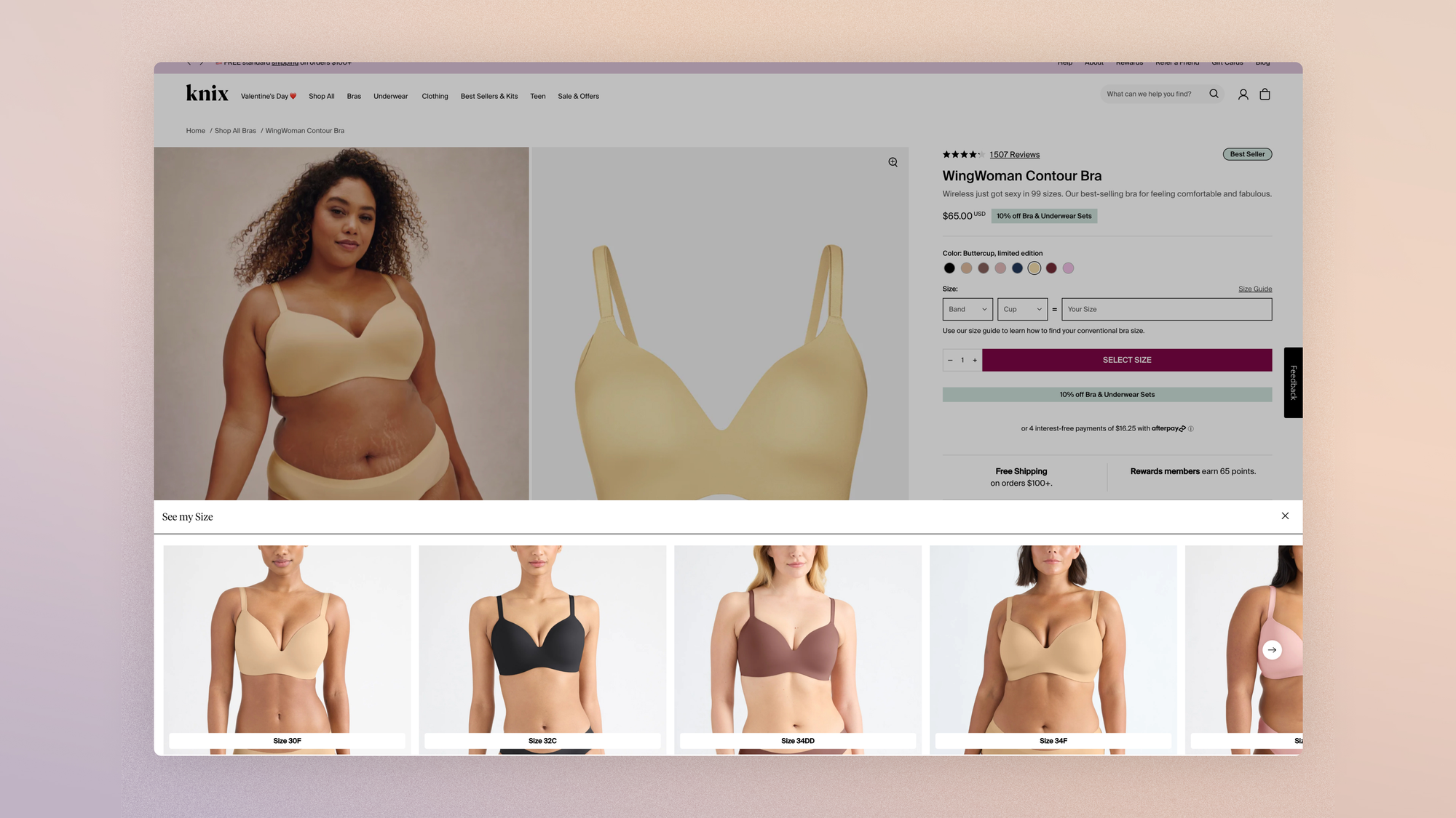
Behavioral signature in Clarity: inability to identify with the model
- detailed inspection,
- scrolling back up to look for markers (model size, size worn),
- looking for other models,
- exit when there are none
Editorial lookbook: the paradox of engagement without conversion
Editorial photography, or the lookbook, maximizes desire and brand mythology. It's also the format that produces the most counterintuitive behavioral pattern:
- high engagement (long sessions, deep scrolling, multiple views)
- paired with low conversion
- and high returns.
Editorial imagery often sells a lifestyle the product alone can't live up to: either shoppers don't convert, or the return rate goes up. That's where good CRO experts make the difference: creating healthy sessions and confirming the impact on the P&L.
Volume and variety: the sensory completeness ASOS put a number on
Adding images changes nothing if you don't think about what each one has to prove. But when the image set is sized to answer the shopper's implicit questions, the effect on conversion becomes measurable and significant.
When ASOS went from 6 to 12 images per item, its mobile conversion rose by about 18%. That's not a creative win. It's a win in sensory completeness: more images means more checks completed without leaving the page.
More interesting still: ASOS also documented the effect of body diversity on the product page. By showing its pieces on two different body types, the brand saw total orders rise 30%, average order value rise 3%, and conversion rate climb 20 basis points.
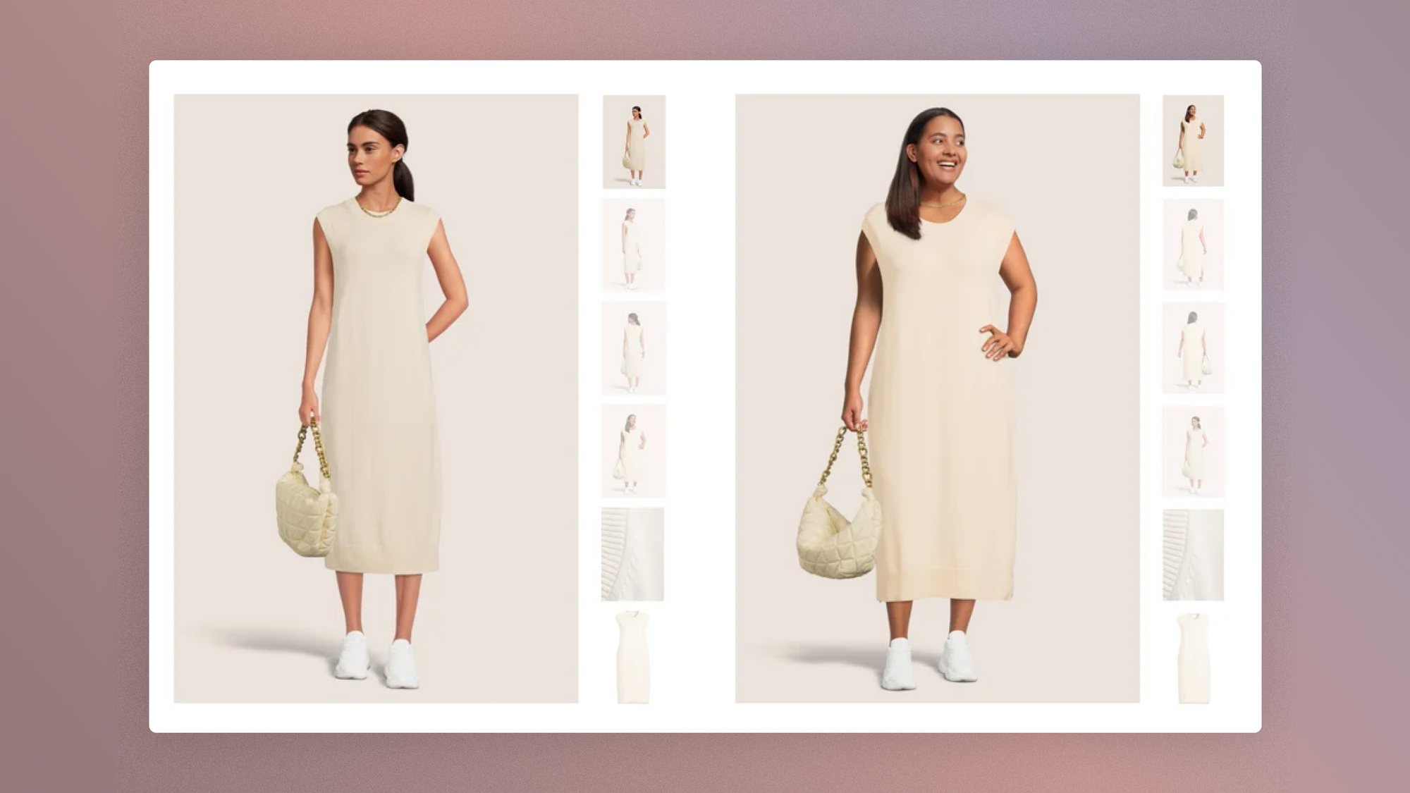
Mapping image roles
Before producing your next campaign, it's worth mapping image roles the way you'd map the roles on a team.
| Image type | Question answered | Question left open |
|---|---|---|
| Model photo | How does it fall? | What are the exact details? |
| Ghost mannequin | What's the structure, the cut? | Would it suit me? |
| Flat lay | What's the silhouette? What's included? | How does it move, at what scale? |
| Macro detail | What's the fabric, texture, finish? | What does the whole product look like? |
| Video in motion | How does it behave when walking? | What are the technical specs? |
| Editorial lookbook | What world does this product belong to? | What exactly am I buying? |
The CRO mistake is picking a single format as if it could do all the work.
Behavioral signature in Clarity: image exhaustion
Here's the pattern that shows up most often in sessions when the image set is too small for the identity question the product raises:
- The shopper lands on the page
- Swipes through all the images
- Zooms in on one or two details
- Scrolls down to the price and sizes
- Scrolls back up to the images
- Goes through the carousel again
- Leaves without adding to cart.
That doesn't mean they "engaged" but rather that the image selection never answered their question.
CRO actions to test to optimize your images
Move beyond the "more images" mindset and into a mindset of image roles. Every addition should close an identifiable question:
- A full-body photo with the model's size and the size worn annotated
- A back view
- A macro close-up of the texture
- A short video in motion
- A scale image (especially for jewelry, bags, accessories)
- A natural-light photo, for color accuracy
- A "styled with" image linked to the full outfit
For a premium fashion brand, a good product page isn't just beautiful, it's also visually diagnostic.
On how a fashion site's design becomes a positioning driver (and not an aesthetic nicety), I'd point you to Jonathan Sobota's analysis of three brands that made design their real strategic variable.
Related reading
 Jonathan Sobota

Fabric description: why "100% cotton" kills your conversion
I've analyzed hundreds of brands, and it's clear that very few fashion brands treat fabric copy as a CRO asset.
Most write "100% cotton" or "Italian wool blend" and consider the job done (if that's you, don't panic: a useful surprise is waiting a bit further down).
In practice, it's a missed signal, and a particularly costly one on premium pieces, where shoppers commit several hundred euros without being able to touch the fabric.
I won't go as far as saying a classic "100% cotton" is like a customs declaration, but let's be honest: it says nothing about how the fabric drapes, ages, wrinkles, and behaves in the light.
And if the piece is fairly expensive, it ruins your conversion.
Embodied simulation and the sensory lever
Now imagine that with rich, specific fabric information, you could generate up to 30% more add-to-carts.
The reason is simple and widely studied: in psychology, texture descriptions trigger an embodied simulation, a tactile mental representation that partly stands in for physical touch.
When you give shoppers a sensory anchor, you remove an entire class of pre-purchase hesitations that no checkout optimization will ever solve. All it takes is anticipating the questions:
- Is it soft or dry?
- Is it thin or dense?
- Is it see-through?
- Does it wrinkle?
- Does it stretch?
- Does it drape or hold its shape?
- Will it feel premium?
Behavioral signature in Clarity: sensory search
When the fabric copy doesn't provide these answers, shoppers enter a very recognizable search cycle:
- They look at the visuals
- Zoom in on the texture
- Scroll down to the product details
- Open the composition accordion
- Scroll back up to the images
- Zoom in again
- Leave or go back to the collection
This pattern intensifies with price. Cashmere, silk, linen, leather, premium denim, fine jewelry finishes, ceramics: the higher the price, the more sensory proof is expected.
CRO actions to test to optimize your product descriptions
Replace the generic composition with a sensory story. The rule: every line must add information that can turn into tactile projection.
| Weak | Better |
|---|---|
| 100% cotton | Dense, brushed cotton, 320 g/m². Warm to the touch, structured enough to hold its line, softens with every wash. |
| 100% linen | Mid-weight European linen with a dry, natural hand. Breathable, lightly structured, designed to wrinkle softly with wear. |
| Gold-plated brass | 18-karat gold-plated brass, polished finish. Light enough for everyday wear, with a bold shine in natural light. |
Also worth testing:
- Macro texture images
- Short touch or movement videos
- Fabric weight indicators (g/m²)
- Transparency notes
- Stretch and drape scale (fluid, balanced, structured)
- Care labels (easy, delicate, dry clean)
For a premium brand, fabric proof is a price justification.
Size guides: why 83% of fashion sites fail
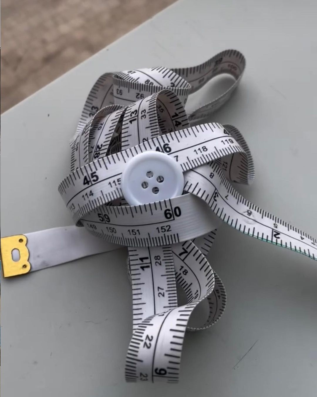
Size anxiety is the silent killer of fashion e-commerce, and almost no size guide lives up to expectations. That's what Baymard reports, in a study finding that 83% of fashion sites fail to provide enough sizing information.
More broadly, SAIZ's research on the behavioral footprints of fit problems shows that these problems appear as underperforming specific size variants, returns concentrated on certain items, conversion gaps between similar products with different cuts, and unusually cautious browsing.
In short, no one tells you about a fit problem, but everyone leaves footprints.
Three failure modes: inconsistency, no fit indicator, missing key measurements
To know where to fix things, start by knowing where your guide breaks:
- Inconsistent measurements across products: Shoppers learn that "M" doesn't mean the same thing from one item to the next, become cautious, and abandon multi-product carts.
- No fit indicator: The same XS/S/M/L grid hides whether the piece is fitted, relaxed or oversized.
- Missing key garment measurements: Sleeve length, inseam, total length, shoulder width: these dimensions are missing especially on outerwear and dresses.
Behavioral signature in Clarity: the size guide that doesn't help
- The shopper opens the size guide,
- reads for 5 seconds or more,
- closes it, does NOT add to cart.
Cause: information failure. The guide didn't resolve the question. Fix: rework the guide's content (add fit type, garment length, body reference + size).
Behavioral signature in Clarity: the trust failure
- The shopper NEVER opens the guide,
- switches between two adjacent sizes,
- leaves.
Cause: trust failure. They don't trust the guide enough to even open it. Fix: take the fit information out of the modal and place it directly on the size selector: "S fits Marie (168 cm) in a relaxed fit; M in a relaxed-loose fit."
Sezane is a good example to study: the brand annotates its product pages with the model's size and the size worn, and specifies the fit in the description ("fitted cut," "oversized cut," "straight drape").
It's not revolutionary, it's just fit information placed where the decision is made.
CRO actions to test to optimize your size guide
The size guide shouldn't be a separate document. It should become a set of contextual micro-reassurances spread across the whole product page:
- "The model is 176 cm and wears a S"
- "Relaxed fit. Take your usual size for a looser look"
- "Between sizes? Size down for a close fit, size up for layering"
- "Garment length: 62 cm in S"
- "82% of customers confirm the fit is true to size"
- "Free size exchange on this piece"
Baymard also recommends an aggregated fit sub-score in reviews.
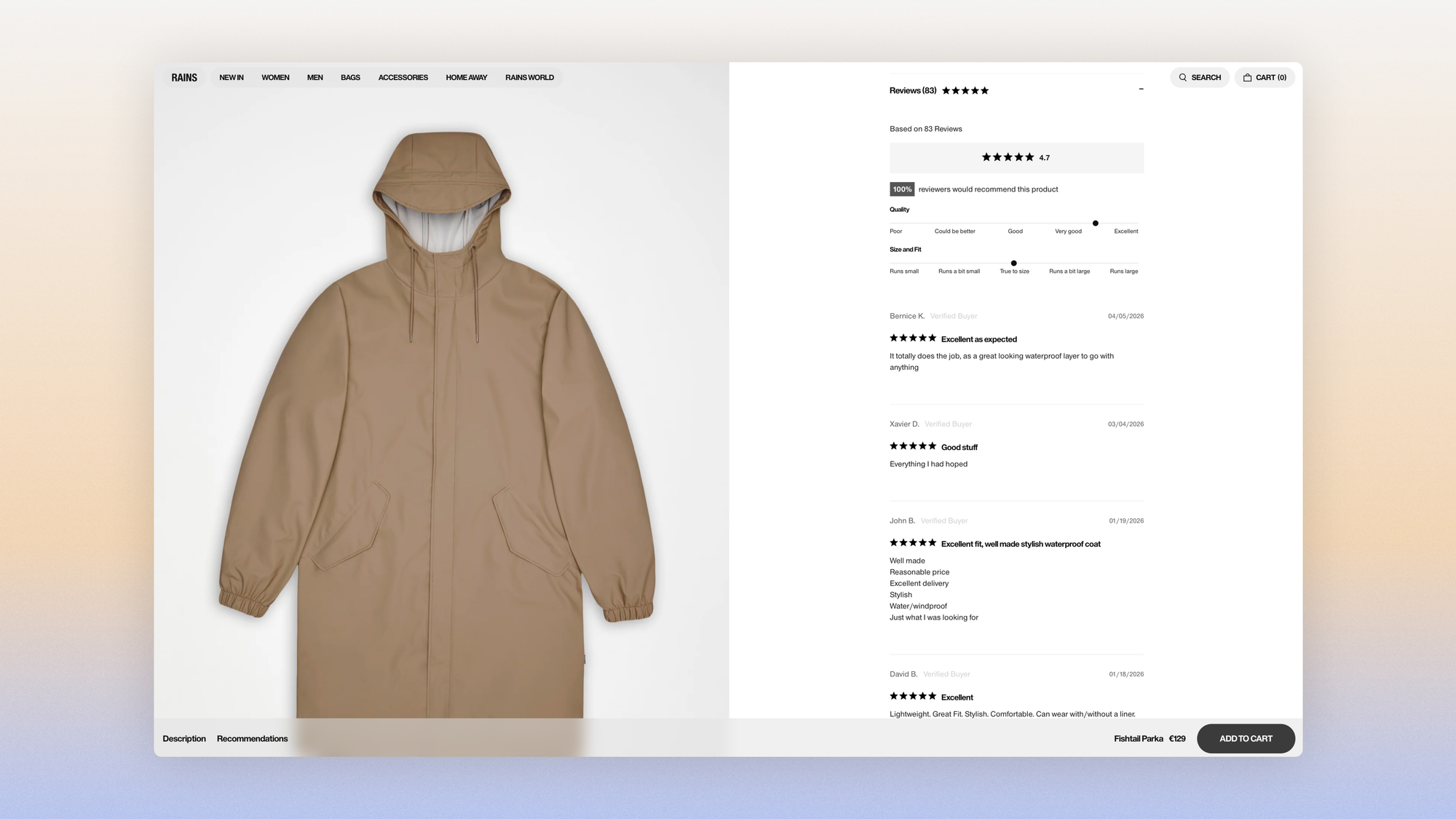
Return anxiety: a pre-purchase signal to address upstream
When the answer to a high return rate is to make the policy more visible at checkout, you're solving the wrong problem. Return anxiety peaks at the moment shoppers choose their size and fabric on the PDP.
The regret asymmetry principle
The fear of ordering too tight weighs more heavily, psychologically, than the fear of ordering too loose, because too tight is unrecoverable while too loose can sometimes look stylish.
This produces a precise behavioral signal, the oscillation between adjacent sizes, invisible in funnel analysis but obvious in session recordings.
Baymard found that 58% of users had returned at least one item in the past year and that 15% had abandoned a purchase because of an unsatisfactory return policy.
The study also notes that lack of access to the return policy early in the journey, especially for apparel, creates anxiety before the cart.
Behavioral signature in Clarity: the return policy detour
When return anxiety kicks in, it triggers a very readable sideways journey. The question at play is: if I get it wrong, how bad will it be?
- The shopper picks a size
- Hesitates
- Opens the size guide
- Scrolls down to shipping and returns
- Opens the return policy on another page or in an accordion
- Goes back to the product page
- Doesn't add to cart
An intuition backed by research
Two recent studies validated the idea that return reassurance has to happen before the decision, not at the moment of payment.
The randomized field experiment by Gallino & Moreno (HBS / M&SOM) showed that virtual fit information simultaneously increases conversion, average order value and revisits, while reducing returns and "home try-on" behavior (ordering several sizes).
The effect is strongest on expensive products with many size variants: exactly the premium context.
Sharper still: research by Wang & Ramachandran shows that an isolated "fits true to size" tag doesn't reduce returns. What works is the combination of two signals: fit valence (does the reviewer say it runs true, small or large) and fit reference (their actual measurements, which let the reader project themselves).
Direct CRO consequence: a review system that captures buyers' size, weight and size worn is a fundamentally different conversion tool from a star-rating system.
CRO actions to test
Move return reassurance to the point of risk, meaning the size selector, and calibrate the tone so it doesn't invite bracketing:
- "Free size exchange within 30 days"
- "Not sure between two sizes? Exchanges are free"
- "Return label included in your order"
Warning: return reassurance should reduce anxiety without encouraging bracketing (ordering several sizes with the intention of returning some).
The ideal CRO goal isn't to "make returns invisible" but to "make shoppers confident enough to choose right."
Related reading
 Robin Marzin

Price-visual consistency: when the PDP betrays the positioning
There's a behavioral pattern that premium fashion brands almost always misread: the shopper checks the price, reads the whole description, goes back through the images, opens the fabric details, looks at the reviews, and leaves without adding to cart.
The standard CRO reading: "price objection." No, no: the real cause is price-visual inconsistency.
The hunt for proof, a behavioral signature
When a brand prices a blouse at €290 but uses only a ghost mannequin photo, generic fabric copy, no detail shots and no story from the workshop, shoppers feel a credibility gap: the price says luxury, the page says fast fashion.
The Centra benchmarks show the gap between categories: accessories convert at a median of 7.4%, women's fashion at 3.6%, and luxury and jewelry at 0.85%.
Part of the gap is behavioral (luxury inherently takes more time to consider), and a significant part is this visual consistency problem.
Behavioral signature in Clarity: the hunt for proof
When shoppers switch to "building a case" mode, the click sequence looks very different from normal browsing, moving from exploration to verification:
- They land on the product page
- Look at the images
- Notice the price
- Scroll down to the description
- Open the fabric and care accordion
- Open shipping and returns
- Open the reviews
- Scroll back up to the images
- Leave.
The €240 cardigan: weak version vs. strong version
Comparing two versions of the same copy reveals the gap between a brand that calls itself premium and a brand that proves its quality through details.
| Weak version | Strong version |
|---|---|
| A timeless essential for everyday elegance. | Knitted in Italy from extra-fine merino wool. Mid-weight knit with a compact, soft hand. Naturally breathable, warm without weight. Ribbed cuffs and a reinforced button placket for lasting shape. |
In fashion, "premium" means presenting the proof with care. That's exactly what Polène does: minimalist navigation, natural-light photos, a carefully built palette, zero commercial noise.
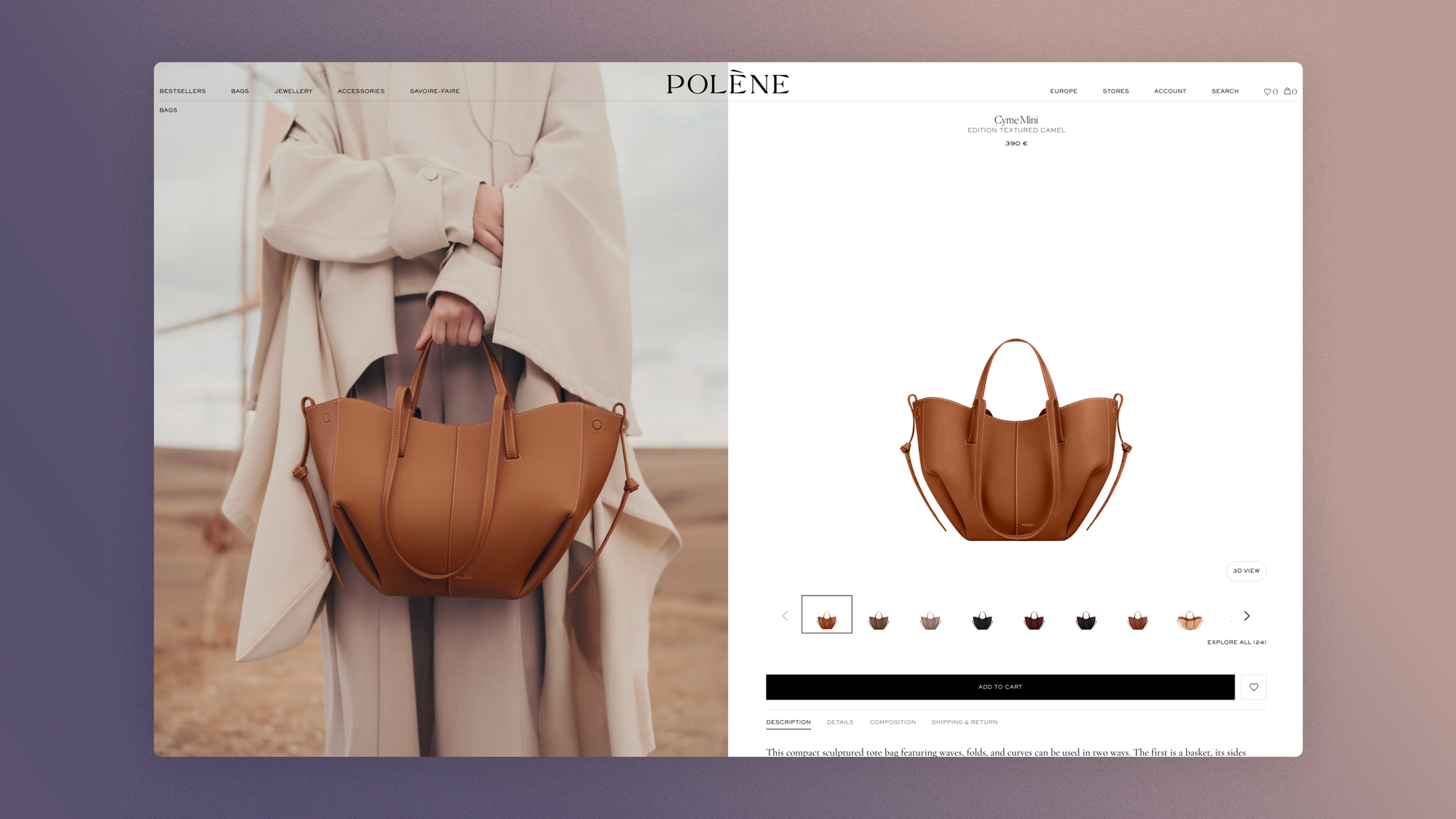
Design does the work that age does for century-old houses. It builds the credibility that the pricing demands. Polène reached €137M in revenue in 2023, up 125% in a year, on this visual grammar.
CRO actions to test to optimize how your product is perceived
Bring the proof above the fold rather than burying it at the bottom of an accordion. Hesitant shoppers shouldn't have to dig to find reasons to pay:
- Add proof of craftsmanship above the fold
- Add fabric weight, origin and construction details
- Add macros for the stitching, lining, clasp and finish
- Add the model's size and the size worn
- Add a "why this price" block for high-ticket pieces
- Add reviews that can be filtered by body type or use
If your visitors systematically scroll past the price before leaving, they don't need a discount, they just need proof.
The lookbook paradox: big audience, low conversion
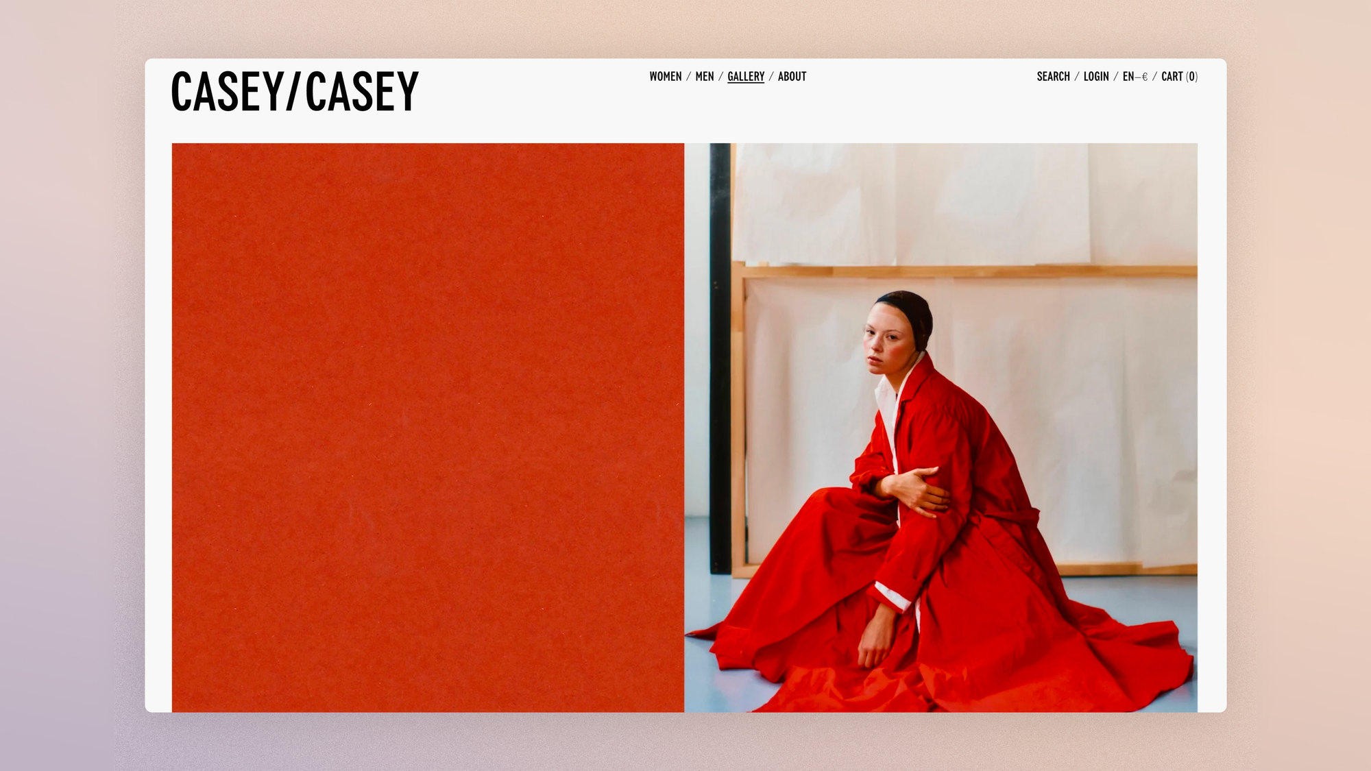
Lookbooks build a world, a tone, a brand. Their value is undeniable, and yet they're one of the formats that creates the biggest gap between engagement metrics and revenue metrics.
A lookbook can fail in two ways:
- It creates desire with no clear path to the product
- It creates an aspiration the product page can't support with enough product information
When editorial engagement is a false signal
The tempting metric "4 minutes average session on the lookbook, great!" is often a warning sign.
High engagement, low conversion, high returns: the footprint of aspirational consumption without purchase confidence. Shoppers enjoy the brand the way they'd enjoy a magazine, not a store.
In reality, of course a lookbook is a prerequisite, but conversion comes from styling context paired with product substance (outfit recommendations, "complete the look" modules, sensory information).
Baymard's apparel research explicitly includes cross-sells like "goes well together" and "buy the outfit," because fashion shoppers buy looks, not isolated items.
CRO actions to test to optimize your lookbook
Connect aspiration and information without asking shoppers to bridge the gap themselves: it's this stitching between editorial and product page that separates a "magazine" lookbook from one that sells:
- Make every lookbook image shoppable
- Add "shop the look" modules to product pages
- Show complementary pieces with their size availability
- Connect editorial images to studio images (same garment, two contexts)
- Add "styled with" items under the main product
First: make me want it. Then (and only then), help me believe I'm right to buy.

How Clarity session analysis can help you spot the right signals
The same click sequence can mean two very different things depending on what comes before it. That's the whole point of a behavioral session review: tie an observable signal to its architectural cause, then pick the right test rather than the standard one.
Take hesitation between two sizes, one of the most instructive signals I know: it doesn't exist in quantitative analysis, but as soon as you watch a Clarity session, it jumps out at you.
Here's a quick example:
| Signal | Implicit question | Emotional pattern | Clarity filter | Architectural cause | Priority test |
|---|---|---|---|---|---|
| The shopper alternates S/M/S/M in under 30 seconds, without opening the size guide, and leaves | If I get it wrong, how bad will it be? | Asymmetric regret: the fear of too tight weighs more than the fear of too loose. | Sessions with >2 size variant changes and no click on "size guide". | No fit information on the selector, no body reference, no return reassurance where the anxiety peaks. | Add "Model 176 cm, wears a S. Relaxed fit" and "Free exchange within 30 days" directly under the size selector. Not in a modal or an accordion. |
I've compiled the fifteen signals I run into most often when reviewing fashion PDP sessions, each with its implicit question, architectural cause, Clarity filter, quantitative confirmation and priority test.
Fashion E-commerce CRO: 20 Microsoft Clarity Patterns
Read your Clarity sessions as a CRO diagnosis. 20 PDP signals in premium fashion, their architectural cause, and the test to run first.
CRO case study: the €220 linen dress
To make the method practical, here is the full diagnosis of a representative case I came across while supporting a premium fashion brand on CRO.
Contradictory metrics
- Solid PDP traffic
- Add-to-cart rate below the category average
- High time on PDP
- High returns citing "not as expected"
- High size guide interaction
- Mobile conversion lower than desktop
Generic diagnosis vs. behavioral diagnosis
A generic CRO diagnosis would say: make the CTA more visible, add a sticky ATC, improve speed, add reviews, add urgency. None of these will solve the real problem, because none of them touches the layer where the decision forms.
A 30-minute behavioral review of sessions shows something else:
- Shoppers swipe through all the images,
- Zoom in on the linen texture,
- Scroll down to the composition,
- Open the size guide,
- Scroll back up to the model images,
- Switch between S and M,
- Open the returns,
- Leave.
Real diagnosis: a failure of the trust stack
Five stacked gaps produce a single result: an unanswered hesitation, and therefore an exit. Each gap traces back to a design decision made upstream:
- Visual gap: The dress is shot editorial-style but barely visible from the side and back
- Sensory gap: "100% linen" says nothing about weight, transparency, structure
- Fit gap: The dress is relaxed, and the selector doesn't say so
- Return anxiety: Shoppers check the returns after the size hesitation
- Value gap: €220 calls for more proof of fabric and construction
Four-way test plan
Four parallel tests, each targeting an identified gap.
Test A. Trust module near the size selector
"Model 174 cm, wears a S. Relaxed fit, take your usual size. Mid-weight linen, not see-through. Free exchange within 30 days."
Test B. Image set upgrade
Add a back view, side view, texture close-up, natural-light image and a short video in motion.
Test C. Rewriting the fabric copy
Original: "100% linen. Machine wash cold."
Test: "Mid-heavy European linen with a dry, natural hand. Breathable and lightly structured, designed to soften with wear. Fully lined to limit transparency."
Test D. Fit module in reviews
"True to size" sub-score, filter by model size and usual size, customer photos where available.
Every hesitation is a question
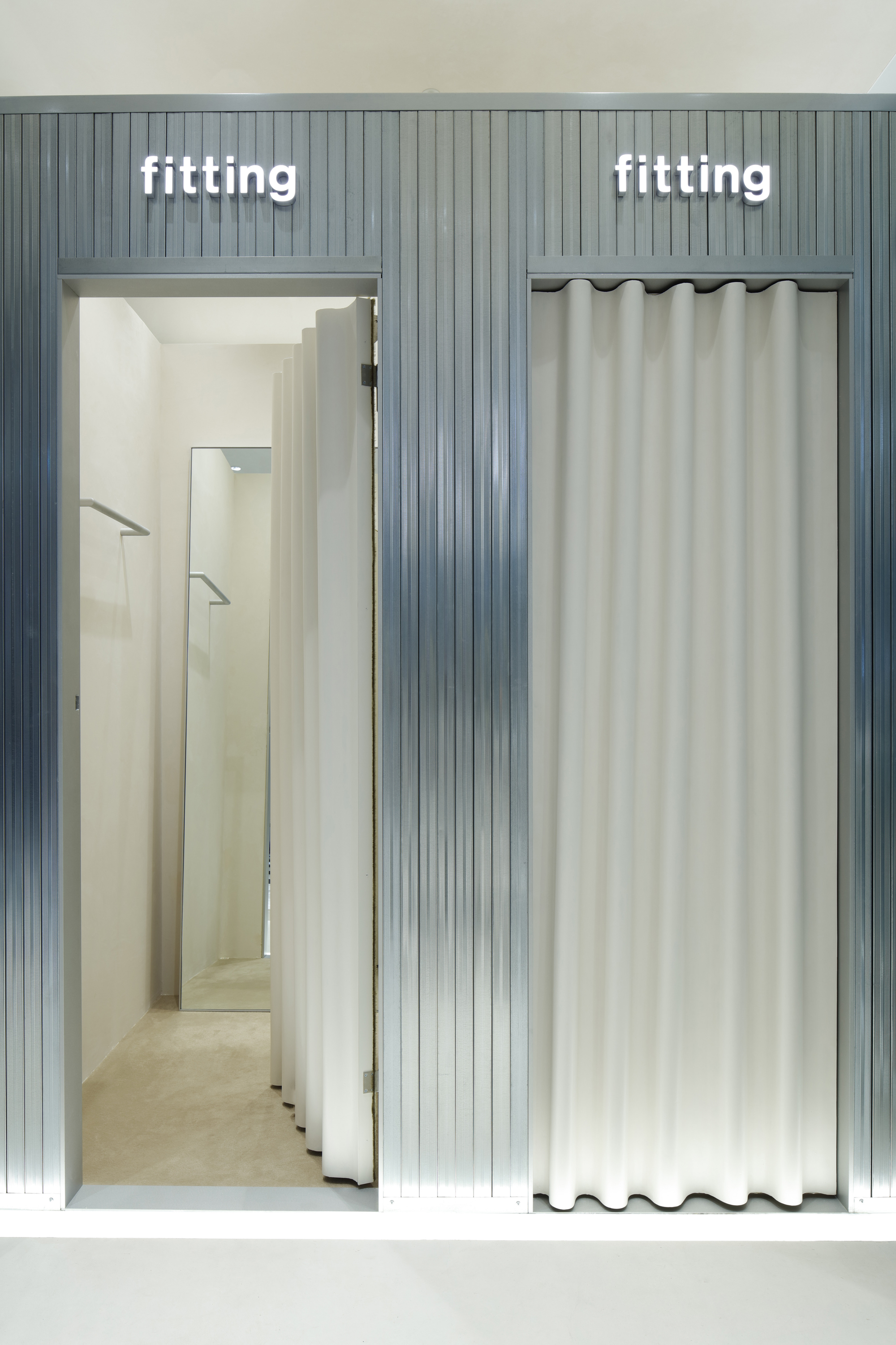
When a fashion shopper hesitates, they're almost never doing anything other than trying to find the missing fitting room.
A zoom is a question. A click on the size guide is a question. A detour to the return policy is a question. A color change is a question. A repeated image cycle is a question. An exit after strong engagement is an unanswered question.
That's a lot of questions, it's true, and in CRO it's important to know how to listen. The brands that win aren't the ones that shout loudest with pop-ups, or the ones with the shortest checkout. They're the ones whose page makes shoppers feel:
- I know what it looks like
- I know how it drapes
- I know how it feels
- I know why it costs what it costs
- I know what happens if I get it wrong
- I can picture myself in it
The real conversion event happens there. The Add to cart button is just where it becomes visible.
Fashion E-commerce CRO: 20 Microsoft Clarity Patterns
Read your Clarity sessions as a CRO diagnosis. 20 PDP signals in premium fashion, their architectural cause, and the test to run first.